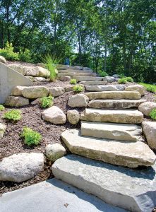
 Coastal living is often associated with the salted waters of the Atlantic or the Pacific Ocean, and yet with its abundant miles of shoreline among the world’s largest series of interconnected freshwater lakes, Michigan is inherently familiar with residential waterfront design. Its natural cul-de-sac formation offers much in the way of lakefront property—both inland and its perimeter—among breathtaking wooded land, mercurial sand dunes, and crystal blue waves.
It is not surprising many have made their seasonal or permanent residence in the state known for its pure natural resources and quintessential beach communities; often dissolving the boundaries between indoor and outdoor spaces in custom homes.
In this particular case, the waterfront home designed and built by David C. Bos Homes in collaboration with Straight Line Design Kitchen and Bath Studio and Lakeside Surfaces Inc. achieves a carefully woven balance of traditional coastal elements and contemporary elegance in a timeless transitional style.
Enduring impressions
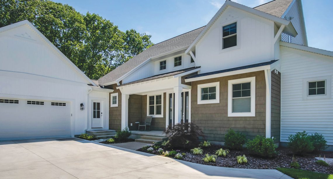
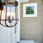
While the home is setback from the shoreline on a wooded lot, the waterfront influence is apparent upon first glance at the warm tone of the durable, low-maintenance vinyl composite shakes on the front porch. When contrasted by the rest of the white exterior, and complemented by the texture of the horizontal and vertical laid siding, the shapes and forms of the front of the home create a bold and engaging statement.
“The clients had a strong vision in their mind when they came to us,” said David J. Bos, president of David C. Bos Homes. “They really challenged us to create their dream home that they wanted for their family and really maximize the exterior style and color theme to really make it come alive.”
David C. Bos Homes specializes in designing, building, and renovating waterfront homes and has been a family-owned and –operated business since 1973. Now in its second generation of ownership, the Spring Lake, Michigan-based company strives to create homes blending classic elements with the technology and amenities of today.
Located on an estate-sized, one acre site, this transitional home is positioned to take advantage of the natural lighting from the east and west, as well as a seasonal view of Lake Michigan from the second floor of the residence. Through the incorporation of glass and its western facing, the home is designed very similar to one that would be right on Lake Michigan, according to Bos.
“They wanted to not necessarily be on the lake, but very close to it,” Bos said. “It is a sandy dune-type site with some natural rolling and rising hills, and it is all dune grass beyond their landscaping. It is very much like a house on the beach and [the clients] went for that feel as well.”
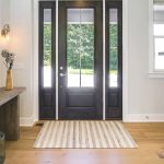
As one steps beyond the threshold and into the foyer, there is a cohesive story being told between the exterior and interior of the home: one of a light, refreshing, and soothing ambiance. Wendy Fraser, interior designer and client relations coordinator at David C. Bos Homes, said it is important the design of a space flows not only with how a client wants the space to feel, but also works well between exterior and interior.
“We worked hard to make sure it was exactly what the clients were after for the exterior. It’s your first impression,” Fraser said. “The overall feel when you walked the space had this great relaxing feel to it, because the colors and everything worked so well together.”
Enlightened interiors
During the process, Fraser said she worked with the clients in making all of the interior design selections, such as identifying cabinetry and its layout, door styles, color scheme, flooring, and fireplace features. It was with the discovery a rather unique quartzite for the island countertop in the kitchen, the rest of the home’s aesthetics were built—layering soft shades of white and brown, complemented with gray and blue accents.
“It was the client’s goal to have an elegant feel to a beach theme,” Fraser said. “We kept all of the colors very soft and serene, nothing too bold or dramatic.”
The kitchen also features a quartz composite countertop along the perimeter, complemented by metal appliances and range hood; cabinetry featuring recessed panels and transom glass doors in the upper cabinets reaching toward the top of the nine-foot-tall ceilings; and warm, white oak flooring.
“We exaggerated the cabinet heights to complement the ceiling in the kitchen,” said Fraser in reference to stacking the cabinetry. “It really set off the whole space.”
There are also a series of hanging oversized globes with a burning filament-inspired bulb over the island. Tucked underneath the clean, thick lines and legs of the island itself are a series of dark gray stools, their legs blending elegant curves with industrial strength.
“They wanted a light, bright kitchen so we painted the cabinetry in the white family,” said Randy Ruter, owner of Straight Line Design. “The kitchen island was fantastic. They did a microwave under the countertop, which minimizes its visual impact…it also had some large legs on it to make it look more like a piece of furniture. It was a very simple straight design.”
Straight Line Design is a kitchen and bath studio with locations in Spring Lake and Holland, and has partnered with David C. Bos on multiple remodel and new home construction projects in the past. For this particular project, Straight Line Design provided cabinetry design services in different spaces, such as the bathrooms, kitchen, and laundry room. Ruter noted as a transitional design, the cabinetry is more likely to feature flat panel doors, very simple straight lines, and lighter finishes, which are evident in this new home.
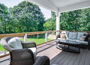
With its open concept layout, elements found in the kitchen carry over into the dining and living areas in the clean lines of furnishings; soft gray, white, brown, and blue hues; and complemented by richly stained cabinets. Wicker-woven stools, modern-inspired chairs, and a bench gather around a dining table set before a slider opening out onto a balcony complete with dark gray wicker-woven outdoor furniture.
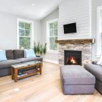
In the room connected on the far side of the kitchen, separated by a set of glass doors, the white cabinetry and trim, light walls, and white oak flooring is complemented by the bolder accents of rich gray furniture, textured stone fireplace, and shiplap above a wooden mantle. Suspended above, a wooden fan with a design reminiscent of a propeller, grounds the space.
There are also custom-wrapped, white oak beams running above head, while the shiplap is repeated in the living room on an entire wall to balance the flow of an open layout with the distinction of space.
“It was important there was a flow to the whole area that we created. In that case where we did want some separation between the spaces, we actually wrapped openings in white oak to match the floor,” Fraser said.
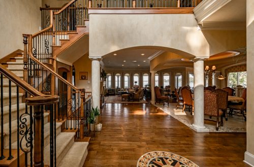
“The client fell in love with the white oak floors and we brought that into the beam that ran across the dining room space and we brought that into the stairwell. It has custom-stained treads in the same finish as the flooring. Those are the details that really draw your attention and give it a ‘wow’ factor in a subtle way,” Fraser added.
Hidden gems
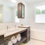
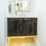
Another distinctive feature of the home adding to its overall impression is the use of Cambria’s White Cliff from the Desert Collection and Berwyn from the Waterstone Collection in the bathroom countertops. The durable, scratch-resistant quartz surfaces were installed by Lakeside Surfaces Inc., which is a Muskegon-based fabricator of natural stone countertops. The company is also a Cambria Lexus Partner, working solely with quartz surfacing materials through the leading Minnesota-based quartz company.
Pete Kuipers, sales representative at Lakeside Surfaces Inc., said the White Cliff quartz was installed in the master bathroom and the powder bathroom from a collection that remains popular today.
“One of the benefits to that particular one from Cambria is it’s the purest white quartz on the market,” Kuipers said. “It doesn’t have a lot of impurities that would cause it to have flecks of different color throughout the design.”
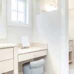
Named for the White Cliffs of Dover, the white quartz lines about 50 inches by a standard depth of about 23 inches deep in the master bathroom, with an additional run of about 40 inches by a standard depth of 23 inches in the powder bathroom. The second Cambria design known as Berwyn—inspired by the dense and earthy mountains in northeast Wales—was used for a small makeup table at about 32 inches long by 23 inches deep.
“Berwyn has been the number one seller for probably the last year. It is a really popular color,” Kuipers said. “Berwyn consists of gray, taupe, and even a little bit of green in a swirling pattern. It is very subtle.”
While the aesthetic of the Cambria quartz tends to speak for itself, Kuipers noted as far as functionality goes, the real beauty of the product is its nonporous nature.
“It basically makes it maintenance-free for the homeowner and it is virtually impossible to stain Cambria with normal household items, whether you are in a kitchen or bathroom environment—or all these different habitations Cambria is used for—the durability of it makes it a wonderful product,” Kuipers said. “It’s the best of both worlds.”
 Life in spaces
With a goal in mind of creating a truly unique space for clients, the David C. Bos Home in collaboration with Straight Line Design and Lakeside Surfaces has managed to capture refinement and sophistication while infusing spaces with quintessential elements and accents often found in waterfront—or coastal—homes. Fraser noted while the team creates the spaces, the clients play a big part in the design process.
“Every client we work with lives life a little differently than the last. Everyone’s desire for the space they live in is different. It is important to try to find that and recreate it in a space,” Fraser said. “This home, I think we really hit that nail on the head, because it was exactly what they feel they wanted in the end. They were really ecstatic about the end result and I felt it was also something we had never done before. It’s gorgeous.”
Photography courtesy David C. Bos Homes

