As part of NeoConnect’s summer exhibition series, the platform recently hosted an informative presentation on the latest developments affecting changing, global society’s color consumption on June 24, 2020. The presentation, “2021 CMG World Color Forecast: From Beyond the Telescope to Under the Microscope,” was hosted by NeoConnect, presented by the Design Center by theMART, and moderated by two professionals from the Color Marketing Group, or CMG. The not-for-profit international association is designed for and by color design professionals and aims to create accurate and relevant color and trend forecast information through an interconnected global network of members.
Peggy Van Allen, president at CMG and a designer and Color Anthropologist with Colorfuel in Cary, Illinois; and Montaha Hidefi, vice president of Color Forecasting at CMG and Color Archeologist with Color Landing Studio in Guelph, Ontario, examined global color forecasts microscopically to reveal societal and cultural forces impacting this coming year’s color directions.
“We’ll take a look at the entire 2021 world color forecast and look closely at four trends that are emerging at an accelerated rate due to the global event happening right now. We create the forecast two years out, so this forecast was done in 2019,” Van Allen said during the presentation. “Many people want to know how a global event like the pandemic will impact the future, so we wanted to view our initial forecast through that lens.”

The color forecast is achieved through a global output of information gathered through research, extensive workshops taking place in the Asia Pacific, Latin America, and European regions, and more intimate color workshops called ChromaZones that take place internationally. Within these workshops, international members and non-members across industries present their own color forecasts and take a deep dive into regional and global topics related to politics, economy, human behavior, and timeliness. Workshops then are steered into regional forecasts that can be applied to industries and products around the world.
For the 2021 color forecast presentation, Hidefi and Van Allen focused on four global color stories out of 12 color stories, and 64 overall colors that were collected from these programs and are especially relevant given global events. The four, color stories correspond to four areas of focus: North America, Latin America, Asia Pacific, and Europe.
Across the four regions, connections were made in themes like regenerative processes, modern integrative technology, historical context and tradition, and the desire for depth in an artificially influenced world. The European forecast includes stories like “Insatiable Appetite,” which addresses modern consumerism and results in a string of colors Van Allen described as a “harmonious color clash,” and “Shared Archetypes,” which examines our desire for depth among the artificial. This palette mixes colors that signify ancient ritual with those that speak to a current need for calmness and mystery, as seen in dusty, chalky hues.
“Old symbology is dusted off and given new meaning,” Van Allen said.
The final European color story, “Planet Living Room,” tells of the changing notions of home, pre-and-post-pandemic, into less of a place and more of a feeling. This translates into how people treat the larger home, the earth, and how environmental wellbeing is continually coming more into focus, especially through activism by younger generations. The colors show variation between neutrals, like “Fish Net,” and darker tones, like “Space Debris,” with some pops of color, like “Apnea,” which is a deep, nearly indigo hue.

The North American color forecast was influenced by the continent’s reckoning with waste and how it is increasingly being repurposed in industry and art. Color stories like “Commit Less” and “Time Warp” focus on the connection between technology and life, with the former examining the relationship to a borrowing lifestyle that satisfies the restless spirit, and the latter showing how technologies are being utilized to change the way people work and assess time; especially in an increasingly remote working environment. Colors within this set of stories range from the statement beige, “Paper Bag,” and cleansing color “Mist,” to “EmpoweRED,” which speaks to material luxury, and “Reconnect,” a yellow-based green representing the bridge between tech and life.
A similar theme emerges in an Asia Pacific color story called “Lazy Society and the New Playground,” which analyzes the appeal of virtual realities and how they translate to virtual travel in a global pandemic environment. The story also addresses a need for reconnecting with personal youth, and this thought shows in a relatively vibrant color selection, which includes names like “Mango Mousse,” and “Bottle Green.”
“Much of what we perceive is beyond our control, but we ask what can we do? The stories deal with harnessing the attributes of artificial intelligence, taking personal control of how we live, and how that impacts the globe. Change can take many forms,” said Hidefi, in reference to the Asia Pacific section.
Other colors in this segment are inspired by the Italian painter Georgio Morandi, the distinctive scent of fresh Thyme, and the historical complexity of the phoenix; as well as rocky, tactile hues inspired by charred wood and natural pastels.
Finally, the color forecast for Latin America posits Indigenous people at the center, with cultural pride, ancestral wisdom, and a return to locally made, artisanal products coming into focus, according to Hidefi. The color palette stems from the land, jungle, and desert in one story—with minerals, turmeric, and green orchids showing their influence—and deep and light blues symbolizing the vast space of the internet and freshness and flexibility of Generation Alpha in another.
Overall, the color direction for 2021 includes rich, warm variations of yellows, oranges, and reds, as well as cooler hues infused with reds and greens, and an uptick in neutrals compared to the 2020 forecast, Hidefi concluded. To validate or test their forecasts, the CMG has a special committee that researches the markets for confirmation on different color directions.
Text: R. Collins | GLBD writer
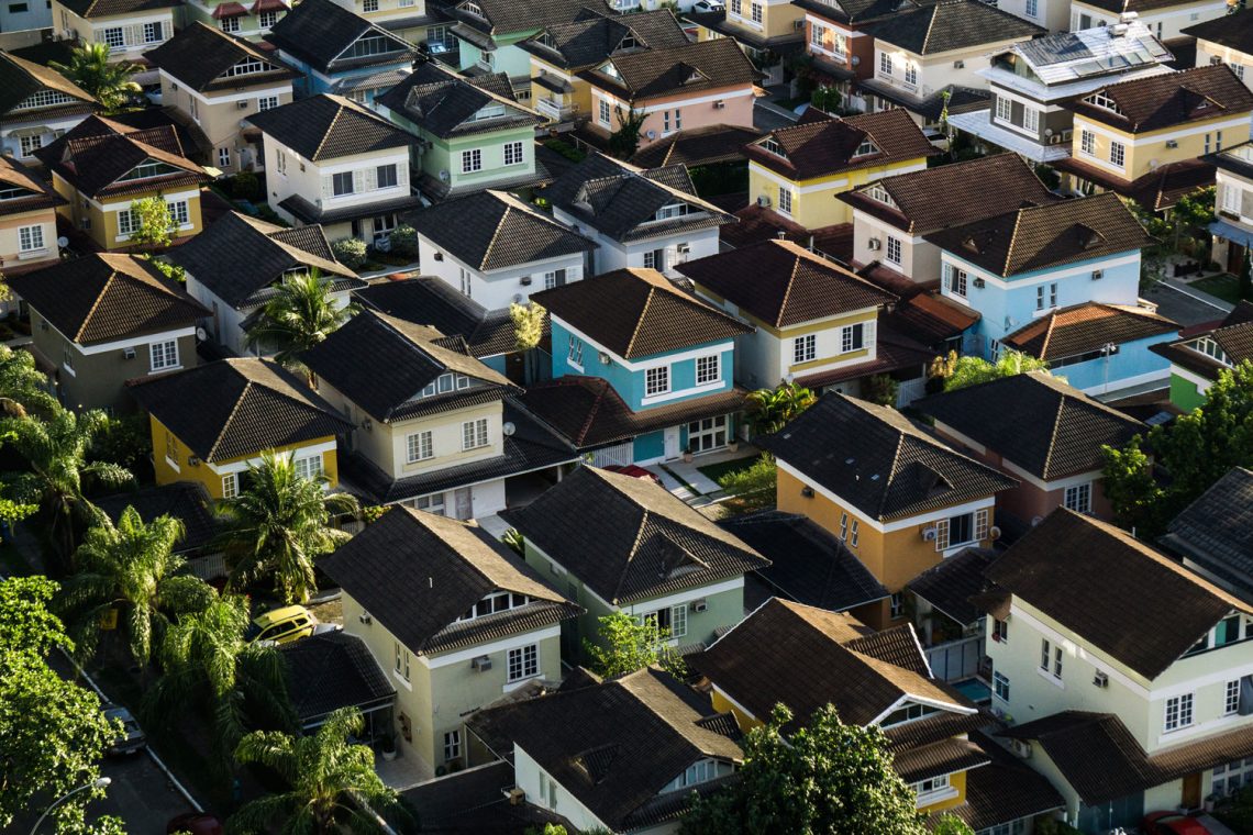
Featured image: Neighborhood by Breno Assis, photo Unsplash