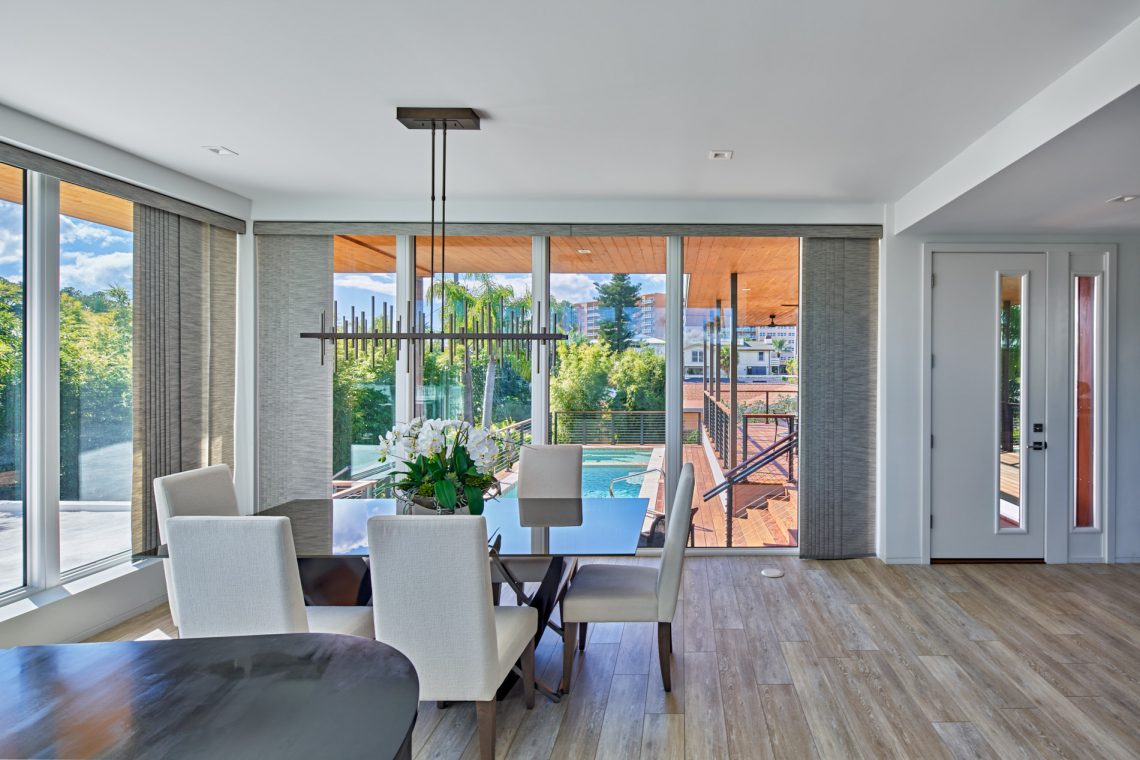
Gazing through a glass expanse in the dining area of a newly renovated home by Mathison | Mathison Architects of Michigan, one gets the sense of being perched in a bright, southern forest canopy, where vibrant green shades gently ricochet through a hot breeze, and somewhere nearby the ocean breathes. This image isn’t far off for the reconfigured residence in Clearwater Beach, Florida, positioned in between the Gulf of Mexico and intercoastal waterways.
What was a single-story, ranch-style, second home from the last century has become a contemporary 2,200-square-foot, two-level residence that successfully merges a complex utilities strategy with a clean style program to center it on the prime location. While indoors, the glass surrounds of the added-second-level still harness a serene sense of privacy even though the home sits on a corner lot within a residential neighborhood. They take in the meticulous new landscaping and palm tree coverage, as well as views of the elevated, “underground” pool.
For Mathison | Mathison Architects, a full-service architecture and interior design firm based in Grand Rapids, Michigan, the goal for this project as with many others was to preserve as much of the existing structure as possible: something the clients and family were glad to accept as intergenerational users of the property.
“We love this project, because a lot of times we and clients will work together in preserving what’s there because it’s frankly just more sustainable,” said Ben Franceschi, AIA, architect and principal at Mathison | Mathison Architects. “A builder might come along and say, ‘just tear this thing down and start from scratch.’ We were all committed, the clients and us, to fighting that temptation to just knock down what was there. The ground level became kind of the servant in a meaningful way to the upper level. The upper level became very special.”
The upper level directly supported the more functional goals for the renovation, which included building an open floorplan connected to landscape views and creating seamless pathways for movement throughout the home as family members age. More technical goals for the project also comprised keeping in compliance with Federal Emergency Management Agency, or FEMA, elevation requirements at the shore-side location.
“Once we made those decisions, we went all-in on creating an oasis in the neighborhood,” Franceschi said.
They began by removing the roof and structurally underpinning existing walls to support the new loads above. For weather management, the team also added wood louvers in openings at ground-level to allow potential flood waters to pass through, and they utilized hurricane-proof glazing for the wooden upper deck, where a mechanical system is also carefully concealed to keep the home operational during weather events.
To combine the two levels, the team carefully integrated access points between them while dressing both exteriors in a patterned, material palette of fiber cement, board siding, and stucco for a “clean read,” according to Franceschi. The passageways comprise a new elevator for easy access to the upper living level, a stair from the car ports that passes poolside activity on the way up, and a front door stair that travels from mudroom upward.
“It was very satisfying for us to do such a [gratifying] transformation of the project; to take an existing single-level house and to use parts and pieces of it strategically and then completely redefine the experience of the upper level,” Franceschi said. “It was quite careful how we toothed in the [existing level] at every single location to the existing structure.”
Bringing the pool to this new elevation was also a huge achievement for the designers, who essentially created a concrete tub form and refilled it with sand to evoke an earth-like bed, before carving it out to fit a rectangular pool. The flush detailing of the pool with the clean geometry of the surrounding thin, wood paneling will keep it usable throughout lifetimes. Though this area along with the rest of the home speaks an unmistakably modern design language, it was informed more so by the family’s practical needs for their now permanent, coastal oasis than a specific style.
“We tried to keep it as simple as possible, which is something we will often do; we’ll choose a few key materials. We knew we wanted to have warm areas with wood on the exterior that really captured and made certain exterior spaces refined, and to have interior qualities,” Franceschi said.
The minimal material palette and clean detailing seen across the two levels and their surrounding landscape create a grounded energy for the space upon first glance, and then during interior experience. The complex project of elevating a new living space atop a foundation of heirloom architecture unfolds seamlessly about the flat, street-side landscape near the sea, but it might take a few glances to truly appreciate the intricacies.
“I think there’s a lot about this project that just driving by it you wouldn’t [notice],” Franceschi said. “It’s not intuitive how much it took to get to what we did.”
Text: R. Collins
Photography: Jason Keen


