 Profound similarities can be drawn between the assembly of flavor and sound, as can many practices within different art forms. Cooking itself can be considered a visual art, requiring the same steps from a chef as a musical orchestrator, sculptor, or other artistic disciplinarian who crafts by hand. It involves a purposeful layering of ingredients; an attention to which senses are evoked and when; and a creation of aesthetic depth in which observers’ ears, eyes, or fingers can explore and savor.
His first love being music and his career rooted in fine Italian dining, Chef Chase Blowers, founder and executive chef at Cincinnati restaurant and raw bar, Eighth & English, has approached the culinary world with a musician’s discipline; continuing to rearrange flavors, while refining dishes down to the last garnish and shade of plate accessory.
When establishing Eighth & English in 2017 in a renovated historic building in the small northeastern Cincinnati neighborhood of O’Bryonville, Blowers approached crafting its brand similarly: he had a desire to contribute the different elements of his artistic influences to a visual—and edible—one-of-a-kind concept.
“I needed people who could translate me into a design and brand. It all needed to be made into a cohesive brand from the website to the wallpaper. That was my biggest focus: creating this brand from the check presenter to the [home] page,” Blowers said.
Apart from his musical background, Blowers developed an affinity for careful refinement and traditional dining during his time at Boca, a concept launched by Cincinnati-based Boca Restaurant Group. During his tenure, Blowers formed a relationship with Sebastien Hue, now co-founder of Cincinnati-based brand and marketing firm, BS LLC. From the firm’s experiential focus and creative energy, Blowers realized the team of Hue and Co-Founder Ben Greenberg at BS LLC would be the right outfit for the job based on similar tastes and backgrounds.
“Our goal from the beginning, and for every project, is to create something that’s unique and proprietary. That goes back to this philosophy of doing things by hand,” Greenberg said.
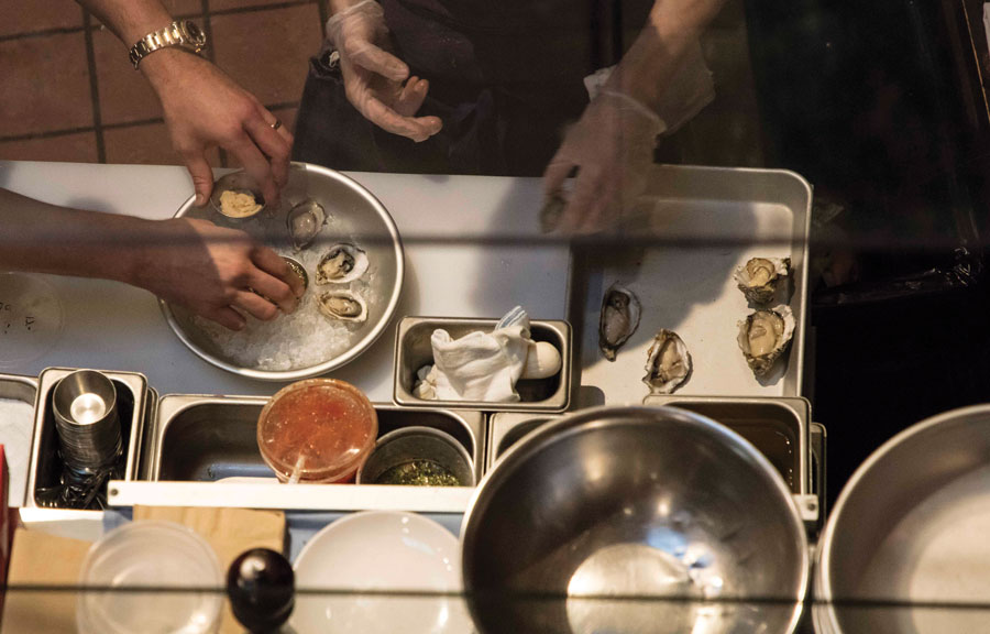 “When you do things by hand, they become impossible to replicate. We wanted to create something for Eighth & English that stood out. From a food perspective, I think the menu is really vibrant and the brand had to match that vision of pulling together different flavors and pairing them in unexpected ways,” Greenberg added.
The restaurant’s menu and concept being largely pescatarian-focused, themes of sea life set the foundation for the brand’s visual characteristics, while other themes develop its personality and add tasteful elements of surprise. Original pieces of art for the 120-seat interior were created using the Gyotaku print-making method in which ink is pressed to paper using organic materials such as fish or leaves. The prints mirror themes of pattern-making and repetition found in music composition, but visually, they represent what Blowers creates for the palette: a methodical layering of ingredients by hand that is also joyfully deconstructed.
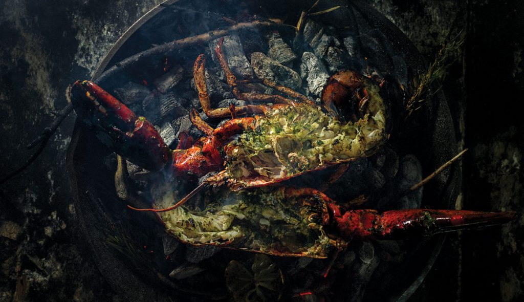
 “When you go to the website there’s a gif of people just grabbing and sharing [food] and making a mess. I was trying to put that picture in front of the people,” Blowers said. “We [also] want to keep things fresh and try to do a little extra flavor here and there; bringing in new ingredients and bringing in something outside of the usual.”
Blowers also noted that the initial menu was decidedly Mediterranean-influenced with fresh fish, locally-sourced seafood, and produce from his family farm and garden being the mainstays. While the best-selling dish—a lightly seared and braised halibut accented by coconut curry and fried arancini—continues to reinforce the menu’s sea-fare foundation, continental proteins such as Amish chicken breast and grilled strip steak make the menu turf-lover-friendly; and various sections of the four-category menu change every four-to-five weeks to allow the kitchen team opportunities to engage with the menu and adapt it.
“It’s cool to not be afraid to try things and figure out what the right thing and the wrong thing to do is. I think it’s a tough bag to figure out and do well,” Blowers said. “[It can be] a tough place having a fine dining background. You need to ask what’s going to create business; what’s going to create repeat business; and what’s going to engage staff?”
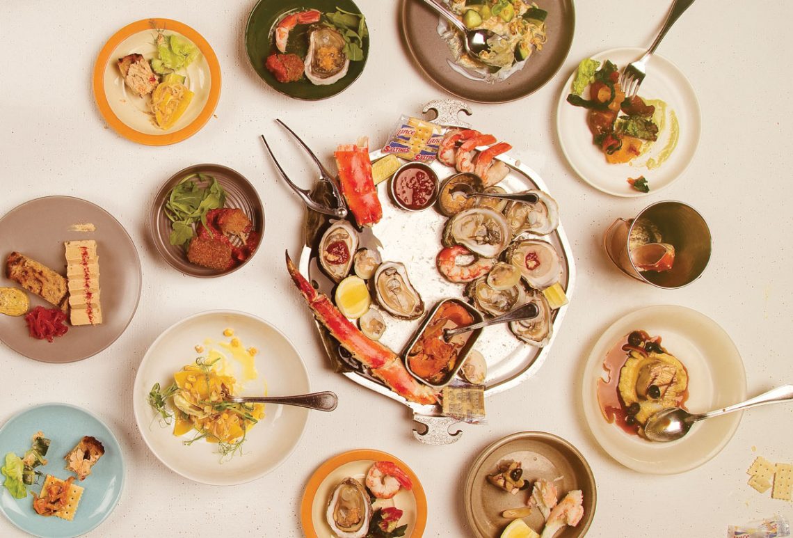
The experimentation in the creative kitchen is refined by Blowers’ old-world technique and understated plating presentation, which he states is transitioning into a new era altogether with the more recent coinciding of guests as both patrons and social media food photographers. Many items on the menu feature the neutral and pink tones of fresh seafood and are contrasted with bright sauces and dark garnishes before being layered atop curved plate ware with low edges.
The colorful collage of menu items mimics that of the menu and website design itself in which Blowers’ modern tastes are also met with purposeful tributes to tradition, retrospective, and vintage aesthetics. The menu design pulls inspiration from the adventures and nautical style of ocean conservationist and filmmaker Jacque Cousteau, as well as a selection of album covers by jazz musicians such as Chet Baker, Charlie Mingus, and Dexter Gordon, which feature vibrant colors arranged in patch-like patterns against cool tones. The name of Eighth & English itself references Blowers’ eighth-grade English teacher who helped him thrive creatively in a small Ohio town.
“’Vibrancy’ is the word we kept using around this—the food is vibrant and really unique. [Blowers] is not vested to one food culture or nationality; he’s into flavor,” Greenberg said. “The chefs he works with are into experimenting with flavor so we wanted to do the same thing with a visual identity—experimenting with textures and loosely tying in together this world of the ocean and sea life, but pairing things together that are unique.”
As the restaurant has evolved, Greenberg said, more prints and custom art work created by artist Cody Dunningham have appeared on the walls among the custom wallpaper BS LLC developed for the space. Blowers, Hue, and Greenberg also collaborated with Kelly Shiels, interior designer and founder of KShiels Interiors, a Cincinnati-based interior design firm with services also provided in Chicago and New York. The interior design represents the highly refined product Blowers prefers, and allows menu items to take center stage.
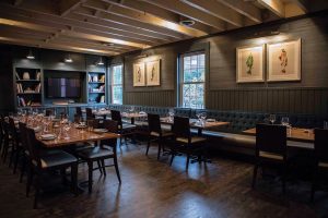
 Other than the lightly nautical lighting fixtures, the space favors line over curve, Earth tones over highly pigmented shades, and features black French mattress banquette cushions under dim lighting. Observing the ground floor from the loft, a high brick wall buffers sleek, peaked exposed ceiling beams and dark wood flooring. Matte black finishes contrast a white stone bar and gray stools, and complete a comprehensive textural experience that travels from one area of the restaurant to the next.
The opportunity to create digital and physical texture pairings alongside like-minded creatives is something that continues to draw Hue and Greenberg, not only to branding projects for the often creative, experimental restaurant industry, but also to the Cincinnati region as a whole.
“It’s such a thrill for creative agencies to work with restaurants because there’s just so many more colors with which to paint [and] so many more textures to play with,” Hue said.
“We often think of Cincinnati as this kind of weird step-child of the Midwest, because we’re the northern-most southern city and the western-most eastern city; and it occupies a strange place and collects a lot of talented people that we’re lucky to know and work with. We’re happy to be a part of that ecosystem,” Hue added.
Placed strategically within O’Bryonville, and outside of Cincinnati’s core restaurant district, Eighth & English is geographically autonomous, with guests enjoying a similar privacy away from the city sphere. Blowers noted that the explosive growth of the Midwest’s more casual restaurant population over that of fine dining has changed the way many restaurants function and come to fruition, causing them to consider social media and brand engagement in a new way. As a result, Blowers and the design team worked to activate an interest in guests to step out of the-sometimes-congested city-sphere and dive into a well-orchestrated experience full of vibrant and refined sensory activators, from flavorful to visual.
“You get to touch on a lot of senses, from what you hear to what you see; what you touch and what you taste,” Hue said. “The experiential design is a much more powerful medium than just tracking what you see on a screen or a piece of paper. It creates more evocative spaces; places where you can help people disappear into a moment and create a memory.”
Text: R.Collins | GLBD writer
Photography: BS LLC

