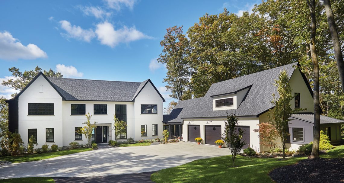
This private waterfront residence located on the shore of Lake Michigan is the culmination of the combined creative and technical talent of Sears Architects, Cannarsa Structure and Design, and Zahn Builders Inc. In a region where certain vernacular styles often reign, it is evident upon first glance—the subdued white stucco exterior combined with bold, dark windows—this home is truly a study in contrast.
Contemporary lines are married with traditional features; an iconic floor-to-ceiling fireplace defies expectations and boundaries through the use of cinder block; intricate and sophisticated light fixtures and furnishings are interspersed with others more crisp and minimalist-inspired; and an 18-foot-high main living room is grounded with concrete floors, a coffered ceiling, and trim-less windows.
“The homeowners were looking for a house leaning toward contemporary, but at the same they wanted something with some traditional feel to it; to have some vernacular elements,” said Rob Sears, founder and principal at Sears Architects.
“The massing of the house—with the two gable ends and the window openings on the façade—has a very traditional air to it, yet the material is a smooth-finished stucco exterior that is a little more contemporary,” added Sears.
Sears Architects is a Michigan-based boutique architecture and planning firm specializing in the custom residential field throughout western and northern Michigan. Since its establishment in 1995, the award-winning firm has worked with homeowners, historic residential associations, joint-venture partnerships, and private developers in both the residential and commercial sectors.
Supported by a nine-member team, Sears Architects’ portfolio has grown to encompass not only private residences and cottages, but also neighborhood planning, mixed-use, and hospitality projects in locations such as Seattle, New Jersey, and Florida.
The strategy
In uniting the two often quite distinctive architectural and design styles into a cohesive, bold statement for the private single-family home on Lake Michigan, Sears Architects—in collaboration with Cannarsa Structure and Design, and Zahn Builders—subtly infused warmth, texture, and character into the more modern-inspired residence. The smooth, stucco exterior features simple detailing, such as intentional horizontal lines running the length of the structure and recessed details on each gable end, and is complemented by the black, grille-patterned Pella windows and metal accent roof.
“It is the colors and the materials providing a little more of a contemporary feel. If the windows were white and it had gray, horizontal clapboard siding on it, it would be a completely different house,” said Sears.
“I think my favorite element of the house is really the simple and understated massing and detailing. It is not frivolous or excessive; it is really clean, but at the same time it is not cold. There is some textural feel to it, some vernacular feel so it doesn’t look too stark,” added Sears.
When approaching the layout of the home itself, Sears said the architectural firm works with homeowners to identify programmatic requirements, such as client needs and desires, and site information to deliver well-crafted and positioned spaces. While some of the criteria tend to be more pragmatic, such as the number of bedrooms, bathrooms, zoning restrictions, and natural topography, others are more emotional in nature and not easily defined, according to Sears.
“With this house in particular, we wanted to have a center entrance where you could see through the house and have a framed view of the water beyond, but we didn’t want it to be a house where you walk in and all of a sudden there is a wall of huge windows,” said Sears. “We wanted to pull you through the house.”
To accomplish this, Sears noted most of the spaces are situated to radiate off of the main entrance hall, which pulls the viewer into the large, 18-foot-tall formal living room. The centrally-located living room branches off into a more intimate-sized family room beyond the fireplace, a formal dining room and wet bar, kitchen area and nook, kids playroom, and office space on the main level.
Surrounding terrain
Relative to the site layout, Sears noted the residence sits into the land really well and is positioned to reveal itself as the homeowners and guests draw closer to the lower courtyard while traveling down the length of the driveway. Upon passing a small rise, the home and its three-stall, attached garage—sitting at a right angle from the main massing of the structure—are visible among the wooded, waterfront property.
“The main house is on the left and the garage is on the right, so it almost looks as if it is detached, but in the plan it is clearly connected,” said Sears. “The connector piece is also an easy outdoor access [point] for people when they pull up.”
The property’s natural topography also lent itself well for positioning the home: the fairly flat portion became an ideal location for the large drive and front of the home, while the back of the residence opens out onto a low-bluff access to Lake Michigan; and a walk-out terrace was landscaped into the small ravine or gulley on the south edge of the site to transition naturally toward the higher topography on the eastern boundary.
“The majority of the public spaces of the home, like the breakfast room, dining area, and family area step out onto a hard surfaced terrace,” said Sears. “We used the ravine to make the walk-out portion. We wanted to soften the edge of the walk-out area, so we used landscaping stones to transition up to the front of the house.”
While the home in its completed state appears as if it had always belonged nestled between trees along the lakeshore, identifying a property site suiting not only the clients’ needs, but also logistical requirements began early on in the process.
Tony Zahn, president and founder of Zahn Builders, said based on a good understanding of the Michigan Department of Environmental Quality’s rules and regulations—critical dunes, high-risk erosion—he looks at a lot of potential Lake Michigan building sites with prospective clients to identify how the home they envision will fit.
“Every lakefront lot is drastically different in terms of MDEQ regulation, natural features, and zoning,” said Zahn. “In this particular case, [the clients] were after a low bluff and as much frontage as they could possibly have. It also became clear they really needed to come up with an estate feel to the home, which required a large footprint.”
Zahn Builders has specialized in the science and art of custom residential home building and renovation for more than 20 years. Established in 1995, the Holland-based company has grown its portfolio of projects to comprise traditional, modern, and one-of-a-kind-designed homes among the lakeshore, East Grand Rapids, and Ada regions.
Zahn noted the clients brought strong design concepts to the project during the site selection phase of the building process, which led to the collaboration with Sears Architects based on Sears’ understanding of timeless, traditional design and ability to blend modern elements.
“[The client] was very interested in the European, traditional home with an industrial, modern twist to it. It made it exciting. We needed a really big footprint and we found the perfect site. I worked with some really rough site plans of how a house could fit there,” said Zahn. “Sears Architects began the architecture and design phase in lock-step with us as we were pulling permits.”
Shaping a home
The design process itself began in December 2013 and it was only a short few months later in March 2014 when construction broke ground, according to Zahn. While the design process was “very fast-paced,” the clients also challenged the team with unique design features, such as integrating an exposed, lightweight concrete floor on the main level.
“At the time, it was pretty cutting-edge and pretty bold,” said Zahn. “I really enjoy finding the property, doing the initial site planning, having their dream work on the lot, getting to know the client’s personality, and putting the right team together to execute the job.”
As the home began to take physical shape, the clients also retained John Cannarsa of Cannarsa Structure and Design to help source, coordinate, design, and install the different exterior and interior aesthetics of the home.
“I take my cues from the architect and the homeowner, and this homeowner liked a lot of contrast—a certain edginess,” said Cannarsa. “It is minimal, clean, and concise. It’s a dramatic home, it’s detailed, but it’s simple at the same time and that can sometimes be difficult to accomplish.”
Cannarsa Structure and Design works with architects, builders, sub-contractors, and homeowners to create beautiful and functional spaces. While located in Saugatuck, the studio’s team has completed projects not only along Lake Michigan, but also in northern Indiana, Wisconsin, Chicago, and southern Florida. When working with clients, Cannarsa noted one of the first steps in the process is assessing the amount of involvement people want up front.
“There are three variables that I assess in my early conversations: time, interest, and knowledge. This homeowner had all three,” said Cannarsa. “It made it easier to help find options within the confines of [their] tastes. I can be very flexible and consultative.”
Beginning with the exterior, Cannarsa worked with the clients to select the dark, grille-patterned Pella windows, roof materials, perfect warm shade of white stucco, and light fixtures to set the stage for the sophisticated visual.
“Sears Architects boiled it down to really simple elements and there are not a lot of embellishments in this house,” said Cannarsa. “Every once in a while there is a surprise of unexpected detail in the selections for the home and furnishings, which highlights them, but also is what surrounds them.”
Even before entering the house, a perfect example of the intricately detailed, intentionally placed embellishment on the more minimalist-inspired home were the light fixtures chosen for the front entrance and driveway pillar from Troy Lighting’s Los Olivos Collection. The elegant use of unique lighting continues beyond the threshold of the front door as well: the industrial-inspired bulbs in the master bathroom, scissor-like light hanging in the playroom, and the chandelier in the living room.
While a few of the lights are simple, Cannarsa noted others have a special “glam” quality to them and the well-balanced overlay of detail onto a cleaner aesthetic can really work.
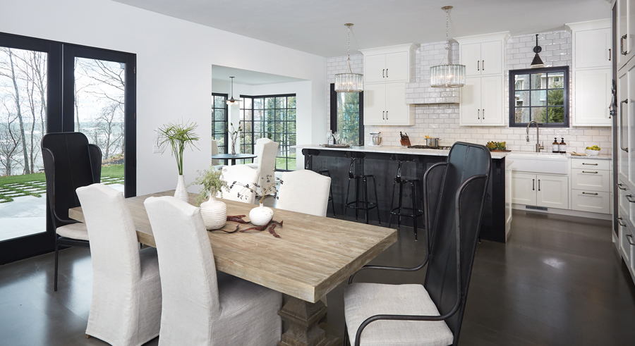
“In the kitchen for instance, there is an industrial fixture on an arm over the sink, while the ones over the island are tubes of glass with a chandelier look while also industrial at the same time,” said Cannarsa. “The one over the breakfast nook is simple and has a more retro industrial look.”
The bridging of seemingly dichotomous styles has come together in an elegant design: stark walls breathe with warmth; the textured cinderblock fireplace is grounded by a deep, warm, gray-hued contemporary board and batten treatment on the family room wall behind it; Carrerra marble covers the kitchen and master bathroom counters, which are both offset by black furnishings; brick-shaped, hand-glazed tile kitchen backsplash to complement the Van Enk Woodcrafters LLC custom-made cabinetry; and the dark wallpaper in the nursery comes to life with pops of color.
“This house was more of a study in contrast than in color,” said Cannarsa. “It has traditional, industrial, and those glam elements that can’t be denied, but there aren’t very many of them. It was an exercise in restraint and simplicity.”
Through an artful execution of building and design, the residence dissolves the boundaries of contradiction to blend a number of elements—which extended to include not only the clients who brought strong design ideas and solid feedback, but also the professional team behind the project as well.
“The interior design, interior architecture, and exterior architecture relate; it is clearly the same house. Every now and then you will see a house where the exterior is one style, the interior is a different style, and they don’t really mesh together,” said Sears.
“I think with this project, [the homeowners’] design sense and skills, our sense of design and skills, Cannarsa’s sense of design and skills, and Zahn’s sense of design and skills worked together really well. The detailing on the exterior speaks the same language as the detailing on the interior,” added Sears.
Photography By Ashley Avila Photography

