To the Scots, whisky, “uisge beatha” or “usquebaugh,” means “water of life.” Derived from Scottish Gaelic, the word—and spirit—has since traveled the world, taking on new flavor profiles, processes, names, and styles, pairing heritage, history, and cultures. In the United States, where whiskey has become the distinctly American product known as Bourbon and thrives as a tradition of sour-mash, whiskey making, the subterranean rivers, natural springs, and aquifers of Kentucky Limestone Water play a storied role in the regional terroir of Kentucky Bourbon. It has been credited as contributor and integral ingredient—if only in the sense that it requires a great deal of it—in a rigorous process that features new, charred oak containers or barrels, a mash bill of at least 51 percent corn, and fermentation and distillation constraints that ensure the preservation of flavors, character, and genuine color that has become distinctive to Kentucky Bourbon. And at New Riff Distilling, located in Newport, Kentucky just across the river from Cincinnati, Ohio, its source of water has served as inspiration behind the name of its bar, The Aquifer.
Considered the northernmost stop of the Kentucky Bourbon Trail Craft Tour®, New Riff Distilling’s distinctive industrial riverfront facility was first constructed in 2014, roughly four years before a single barrel of their signature spirit debuted. Since then, the distillery has experienced exponential growth and growing popularity, leading to additional campus locations for aging, bottling, and storage, and a roughly $3 million renovation project that saw the overhaul of its first-floor space, update of its outdoor patio, and transformation of a former event space into a new tasting room and bar.
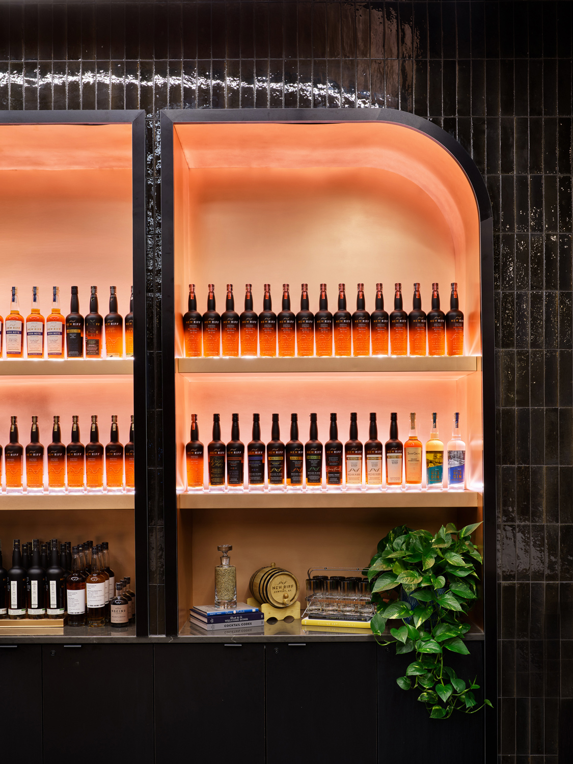
The renovation, which relocated The Aquifer Tasting Room to the third floor, reimagined the space in alignment with their high-touch, experiential customer branded experience. The idea was to capture an elevated experience that reflected the character of both the company and the spirits in its portfolio. It embodies the warmth and comfort often associated with the experience of sipping bourbon, and features a thoughtful curation of soft textures, acoustics, rich color, and materiality that references both the company’s branding and the distillation process. Its facility, which embraces an industrial vibe that aligns with its “new riff on an old tradition” inspiration, features an intimate, but fresh take on the cocktail-and-flight experience of its award-winning spirits.
“I think design is exceedingly important. If it is really successful, then you don’t necessarily know it is designed and typically you are thoroughly enjoying it and the company you are with. You are creating an experience and a feeling that you leave with, and you always have that connection back to that space, to that particular moment,” said Amanda Searfoss, LEED AP, senior design manager at Luminaut in Cincinnati.
“It was really important for New Riff Distilling to have a really well-designed space, because it had really great bones, but they had filled it over time as they had grown with [their immediate] needs. They had hit the function in some ways, but their brand really wasn’t coming through in the space itself. They were bringing things in and making it work, and so I think they really wanted to hone in on that experience so when people came, they were focused on the bourbon itself. It was important to them for people to come in and enjoy the experience and enjoy the bourbon,” Searfoss added.
Luminaut is an award-winning architecture, planning, and design studio based in Cincinnati, Ohio, and Indianapolis, Indiana. Its diverse team of specialists embrace a culture where ideas are born, people can shine, and spaces are transformed as places that illuminate and inspire. The studio has worked in fields like hospitality, higher education, libraries, senior living, public works, and workplace, bringing its multidisciplinary expertise to each project. Searfoss noted the team works across a pretty full gamut of project typologies, which informs their cross-pollination approach, particularly now that the lines between different sectors have become more blurred. And when it came to The Aquifer Tasting Room at New Riff Distilling, Searfoss said the team called Luminaut looking for an interior design partner.
“Bourbon has taken off like nobody’s business in Kentucky and we are right across the river on the other side in Cincinnati, Ohio. When they started New Riff, they couldn’t necessarily sell their product because it had to be in barrels for so many years. So, they built a building—the first floor was retail and a little bar and the third floor became an event space—and 13 years later, it was booming. The event space had taken off, but they wanted people to come and really sip, savor the bourbon,” Searfoss said.
“We all knew it as a brand and thoroughly enjoyed drinking it, and they called us. They were looking for an interior designer to come in and redo the retail space on the first floor and then turn their event space into the bar, working with the architect they had worked with on the original building,” Searfoss added.
Luminaut, which provided interior design services and served as project lead, partnered with Platte Architecture + Design, architect of record, in transforming the overall design and experience of New Riff Distilling as it entered its next chapter. The collaborative team also comprised Goodfire Design, which provided environmental graphics, signage and wayfinding, and exhibit design; Schumacher Dugan Construction, LLC as general contractor; and KLH Engineers, which provided lighting design. Searfoss noted after interviewing for the project and presenting some ideas, they met with the architect of record and quickly realized that it was the start of a really great partnership with a client who was really excited about doing something new and refreshing.
“We were just excited. I get excited for any new project that has a cool opportunity and it was funny, the first meeting we went to with the [architect of record] we were walking through and you never know if you are going to hit it off, are you stepping on toes, how is it going to go? And she was just awesome. She’s like, ‘no, it’s time. It’s been here for 13 years, let’s do something different, let’s lean into making it the best that it could be,’” Searfoss said. “The stars aligned in getting it kicked off on the right foot.”


Located at 24 Distillery Way in Newport, New Riff Distilling is just off Fairfield Ave. in view of the yellow, twin steel bowstring arches of the Daniel Carter Beard Bridge that span the Ohio River on Interstate 471. The building itself, which was also first designed in part by Cincinnati Urban Design & Architecture Studio LLC, featured a 60-foot-tall copper column still and copper pot still encased in a glass tower, and an authentic materiality that anchored it in industrial style. Unpainted concrete block walls and exposed steel met metal garage doors, exterior metal panels, and rustic stone. Searfoss said it was an intentional deviation from some of the very traditional, old distilleries known to Kentucky that embraced its origin story as “a new riff” on tradition, where master distiller evokes guitarist and its branding evokes the visual language of an audio sine wave and a sweeping curve for flowing water.
“New Riff was very much a new bourbon when it was built 13 years ago, so the building itself had more of an industrial vibe to it than driving through the Kentucky countryside, so we leaned into that whole idea. We thought that it was really important. We wanted the first floor to really embrace you when you came in,” Searfoss said.
“You had to go through the first floor and to get to the third floor, you could either take the elevator or meander up the staircase, and a lot of times people will go through the distillery tour and then end up on the third floor, so it was really important to incorporate that staircase,” Searfoss added.
New Riff Distilling, which is an independently, family-owned distillery, was founded by Ken Lewis and is led by a team of “corporate refugees.” The site, which Lewis had owned since 1992, sits above the Ohio River Alluvial Aquifer and it heavily informed the design and build of the distillery since it first opened in 2014. The aquifer, which is an underground layer of water-bearing material or body of sediment that holds groundwater, became an integral part of its sour-mash, whisky-making process, leveraged for its bottling in bond without chill filtration.
Over the years, it has crafted a range of whiskeys—Kentucky Straight Bourbon Whiskey, Kentucky Straight Rye Whiskey, Single Barrel Bourbon Whiskey, Single Barrel Rye Whiskey—as well as a Kentucky Wild Gin. Its signature Kentucky Straight Bourbon Whiskey’s core expression is considered genuinely high-rye, full-bodied, savory, and spicy featuring a mash bill of non-GMO grains at 65 percent corn, 30 percent rye, and 5 percent malted barley. It is aged in 53-gallon toasted and charred new oak barrels for four years and bottled in bond without chill filtration for a long, rye-led finish with brambly red-black fruits amid white pepper and clove. And its bottles feature a distinctive visual—a graphic the Luminaut team wanted to bring to the spatial experience.
“The bourbon bottle itself is a gradient, so it is clear on the bottom and then as you move up the bottle it goes to black. We did a full custom wallcovering on the stairwell, so it starts out as this bourbon color in the retail space. When you walk in, you see that touch of the bourbon at the stair and then as you walk up it, it goes completely black at the very top,” Searfoss said. “When you get to the third floor, you also have a forced perspective through this dark corridor that opens up into the bar itself.”


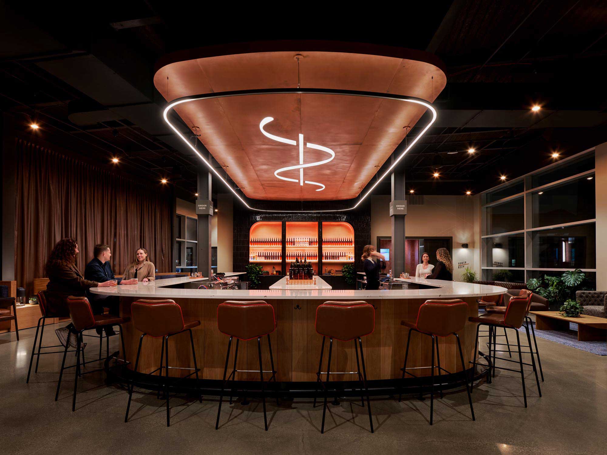
The corridor, complete with custom lighting and a splash of copper hue, visually contracts before expanding into the 30-seat bar and tasting room. There is a 32-foot-long bar that wraps between two structural columns, integrating another visual gradient inspired by the bottle branding—this time horizontally as it fades from white oak to black—and a custom logo light fixture suspended above. There are seating vignettes, offering a series of casual and intimate choices for patrons, cloistered amid rich textures and hues in an open concept that intentionally integrates acoustical solutions to mitigate noise. There are also copper panels that line the ceiling, offering a distinctive warm glow for passersby at night, and metallic copper threads in the drapes.
“There are a couple relatively obvious materials for bourbon, white oak and copper, and we wanted to take those materials and work with them in a new light and use them in a different way that hadn’t been done before,” Searfoss said.
“It was really important to the client to use real copper and that was also just a really fun challenge of getting copper on the ceiling and figuring out what that substrate was. It was a real labor of love and definitely a full-team effort to make that work. Today, as you drive by the space, you can see that ceiling glowing at night from a distance because of the windows on both sides of the building. In general, we wanted to take that industrial space and create a really soft, warm glow as if you had just taken a sip of bourbon, emulating that feeling when you walk into the bar,” Searfoss added.
She also noted the client really wanted the space to be comfortable for all guests, whether they showed up in flip-flops and shorts, or arrived for a more formal event, which was a challenge in itself to make sure the intimate experience worked for a couple on a date or for small groups. To address it, the team used acoustics, lighting, a fireplace, and the bar’s central position to help break up the space into its vignettes, banquettes, and additional lounge seating.
“Acoustics was a big concern of ours. It was an industrial space, so it was high ceilings and concrete floors and we didn’t want to lose that [character], but we also knew that if you went in there and had a conversation, it got really loud, let alone if people are drinking and hanging out. We used SonaSpray, SonaKrete, on the ceiling, which helped with the actual acoustics. Visually, you can’t tell it is actually there, it is painted the same color as all the beams, but it really helps acoustically,” Searfoss said. “We also used a copper fabric for all the windows on one side, so as light streams through the copper sheer, it is reflected and creates this really beautiful visual.”
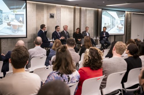
The copper sheer also acts as both visual thread and an additional acoustical solution, supporting the client’s desire to have guests sample its crafted bourbons and whiskeys over conversation amid a pleasant buzz of activity in the background. The renovation project also saw the design of the Tower Room, which is tucked off of The Aquifer Tasting Room and reservable as a flexible meeting space that can accommodate between 20-to-40 people. On the first floor, the retail space was updated and the entry space now features a generous reception desk and custom shelving that lines the perimeter inspired by wood-framed rick structures and rickhouses.
For Searfoss, who is passionate about designing cool spaces, utilizing space and funds to create environments that excite and exceed expectations, going back to see the space and how people use it has been really rewarding.
“I think it has been pretty successful,” Searfoss said. “[New Riff] went through and really stepped up all of their glassware, and it is absolutely beautiful; it is just about the finishing touches of the whole space. They obviously care about that experience and so, to see them continue that thoughtfulness and level of detail has been really cool.”

Text: R.J. Weick
Photography: Ryan Kurtz Photography
First published in Great Lakes By Design: Bold Graphics, Volume 8, Issue 4


