With its intentional use of natural, light materials, this farmhouse shines with timeless style.
Text: R. Collins
Familiar with modern design trends and imbuing a sense of timeless style, Visbeen Architects and full-service interior design firm Vision Interiors by Visbeen reworked midcentury design concepts blended with the equally classic residential style often known for its use of raw wood and natural materials: the country farmhouse. Perched amid Kalamazoo, Michigan’s shaded woodlands, the Holloway House—finished in 2017—overlooks a ribbon-like stream and bountiful natural beauty that is complemented by the home’s refined, rustic-inspired appearance.
“While the exterior is more of that contemporary farmhouse, [the homeowners] had a midcentury theme that they wanted, which is where some of the horizontal cedar siding comes in. It’s a really fun plan because it’s not just a farmhouse,” said Julie Holmes, principal designer at Vision Interiors by Visbeen.
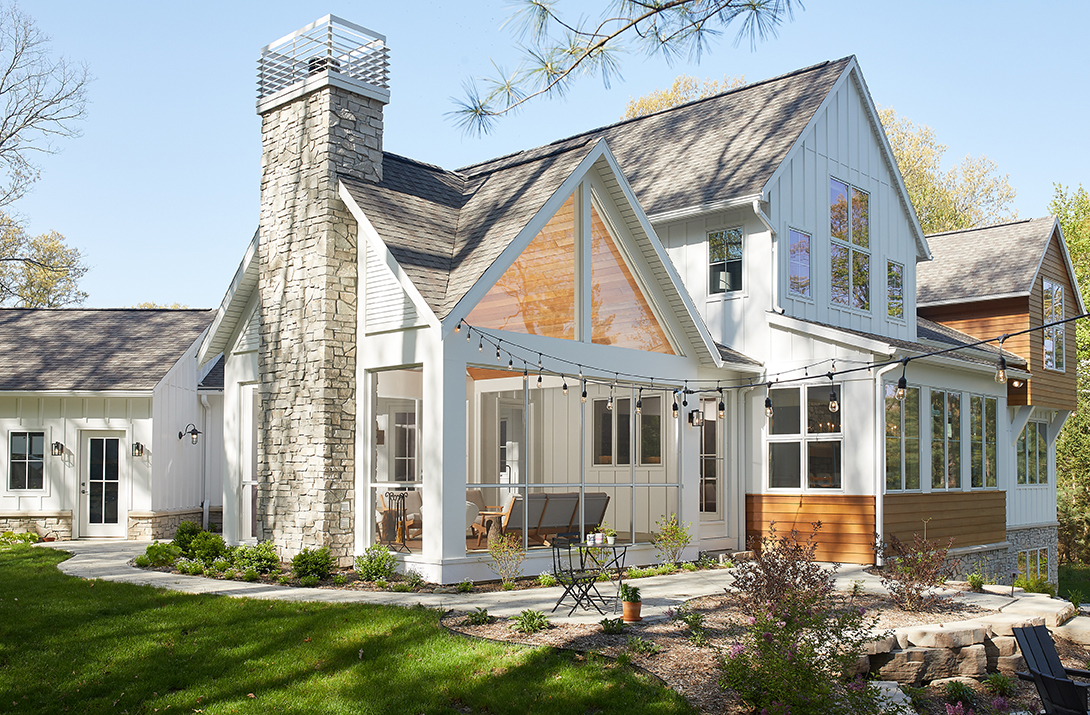
Horizontal, warm-toned cedar siding panels were intermixed with pure, white, vertical panels to produce distinctive geometric features. It is then anchored by a generous series of obtuse rectangle windows, designed to marry the midcentury theme with modern vision by Rhyse Altman, NCARB, MiCNU, project designer at Visbeen Architects.
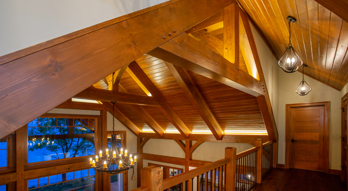
A glance at the back of the home’s exterior reveals a three-season room with one window mimicking the peak of the steeped roof and revealing the room’s warm cedar-paneled ceiling inside, giving the space a lit-from-within, candle-like appearance. Visibility and an overall lightness are also interior trends, and most rooms are merely separated by a sheaf of glass.
Minimal ornamentation contributes to the home’s weightless essence, but the ornamentation that is contributed—light and cabinet fixtures in mixed metals and stand-out wall furnishings—pack the home with the modern flavor that represents Holmes’ style. Holmes said consistency is key when considering mixing metals within any interior design; and in this case, an eclectic series of brass, bronze, nickel, and polished chrome add interest and react differently in the natural light of the home’s many windows.
“Lighting to me is like jewelry—it’s the most beautiful way to accent the home,” Holmes said. “We were very specific about selecting fixtures that would be interesting but not overwhelming.”
Other consistencies in the interior comprise the wide-plank oak floors repeated throughout and accented each time by smooth walnut cabinetry in a muted gloss finish; while plumbing and faucet fixtures are done in polished chrome. The designers collected warm, neutral tones, tossing out shades of gray to keep with the mid-century theme. Both Holmes and Altman cite consistency—without monotony—and a meticulous attention to detail as integral to their design philosophy.
“I think I’m very disciplined in my approach to styles,” Altman said. “I get excited about communicating, articulating, and illustrating the way certain trims come together so that everything is very much thought out and everything adheres to that stylistic choice. You won’t see deviations in style; it’s certainly, holistically, one style.”
While a toneless style is seldom wanted, Holmes said there can be something innately satisfying about walking through every room in a home and knowing each is cohesive with the last. Between the homeowner’s request for a midcentury aesthetic and her modern taste, Holmes said they struck a fluid balance that was only ameliorated by a seamless collaboration with colleague and friend, Altman, and construction and development firm AVB Inc.
“I’m a bit of a classicist—I like classic styles and things that are timeless,” Holmes said. “The midcentury modern request [came] from our client—I loved the idea—but I wanted to make sure that we were putting enough tradition in it so the house would stand the test of time. [We wanted to make sure] that we were making smart choices that would be appropriate 20 years from now.”
For Altman, timeless features from the family-friendly floorplan include the three seasons room in the back of the home and the kitchenette overlooking the in-home sport court. A semi-private landing produced by elevation and nook-like walls separates the master suite from the rest of the bedrooms to give the family an added level of privacy. Holmes cites the rich blue-and-gold-patterned Kelly Wearstler wall-covering in the bathroom and veneers on the cabinetry as some of her favorite features.
Initial drawings for the Holloway Home and other residential, commercial, and retail spaces are crafted by Wayne Visbeen, AIA, IIDA, founder of Visbeen Architects. Both Holmes and Altman credit Visbeen as setting them up for success during the smooth production of the Holloway Home. Visbeen Architects and Vision Interiors by Visbeen are award-winning Grand Rapids, Michigan-based firms valuing livable, completely unique designs and creative solutions.
Photography by Ashley Avila Photography


