In renovating this waterfront aerie, nestled between waves and ravines on a mid-bluff along the shoreline of Lake Michigan, the collaborative team of Rock Kauffman Design, New Urban Home Builders LLC, and Bradley J. Boyer Design sculpted a 1950s-built cottage into an open and bright modern beach home in respectful interpretation.
There is a tendency toward clean, minimal lines throughout the open floor plan where layered textures add subtle warmth and artistic touches such as the metal-and-wood staircase enveloping the main floor wine cellar serve as focal point and accent. Its materiality has interplay with its environment, where blues and greens of the waterscape add depth to its interior, while the natural wood on the exterior speaks to the surrounding land on the property.
Intentional in both design and construction, this approximately 3,800-square-foot home re-establishes its footing in a critical dune and is infused with authentic character as the homeowners strove to retain elements of the original cottage in modern update.
“We found this cottage on this beautiful beach property. It was built in 1954 and it sits up on a mid-bluff with about 50 steps down to the beach. We knew there was going to need to be some renovation, but we just fell in love with the property first,” said Kelly Adams, homeowner. “It’s a real peaceful place. In the front of the house is a ravine, so you are protected from the road with this beautiful forest of trees.”
With a permanent residence at the time in the nearby area, the homeowners—an ever-growing family of seven children and several grandchildren—initially sought out the property as the couple looked to downsize on Lake Michigan. Upon decision to move into the cottage full-time, Adams noted she and her husband talked about renovating it into a year-round home with additional space to accommodate their growing family.
The designer
It was at that time, Adams—a long-time admirer of the Michigan-based designer’s work—looked to Rock Kauffman, president and interior designer at Rock Kauffman Design to help bring an updated, expanded version of the cottage to life.
“I was talking to a friend of mine and I was telling her the story and she said, ‘oh, well [Kauffman] is a childhood friend of mine.’ She texted him and next thing I know he was going to come out and look at the cottage,” Adams said. “He came out and I think he fell in love with the property as much as I had and he said he’d love to help us renovate it.”
Rock Kauffman Design is an award-winning interior design firm based in Grand Rapids, Michigan. Since its establishment in 1993, Kauffman has built a portfolio of architecturally driven projects blending timeless style and contemporary elements into comfortable and sophisticated cohesion. Kauffman, who initially began his career in the furniture industry before transitioning to the design field, believes in a hands-on, step-by-step approach and weaves projects to life through an intuitive, layered design process.
“I feel fortunate that everything I do is pretty much with great clients who trust my involvement and how I do things. They know me well enough to know I’m not one of those designers who has to plan everything out,” Kauffman said. “I like to move through it, let it evolve, and not force it. I like to be creative and let-me-think-about-that-I’ll-let-you-know-tomorrow kind of thing. It is how I layer my work.”
In this case, Kauffman noted not only were the clients—who spent much of their time in Florida during the winter—great to work with, but also he came to appreciate the drive from studio to property since it allowed inspiration to come naturally.
“It gave me time to get excited when I got out there, inspired, and then I could leave and think about it and come back with other ideas,” Kauffman said. “I met out there once a week to go through the project and it was just really special to me.”
Before any renovation work took place, the homeowners then looked to bring on Scott Branc, owner and principal at New Urban Home Builders in Grand Rapids Michigan as part of the design-and-build team. Adams noted the collaboration between Branc and Kauffman was a great combination and as clients, she and her husband had total trust and confidence in them.
“Craig [Adams] and I are of the philosophy that when you have talented people, you let them go,” Kelly Adams said.
“I love how they work—and they work together really well. [Branc] is a meticulous builder, he is a real attention-to-detail guy so you just feel like you have a really well-built, quality home and then [Kauffman] puts the artistic touches on top of it,” Adams added.
The builder
For Branc of New Urban Home Builders, who has a mechanical engineering background in both automotive and medical devices before stepping into the construction industry and ultimately launching New Urban Home Builders in 2003, the collaboration and pooling of ideas to make something work is one of the things he loves about building.
“It is not just black-and-white,” Branc said. “It is this molding of ideas until you have something that works for everybody.”
New Urban Home Builders is a boutique, custom home builder specializing in new construction and renovation in West Michigan and the lakeshore areas. Driven by a passion for architecture and design, and led by Branc; Rick Smith, project manager; and Alison Black, office manager; New Urban Home Builders has intentionally remained a small, agile team as it works with clients and industry-related partners in the greater Grand Rapids area, such as architects, interior designers, and craftspeople.
Branc has applied his talent for creative problem-solving, meticulous processes, and an eye for detail, honed from years spent in the manufacturing sector, to the construction industry. Upon returning to Michigan in 2013 after spending five years practicing in Austin, Texas, has been equally passionate about explaining to clients why building the right team and having a focus on good design and quality is important.
“It has been one of my big goals to really help educate more people on why it is important to hire an architect, and interior designer, and a builder who know what they are doing,” Branc said. “It is more expensive initially, but in the end, you have a better value, because you end up with a house that is going to hold up better and on resale is going to attract more people to it.”
Education has not only been an outward focus, but an internal one as well, as Branc immersed himself in building science and high-performance construction to develop best practices, which has led the firm to working with architects and residential designers in the region.
“It allowed us to really explore what houses can be,” Branc said. “As an engineer, I like the challenge of more unique homes, more challenging homes, and it allows us to really dial them in and work with our clients on it. That is why our tagline is ‘The Passion Builds,’ because that is what drives this business. It is a big range of styles, but the focus is getting the details right, and getting the form and function to work properly.”
In a field that has become highly competitive, especially in high-end residential work, Branc noted one of New Urban Home Builder’s differentiators is in its size and its one-on-one interaction with clients from a standpoint of conceptual design, on-site design challenges, scheduling, change orders, and overall project management. While Smith oversees project management on-site, Branc works directly with clients to help them navigate the initial process, pricing strategies, construction, and concierge services such as maintenance upon completion of the project.
“We liked how he thought,” Adams said. “We went through a couple of houses [Branc and Kauffman] had done together and just love them. I could have moved into any of them. We hired both of them and started the work.”
Concept to construction
With a vision in mind to expand the square footage of the existing 1950s-era cottage, the design-and-build team was tasked with addressing an initial challenge of minimal footings beneath part of the structure on sand in a designated Critical Dune Area by the Department of Environment, Great Lakes, and Energy—formerly Michigan Department of Environmental Quality, or DEQ.
“We did some investigating and found out the whole house was built on 12-inch footings and it had withstood all these years basically built on sand,” Adams said. “You can’t add on a home that is built like that; you have to put a foundation underneath in order to build up.”
The added issue of its tight lot lines—common when working on waterfront properties—and limited access for equipment and building on-site also contributed in the decision to tear down most of the existing structure and rebuild. Branc noted since the final design stayed within the same footprint, working with the DEQ was a relatively straight-forward process.
Working through conditions inherent to the lakeshore—weather, winds, and steep grades—the new structure was built on the old footprint and integrated with the original garage. The new construction comprised a crawlspace, small basement—sealed to mitigate moisture—a kitchen and dining area open to the entertainment space on the main floor, outdoor patio, central wine cellar and staircase, soundproofed bedrooms, and a renovated game room above the garage.
For Branc, it is distinctive in its design and its interaction with the property and nature as the footprint achieves a harmony with the land in terms of its scale.
“The home has a mid-century vibe to it, but the way [Kauffman] worked on the exterior and the interior, it has a beach-twist to it, which is really cool. It is a very unique, one-off, version of it—almost like an urban, mid-century, beach house. It’s very bright and very beachy inside, and the outside has natural wood on it and blends into the trees a bit,” Branc said. “It sits on the property in a really nice way. It is not overpowering for the land.”
Woven beachfront
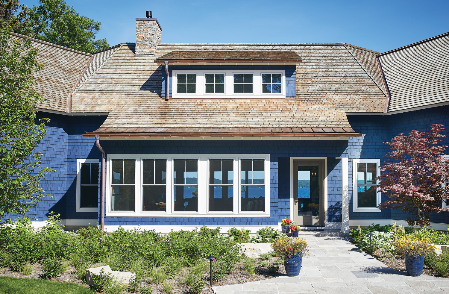
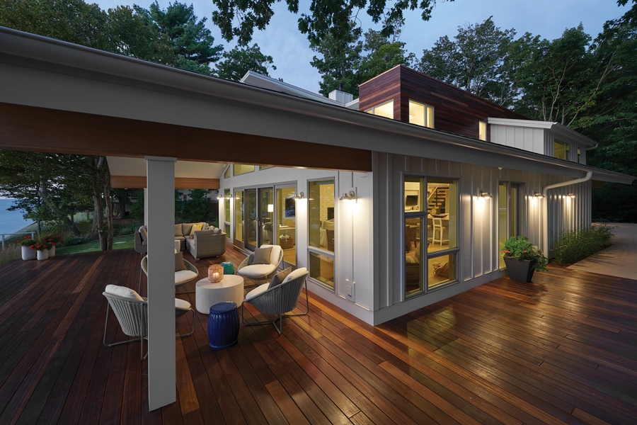
Its form is layered in easy complexity: traditional gable rooflines are set against more concise gestures of a flat, two-story volume and mono-pitched roof opening out toward the lake. White, vertical board-and-batten adds both contrast and balance to the horizontal, natural wood on the upper section and its surrounding property.
The main floor interior, awash in brightness through an intentional mixture of materials and textures to soften and warm, is a neutral palette of alabaster and wood. Wicker elements, found in the oversized, 33-inch-wide, outdoor light fixtures hanging in the kitchen, chairs at the dining table, and Raffia wallcovering in the master bedroom weave notes of the beachfront; while the bold, dark metal of the staircase support and railings pair well with the wine bottles visible adjacent through large glass panes of the cellar.
Its vaulted ceiling stretch toward the lake, beams extending far beyond the interior to the patio, dissolving traditional boundaries as doors and windows allow natural light and air to filter throughout the space.
For Kauffman, the interior design was based on form following function—such as designing the kitchen with two islands where one was built into the support pillar to offer additional seating and the other integrated dual workstations with two sinks, refrigeration, and ovens—and embracing its beachfront location.
“I didn’t want it to be modern coastal; I wanted it to be modern beach. I wanted it to feel like you could come in with towels and bathing suits, which is why all the fabrics are performance fabrics,” Kauffman said.
“I love how open it is, I love the finishes, and I love the fact that as light and bright as it is, it’s still practical. The fabrics are easy to keep clean so you can go lighter and brighter. On the cloudiest day, this place is bright,” Kauffman added.
Kauffman also noted the extensive use of warm white works well in the home due to the amount of complementing textures used, such as the hexagonal tilework on the fireplace. Reminiscent of sand dollars or flowers in shape, each piece of tile was cut to match and blend into a sculptural and tactile display.
“There is a lot of texture: it is what makes white work for me, because it is so cozy and comfy,” Kauffman said. “It is an alabaster, warm white, and we did that because when you are actually in the space, you see the green and blue of the water and that is truly the relationship of color.”
In the kitchen, a clear, reflective glass tile backsplash blends range hood with the wood and white palette and is left open to both main gathering space—and view of the lake beyond—and staircase where glimpses of wine bottles are visible through railing and treads.
“We love wine. We had a small room under our stairs at our other house and we think it added a pretty artistic display so we decided to put it in this home as well, but display it even more with the glass windows,” Adams said. “When we saw the stair design we thought, wouldn’t it be cool to display the wine there?”
The design-and-build team worked with Benchmark Wood Studio of Holland, Michigan to complete the wine cellar—composed of walnut and custom display units for the space—ensuring it was insulated for appropriate conditions and designed to offer a seamless interplay among viewer, glass, and cantilevered staircase. Branc noted the team also collaborated with Dan Carlson of Carlson Design LLC of Ada, Michigan on the staircase.
“Every staircase we do tends to be a one-off—something that is always unique—so we worked very closely with them. We worked with [Kauffman] on the overall design of what he wanted to see and then we worked with Carlson to figure out the logistics: how does this work and how do we build the structure of the staircase so it actually functions, is installed properly, and meets code?” Branc said.
“I go out and work through these design things with the trades, architects, interior designers, and homeowners to make sure we get it all right. I don’t sleep a night until we get these things right for our clients,” Branc added.
Adams also noted another aspect about the staircase was making sure it matched the upstairs where the space above the garage had been renovated into a game room, bunkroom, and bathroom as well as the whole new addition on the upper level.
“They did a beautiful job with that,” Adams said. “It was a matter of how do we get from the lower level to the upper level? It was an engineering puzzle and I just love how that staircase came out in the end.”
An aerie to call home
Yet, despite the extensive renovation, the lakefront home still echoes of its past as the homeowners strove to keep the integrity of the old cottage with a modern perspective.
“We put the cottage back up on its original footprint and just went to work trying to re-create the old, but with a modern update to it. I actually have a seven- or eight-page brochure of the cottage when it was for sale when we bought it, so I have the before and after pictures. There are a lot of similarities; you definitely know you are in the same place, but it’s a new version of itself,” Adams said.
“It feels like it flows from the inside to the outside. It is a real peaceful décor—very light and airy—and it just feels like the inside was brought out and the outside in. It’s not a big home by any means, but it lives open and large and it’s really quite beautiful,” Adams added.
Kauffman also noted the team was able to put so much into the cottage while still paying homage to the existing floor plan so it now feels totally custom as it transitioned into a dream space.
“One of the things, too, that stands out is because they travel a lot, they’d come into town and we’d have a meeting and they were just so excited. They would come back and more would be done and they were so happy,” Kauffman said. “There were very few hiccups with this project. It felt right. It was fun to do. It exceeded their expectations, which I hate that term, but it was the truth.”
For Branc, having clients walk in their house and fall in love is when he knows the team—architect or residential designer, interior designer, builder, and landscaper—have done a great job in pulling all of the pieces together, from initial vision and architectural concept to construction, interior finishes, and landscaped exterior, into a home with depth.
“Design has to evoke emotion. You have to feel something,” Branc said. “If you don’t feel anything, then you didn’t do a good job with it.”
Photography: Geoff Shirley | GSstudios

 Purchase the full issue or start your subsciption

