The resilient prominence of midcentury styles in the residential design sphere can be credited, in-part, to the appreciatively clean forms of their vernacular and an inclination for melding indoor and outdoor space—something even more appreciated these days as open-air spaces skyrocket in general value. In the ample fresh airs on Lake Winnebago’s eastern frontage in Wisconsin, principles of midcentury design bloom in a recently renovated residence that seemingly unfolds about the lake’s edge. The four-bedroom, four-and-a-half-bathroom, 6,300-square-foot structure merges newly built aspects and several existing additions that it has collected since its original build in 1949.
The project is the work of dSPACE Studio Ltd., an architecture, interiors, and landscape design firm based in Chicago’s Lakeview neighborhood. Its horizontally balanced exterior forms meet the sturdy presence of darkened steel and warm wood that are opened by generous glass expanses that soak in the best of seasonal views and natural light. Flat rooflines charge the space with an earthy, intimate energy and accentuate the window coverage across the long line of the home—a move that offers nearly every room a special view.
The dSPACE Studio portfolio is rich in modernist innovations in the architecture and design of custom residential spaces. A desire to enhance quality of life through architectural principle rests at the core of the studio’s design approach, and it is seen in spaces that group clean lines into complex shapes that afford an equally complex planning approach, in order to execute minute details perfectly. A tour of homes designed by dSPACE reveals highly functional, modern architecture punctured by idiosyncrasies like atriums or courtyards that mix interior and exterior, and extend the livable essence of a property. Creative positionings on a site reveal the ingenuity of the firm and its favor for a design challenge; something that is clear from the exterior of the Lake Winnebago residence.
“It very much is a response to its context and the site itself. It wasn’t just a blank slate or piece of property; they liked the existing house,” said Tom Hagerty, AIA, principal architect at dSPACE Studio. “We wanted to be respectful to the house that was there and at the same time make it more modern, while opening to views of the lake and adding a guest house. All those restraints are really great opportunities to [improve] how we design things. It was a fun process, because it was somewhat unusual for this project.”
Creating cohesion between spaces was essential due to new additions the team wanted to give the original single-story home; particularly, a second level to complete the master suite on one end, a two-story guest house on the other that the homeowners moved into during the rest of the renovation, and a complete reconfiguration of the interior floorplan in between.
The master suite and guest house, the two bookends of the home, create a moment of formal symmetry in the architecture amongst an otherwise asymmetrical arrangement on the site, according to Kevin Toukoumidis, AIA, LEED, founder and principal architect at dSPACE Studio. The main and guest house are introduced by a semicircular drive court that creates an understated entrance.
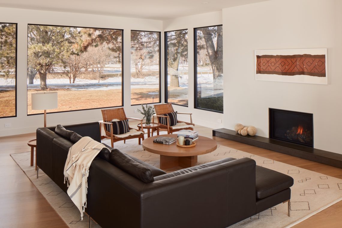
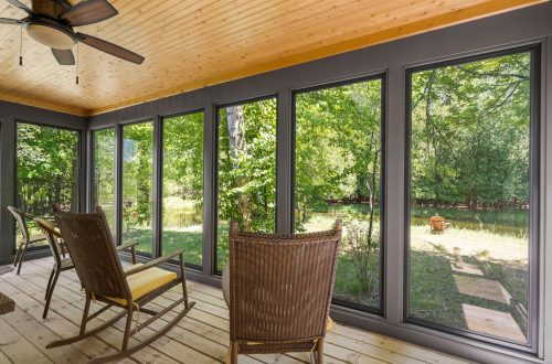
It is here that travel continues through the steel, cedar, and stucco-clad loggia that frames views of the lake. The idea of framing sight lines and views formed the architects’ approach to the interior as well. Rooms reveal the lakefront through the generous window expanses held in atypically minimal framing—a testament to the attention to detail given by dSPACE designers.
“Window frames are typically four- or five-times thicker on average, but we were able to detail the window to have a minimalist frame that disappears from view so you just have what appears to be a piece of art looking out at nature,” Toukoumidis said. “It feels like you could walk into that scene—really blurring the lines of interior and exterior.”
Like the prevalence of framed views throughout the home, material cohesion played double roles in unifying new spaces like the master suite and guest house, and preserving the elegant midcentury character. Stone, cedar, stucco, white oak flooring, and Tuscan plaster form areas underneath preserved rooflines in most areas. The effort to unify spaces visually through a material dialogue was deepened ultimately by the homeowners, who Toukoumidis noted are experienced renovators with a keen eye for design.
“We were in sync as a partner in the process and shared a similar design aesthetic,” Toukoumidis said. “The house is completely tailored to how the client lives. Our goal was to bring their vision to life and bring new and innovative ideas to the house and tie it together with a really strong cohesive architectural language.”
Besides white oak floors, fresh white walls, and the fine-detailed window work, custom-designed millwork and cabinetry compose a bright interior canvas for a casual and Scandinavian-oriented interior design program. Similar finishes like limestone, steel, and concrete on surfaces, as well as detailing in baseboards and stairways, and accessories down to lighting and plumbing fixtures appear consistently from main house to guest house, alongside warm wood furnishings and several fireplaces that, like the walls themselves, feature minimal detailing that simply accentuate their integration with their Venetian plaster surrounds.
An 11-foot-long, concrete-clad kitchen island serves as the family’s main eating area, which also features white oak cabinetry and pivot doors that lead into a hidden pantry. The interiors were formed around this area and the nearby living room or “lake room,” as two of the most heavily used and enjoyed spaces for the family; thus, dSPACE paid close attention to the spatial function of each.
“The lake room and kitchen became the heart of the home and we wanted things to flow around it,” Hagerty said. “It’s always an important piece of information whenever we start a project: ‘where will you be spending most of your time and how can we make that space as accommodating, beautiful, and functional as possible?’”
Another important aspect for the family was flexible space that would allow the renovated home to adapt with them through the years. Flex rooms could serve as playrooms-turned-study-space, or even a library or media lounge; and Toukoumidis noted the sudden relevance of such spaces in today’s pandemic environment, even though the team had envisioned them years ago.
“It’s really an amazing house and for families living through pandemic, I think this kind of house is so essential for having flexible space between indoors and outdoors and having clean living with a focus on sustainability,” Toukoumidis said. “All of these elements really fit in with part of the design that we worked on for a couple of years and they’re thankful to be living in it now.”
Bedrooms located on the south side of the home for privacy culminate in the spacious master bedroom formed by the existing south wing footprint and second floor addition on top; the area features a gym and large master closet and bathroom suite finished in waterproof cement and plaster, fog limestone countertops, tile slabs, and an undermounted bathtub—all arranged to showcase dramatic views out onto the lake.
The relaxed movement of the home lengthwise along the lake readily invites the serene outdoors inward, where abundant natural light bounces between highly curated material relationships that speak their own comfortable, modern design language. The deep overhangs of the rooflines reflect the beloved midcentury character that attracted the homeowners in the first place, all while protecting interiors from the hottest summer days and allowing them to gaze comfortably outward onto bright fall and winter grounds, from the comfort of a room warmed by soft wood and active fireplaces. It is these spaces that exemplify the artful approach to designing environments for life; where material, structure, and inspired ideas combine to create a memorable home.
“They were great clients who inspired us and I think we inspired them; we really created a one-of-a-kind house together that we’re all proud of and they’re now living their best life in it with their growing family and they couldn’t be happier with the outcome of the project,” Toukoumidis said.
“That’s the reward for us: seeing our clients create memories of their homes. The power of the architecture here really resonates as having a strong impact on the quality of living in [it], which is really rewarding for us, to see them start the next chapter of their lives in this house that’s been around since 1949,” Toukoumidis added.
Full text originally published in Great Lakes By Design: Raising the Bar
Text: R. Collins
Photography: David Bader Photography | dSPACE Studio Ltd.


