Though the portfolio of the design-driven, multidisciplinary firm of M1DTW Architects in Detroit, Michigan reflects a distinct breadth of commissioned works from the design of objects, artifacts, identities, and spaces, there is a commonality to the principles and tenets woven throughout each project. There is a sensitivity to resource and material, an intentionality to use and reuse, and a drive to push the boundaries of its creative practice to ultimately deliver spaces, objects, and materials that are nuanced, minimalist, and dynamic.
“We think a lot about the role that design can play in people’s lives. I think while it is front-of-mind for me and it is the thing we work on and pay attention to in our practice, for us, a project is most successful when it becomes a background to the work [clients] are doing,” said Christian Unverzagt, Associate AIA, founder, principal, and design director of M1DTW.
“A successful design starts to become invisible. We work hard to make it look like we didn’t work hard and maybe some of that has to deal with also trying to be sensitive to our resources, the mix of the ready-made and the custom-made. Not everything can be exclusively custom-made and not everything should be out of a catalog or off the shelf. Trying to figure out where best to focus our efforts and our clients’ resources, is usually the recipe we found that makes things work,” Unverzagt added.
M1DTW is a multidisciplinary architecture studio dedicated to creating thoughtful environments for clients and people to do their best work. Informed by a holistic, cross-disciplinary approach, M1DTW has applied its design philosophy to projects of all scales, working with clients like entrepreneurs and established cultural and educational institutions alike. Since 2000, the architectural practice and creative studio has completed more than 100 commissioned works, including retail and commercial spaces, adaptive reuse and interior renovation, furniture design and casework, graphic messaging and branding, and book design.
“Design is important, because we shape our world intentionally and we also shape our world unintentionally. As with the climate crisis, it’s a byproduct of what we’ve done and so it’s thinking of design much more holistically and the responsibilities that we all have,” Unverzagt said. “We’ve got some big problems to work on now, and I think it is an asset to design and the role of designers that we have much more agency. People are so much more aware of the role of design from consumer electronics and interface design to furniture and all the places we live in certainly. We spent so much time in our homes the last few years, we all became aware of just how connected things are.”
Founded and led by Unverzagt, M1DTW is a six-person firm located in a renovated, former meatpacking building in the Eastern Market district, set just east of the Dequindre Cut Greenway. In addition to his professional work at M1DTW, Unverzagt is also an experienced educator and lecturer as an associate professor of practice in architecture at the University of Michigan’s Taubman College of Architecture and Urban Planning in Ann Arbor, Michigan, where he focuses on visual communication, interdisciplinary design methodologies, and teaches graduate design studio.
Throughout its more than two-decade tenure, the M1DTW team has produced a number of award-winning projects recognized by AIA Michigan, AIA Detroit, and AIGA, among other organizations. Some of its award-winning works comprise the Water Street Drive-thru, Oakridge Dental Center, 6 Salon, House of Pure Vin, and Diller+Scofidio Eames Book. And in 2020, 2021, and 2022, M1DTW was recognized by AIA Chapters for its work on the FLOYD HQ and Bloomscape HQ projects—the latter of which is otherwise known as 5000 Grand River Offices.
Home to Lafayette American, a creative marketing agency of thinkers and makers who believe in the power of creativity, deployed beautifully, can drive ambitious brands forward, the 5000 Grand River Offices project is one as nuanced and layered as the agency’s Scorpion Rose brand. The building itself, which is a triangular-like form on the corners of 16th Street, W. Warren Ave., and Grand River Ave., has a history that traces back to the 1950s as a roughly 13,500-square-foot grocery store. Though its use would undergo a number of iterations, meandering forward in time, its utilitarian character remained despite its derelict condition when Prince Concepts, a real estate development and property management company, finally acquired the building.
It was a characteristic that would lend itself well as a canvas in converting the structure into a build-to-suit office space featuring three, internal courtyard interventions and an exterior, 17,000-square-foot landscaped garden space between it and the adjacent Grand Trunk Railway. Initially envisioned as a mixed-use program with eight apartments and three commercial studios or workspaces, leveraging the interior courtyards to delineate use of space, Prince Concepts, known for its work in Core City and innovative approach to transforming formerly industrial property, looked to long-time partners at UNDECORATED and D.I.R.T. studio to realize the vision. It wouldn’t take long, though, before the project caught the eye of M1DTW’s client and the concept evolved into a single, commercial-use program.
Unverzagt noted the building itself became a community project in many ways, and when Philip Kafka, president of Prince Concepts, had bought the building, he wanted to convert the large, triangular floor plate complete with a mezzanine located at the rear, into a mixed-use residential and office building.
“[Kafka] worked with a designer, Ish [Rafiuddin] from UNDECORATED and they had the idea of putting these three courtyards in as a way to bring light into the expansive, dark floor plate, some of which would be surrounded by three separate office suites. Then, where the mezzanine is, the two-story area would be divided into eight apartments. That was the plan and they had gutted everything, put a new roof on, and inserted the courtyards. It was still a pretty rough shell, but the future was outlined and kind of defined,” Unverzagt said.
“Then, our client, Justin Mast, the founder of a company called Bloomscape contacted us and was looking for office space. They were growing out of their WeWork offices and we met with [Kafka] and looked at a few other properties and none of them were quite large enough. [Kafka] says, ‘let’s go across the street,’ and so he came in and said, ‘my plan was to make it mixed-use, but if you want it all, we will change it.’ At that point, Ish mostly stepped aside, and we took over and transformed it as an office interior,” Unverzagt added.
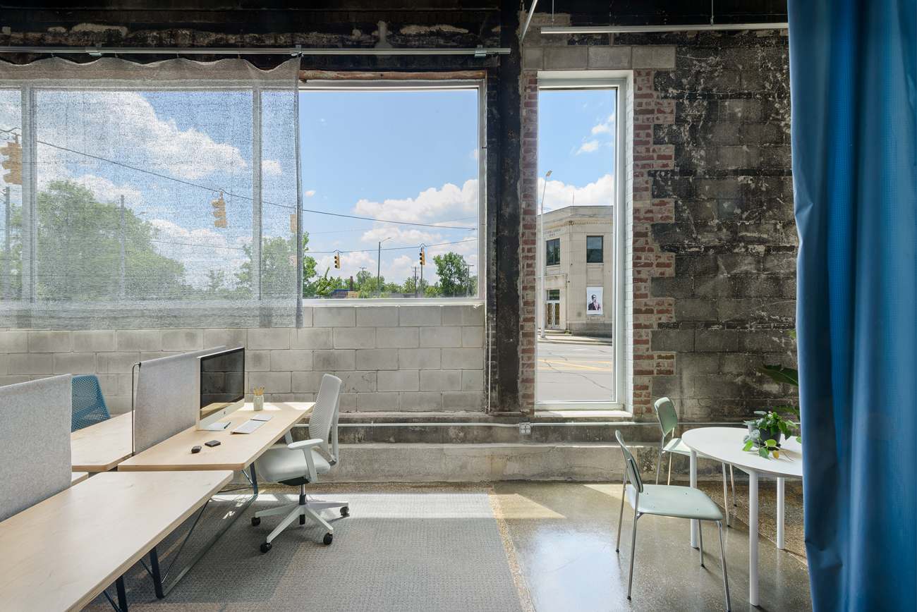
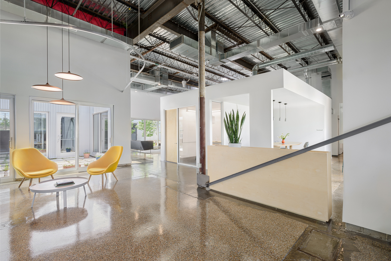
Considered a project of many pivots, M1DTW was then tasked with modifying the interior into a dynamic workspace with a range of flexible spaces and environments fostering productivity, well-being, and engagement, while also providing a strong connection through and to the outdoors. There is a playful use of space through volumes, voids, and intentional sightlines; a local narrative to the furniture sourced from regional companies throughout the pandemic; and thoughtful use of materials like an aluminum mesh fabric shades the space from southern exposure and locally sewn felt dividers that lend privacy and sound absorption to work areas.
Unverzagt said while they can’t take credit for the courtyards—designed by Rafiuddin and Julie Bargmann of D.I.R.T. studio—M1DTW tried to extend that big idea into lots of smaller details, such as two large volumes in the high-bay space to create a series of private areas and in the millwork pieces to help define space.
“The big moves were made with the courtyards and I mean, they are super dramatic and they stand up and I think for us it was just the question of how to build off of the strength of those and not necessarily compete with them. So, we added a volume that has a meeting room and a couple of focus rooms, and we wanted it to almost be an inverse of the courtyard and it, instead of a void, produces a solid two steps removed from the outdoors,” Unverzagt said.
“You can move around it, it helps organize a few different spaces, so the office wasn’t just an endless cube farm or open area. It also just provides a variety of experiences where you are pressed along the courtyard or just able to step away to the focus rooms that are along that corridor,” Unverzagt added.
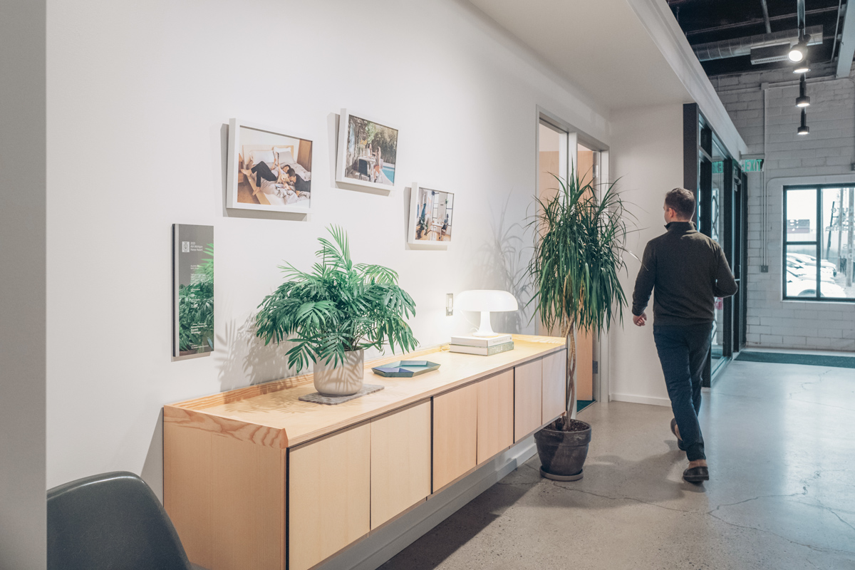
Interior work comprised integrating a range of experiences like individual work desks, small-to-large meeting rooms, phone and focus rooms; juxtaposing the horizontality of the floor plate with vertical elements for planters and greenery; adding pops of subtle color variations in the furniture to complement the changing colors of season visible in the courtyards; and incorporating natural materials like wood to warm the minimalist-inspired interior. Much of the furniture for the project was sourced from manufacturers based in the Great Lakes region, such as Herman Miller and Blu Dot, and components like the powder-coated steel plant holders, custom millwork in the reception desk, kitchen banquettes, and whiteboards were fabricated locally.
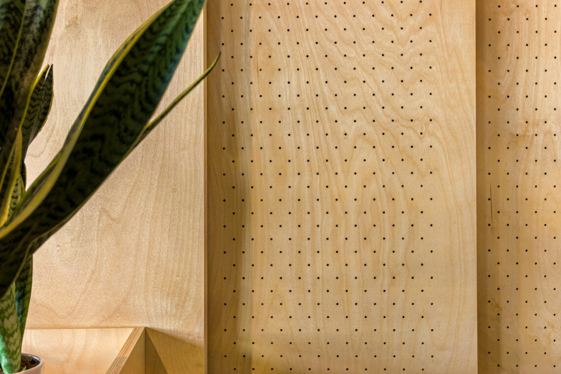
In the phone rooms, carpet that is more like a material than traditional carpeting lines the floor and perforated plywood backed with insulation for acoustics were installed, and conference room furniture is intentional in its indoor-outdoor flexibility, allowing users to work both inside and out in courtyards. The mezzanine, while lending additional work and event space above, also provides compression of volume and scale to the overall footprint, and through a creative engineering solution, the team integrated a cross-bracing to maintain visual connection that serendipitously ties back to the custom-made desks and offers structural expression.
While M1DTW completed the interior build-out, in simultaneous concert, the nearby creative agency, Lafayette American, was also on the pursuit for new space to accommodate its growing team and expansion. Located directly across the street in another Prince Concepts’ space, Lafayette American was familiar and fond of the real estate development’s design approach, and as Bloomscape’s move-in ultimately never came to pass, the creative agency looked to take over the building as an essentially turn-key solution.
“It is a wonderful space. The big thing was moving from our studio to this space, getting everything over here, trying to figure out what is functional, how do we make it work for our people who have been home for a long time, and how do we get them comfortable coming back to the office and having a space that is much larger than we used to have?” said Ra’Ven Miller, office manager at Lafayette American. “It’s like, this is your home. You can come here, you can come in and out, you can go outside, it is just wonderful. I love being here. It is a beautiful space to be in.”
Ben Bator, chief innovation officer at Lafayette American, noted even though certain spaces will be tailored to suit their team’s specific needs—like the soft lounge area on the first floor that will become a permanent boardroom and changing conference room names originally inspired by greenhouses to Great Lakes monikers—the space was perfect because the flexibility was already there.
“You don’t get a lot of flexibility in a lot of finished spaces. It feels very much like we are moving into a dream house and making changes based on whether we like the cabinets,” Bator said.
“For us, light is huge. It was probably the main factor that brought us here, from the cut-outs to just the abundance of windows and just being able to be in a space that was really inspiring. We have clients all over the country, so talking to them is probably easier at home most of the time, and so we wanted a space that was really inspiring that you could bring people here and be able to work together and really effortlessly collaborate and spend more time as a team,” Bator added.
Bator also noted the team has an affinity for the neighborhood of Core City, particularly for its investment in greenspaces, and it was important to ultimately find a space that reflected the care and level of detail that they put into their work each day.
“I mean, design is what we do. It drives us forward and to us, it is an ambitious way to express ourselves and express really powerful feelings whether it is our relationship to our environment or to each other, and it’s so important because it really informs the way we relate to each other,” Bator said. “It inspires us to keep moving every day.”
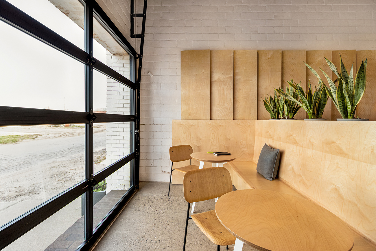
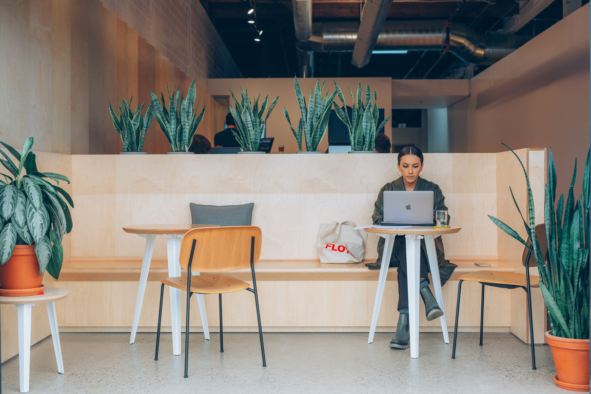
In another iterative evolution, Floyd Inc., a sustainably oriented furniture startup, looked to M1DTW once more as they sought to refine their own workspaces in the same former, meatpacking warehouse the architectural practice is housed. M1DTW and Floyd initially partnered back in 2018 with the construction of its multi-use headquarters, showroom, retail, and research and development facilities. Since then, the company built on its vision of creating innovative design as a counter-product to disposable furniture, using materials like Pennsylvania- and Michigan-sourced walnut, and New Zealand wool, in its pursuit to become the first carbon-neutral furniture brand.
The interior renovation sought to expand its research and design facilities and reimagine its headquarters as an inviting workspace emphasizing smaller meeting rooms, semi-private desks, warmer lighting, and relaxing interiors.
“One of the things I love about this renovation is that it, in many ways, was an anti-renovation. We didn’t demolish anything, we didn’t destroy anything: we filled in, in new and improved ways,” Unverzagt said. “I think as the company matured, the spaces have matured and responded to not only the new ways in which we all work, but also just the way that their kind of work, and working style, has evolved.”
Initially founded in 2013 by Co-Founders Kyle Hoff and Alex O’Dell with a Kickstarter campaign behind their inaugural product, The Floyd Leg, Floyd has since developed a robust line of furniture and accessories like The Bed, seating, tables, storage, and hardware options. Its new workspace, known as the Floyd Library, is intentional in keeping to the company’s ethos, integrating custom designed-components made from returned or less-than-perfect furniture components, including tabletops and bed panels, as well as leveraging a custom-designed display piece using the shelving system designed by Floyd as a core component of the new wall space. The project reimagined the internal layout of the roughly 3,275-square-foot space from a lively open-plan space for a start-up to one designed for simultaneous hybrid interactions.
“For me, personally, design has been the medium through which I’ve interfaced with the world, learned about the world, and designed my world. I’m forever a student of design. Like anything, the more you learn, the more you realize what you don’t know,” Unverzagt said. “I think in practicing in Detroit, I have been fortunate enough to be involved in projects like these. It’s like that line from Ted Lasso: ‘Football is life’—Design is life.”
First published in Great Lakes By Design: The Acoustics, 2022
Text: R.J. Weick
Photography: Diana Paulson, Jeffrey Kilmer, Nev Muftari

