The multi-modal transit system is intended to support the urban core—not unlike a buttress to a wall—and the dynamic economic, cultural, and social activities that take place there. It interacts with the complex spatial structure of larger cities, ultimately becoming inherently entwined with the day-to-day operations and life in the diverse tapestry of its built landscape.
In Chicago, the transit-intensive city has become not only multi-modal in nature, but also inter-modal as many of its residents, visitors, and working populations leverage more than one mode of transportation for a single journey—bicycle, pedestrian, bus, train, automotive, and waterway, to name a few. Perhaps its most iconic infrastructure though is known simply today as the L, which was initially introduced to the city in 1892 and arguably launched the city into the next millennia and toward a future where the elevated railway’s moniker would become as recognizable as its skyscraper silhouette on the coast of Lake Michigan.
As time and wear inevitably takes its deteriorating and natural toll on transit infrastructure of the past—potentially impacting the millions of riders estimated to walk across elevated platforms on an annual basis—a collaborative team of architects, engineers, and city department representatives took on the challenge of creating a new gateway at the heart of the system when designing the new CTA Washington/Wabash Elevated Train Station.
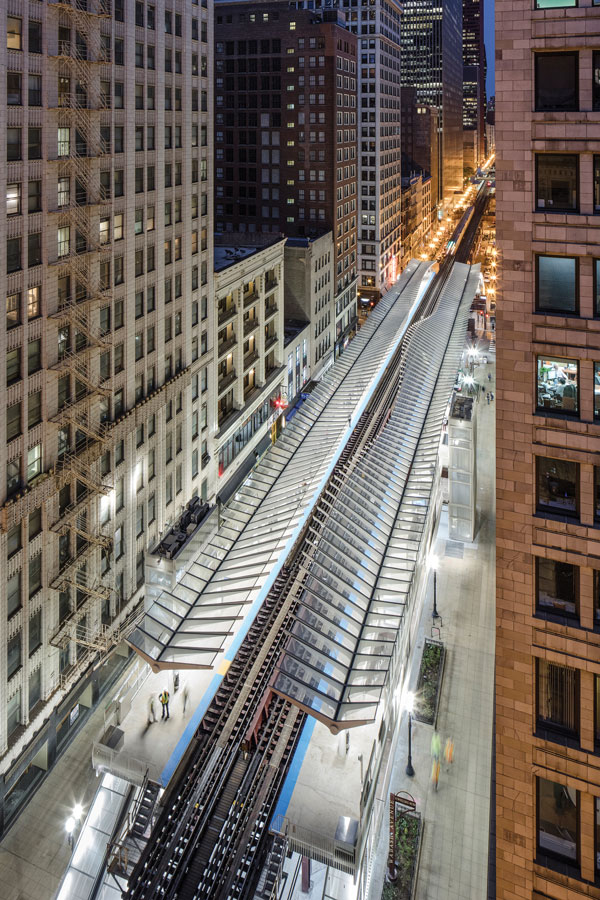 “We saw this as an opportunity to look forward and not back to a pseudo-historical nostalgia, but rather to something that anticipates the 21st and 22nd centuries, the future of transportation. There was always an ambition to be modern and contemporary and speak to the spirit of now as opposed to the past,” said Thomas Hoepf, FAIA, vice president and principal design architect at EXP in Chicago, Illinois.
“At the same time, the rigor of it, the structural ambition, the muscularity of it, the detailing of it, the craft of it, the construction of it: those are all things that are rooted in Chicago’s architectural traditions and history, but the form is different,” Hoepf added.
EXP provides engineering, architecture, design, and consulting solutions for both the built and natural environment. The company, which has roots tracing back to the early 1900s, has developed a diverse portfolio of projects throughout the years spanning markets such as retail and hospitality, and energy and water, to aviation, education, and federal. EXP has also worked on a number of rail and transit projects related to full rail systems, tracks, rail bridges, tunneling, and transit stations in locations such as Quebec, Canada and Chicago, Illinois.
In terms of the Washington/Wabash Station, EXP was tasked by the Chicago Department of Transportation, or CDOT, and its operational partner Chicago Transit Authority, or CTA, to consolidate two existing and adjacent stations on Wabash Avenue at Randolph Street and Madison Street into a single stop that would better meet the needs of transit riders.
“It was a little bit of a different process versus the traditional neighborhood train station. When you are working above an active street, when you are working next door to all of the jewelers and businesses on the street, it affects all of them as well. It is important to take all of it into consideration when you are designing a project like this and the process to get to a solution is really an integrated one,” Hoepf said.
“The idea is that this station was replacing two really old, dilapidated stations that weren’t accessible and weren’t up to current standards for CDOT and CTA. By consolidating to one station, it would streamline the number of stops in the Loop,” Hoepf added.
The new consolidated station would serve not only as a gateway to the historic Jeweler’s Row, Millennium Park, and the lakefront, but also a nearly two-block long hub accessible by the Brown, Green, Orange, Pink, and Purple Express CTA lines—and be the newest station built in nearly 20 years. Prior to Washington/Wabash Station, the last station house design was considerably more traditional and responsive to the historic vernacular, which meant this was one of the first opportunities to present a new concept, according to Hoepf.
“We always saw the CTA as this thread that wove the city of neighborhoods together and that became an idea about weaving and reconnecting. It even started to translate into the idea of the waving form that you see almost like a thread, and seeing it as kind of a playful counterpoint to the grid of the city, the rigidity of the Wabash canyon, and anticipating the soft forms of the lake and the parks beyond,” Hoepf said.
“I think the other thing about the form is we saw it as an opportunity, as a counterpoint, and to be something very lacy and transparent that allowed you to be on the platform and look up at the canyon, the historic terra cotta facades, and it became almost like a lens to see through to those things—there is this contemporary lens that gives you a peek back into history,” Hoepf added.
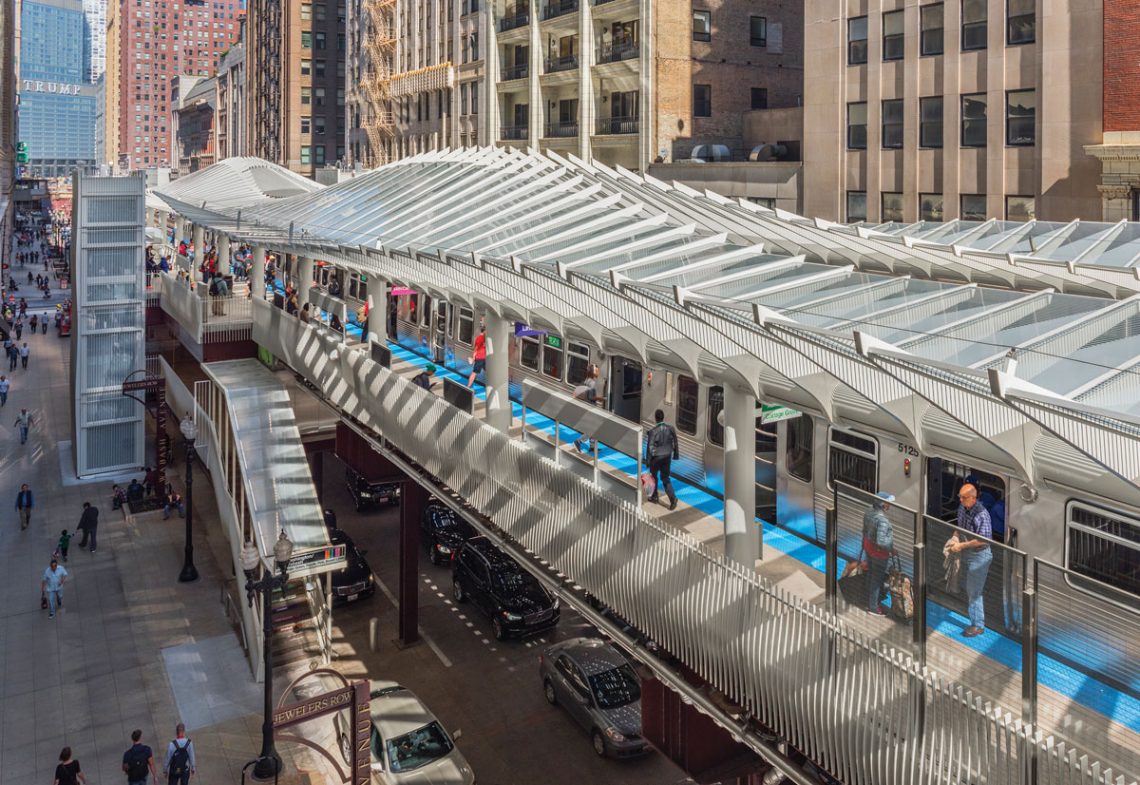
The Washington/Wabash Station, which is valued at nearly $75 million and funded entirely through Congestion Mitigation and Air Quality dollars, posits a new perspective not only on the typology itself, but also for riders and passersby alike as they experience the platform and its surroundings anew. Its sleek, simple, and elegant form stretches along the Wabash corridor, offering distant pedestrians a glimpse of its serpentine form at intersections and the greater built environment beyond. There is a transparency in the three-level station and a connectedness to its greater landscape.
“We also wanted this station to be more than just an experience at the platform. In that way it interacts: it affects the views from the street, the space of the street below, from the buildings above, and then the long view down the street when looking West to East,” Hoepf said.
“It is this ribbon that slips through and you can see beyond it, whereas the original stations were these big boxes almost like little temples or buildings floating above the street and really plugged up those views. It is the idea of cultural infrastructure, that it is essentially a sculpture that animates the street at three different levels, so even if you are not riding, there is an experience there,” Hoepf added.
Despite its lighter appearance, it is a transit platform with rigidity, durability, and accessibility. The station was designed with state-of-the-art amenities and ADA accessibility with new elevators, street-to-mezzanine escalator, train tracker displays, LED lighting, security cameras, and four entrance and exit stairs. Technology is integrated within the structure itself with the capacity to expand or adapt with replacement conduits or new systems; there are no horizontal ledges for avian to perch, which was a major driver in the design so the CTA wouldn’t have to return with pigeon spikes; and the aesthetically lighter and brighter painted platform, canopy, and columns is a standard CTA color.
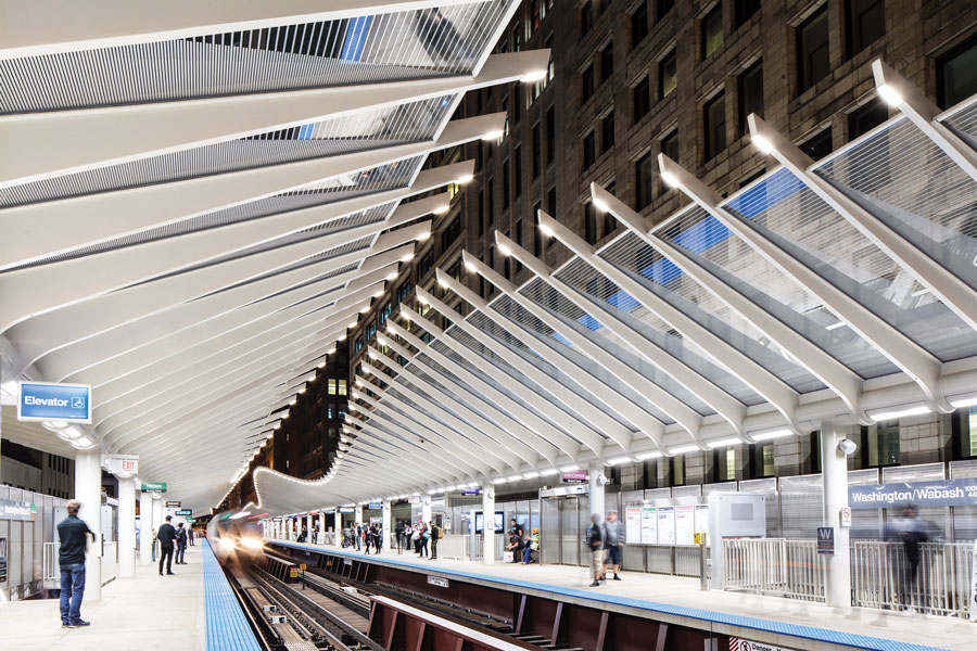
“It can never just be an idea or fluffy; it has to be rigorous, it has to be durable, it has to be maintainable, it has to be practical, and it has to be economical,” Hoepf said. “Once we came to this design solution, as we started to develop it in more detail, we met all the time with the engineers and maintenance from CTA and CDOT…In some ways [their] job is to be doubters and skeptics, it is on us to prove something works.”
While the form itself appears to undulate and curve in wave-like fashion, the faceted skeletal steel and glass canopy sheltering the two, 425-foot-long platforms is composed of straight lines and pieces. The spine, rib edges, and square, flat pieces of glass are straight with slight angled differences and lengths in its installation as the platform moves in cardinal direction. The railings, which were laser-cut 27 different ways to have zero waste, are simple, vertical pickets with 54 different profiles that not only reinforced the design of the canopy, but also used the same material. The flat panes of striped glass feature a dense, triangular pattern through a fritting technique, or baked ceramic paint, and seek to reconnect through transparency while also alluding to the history of the corridor.
“It opens the view back up, lets it be lighter, and more connected with the city, so when you are on the platform you are reconnected to the environment you are in,” Hoepf said. “When sun comes around on the South, you can see how intricate the patterning and the shadows are on the ribs and down on the platform as well. It is a subtle way, without being literal, to tie it to the idea of Jeweler’s Row and diamond facets.”
The galvanized steel framework, while practical, also brings an innovative element to the project as well. Conduit for communications, video, and lighting is run within the structure, as well as gutters to channel water from the natural trough in the spine to bring it through the station rather than shedding it on the tracks and the street below.
“The idea that it is all integrated is relatively new for CTA, because often times the canopy is just the armature for everything to be attached to it. The original stations or even stations designed 20 years ago didn’t integrate all the technology the way this one does,” Hoepf said. “This allows CTA to have flexibility to adapt as technology changes too. Maybe someday it will be wireless and we won’t need any of it.”
Text: R.J. Weick | GLBD Editor
Full text available in Great Lakes By Design: Architectonics, published 2018
Photography: James Steinkamp Photography | Tim Klein Photography

