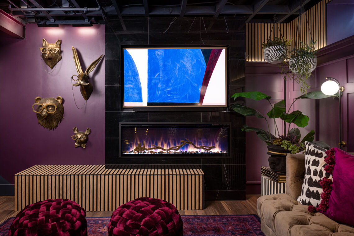
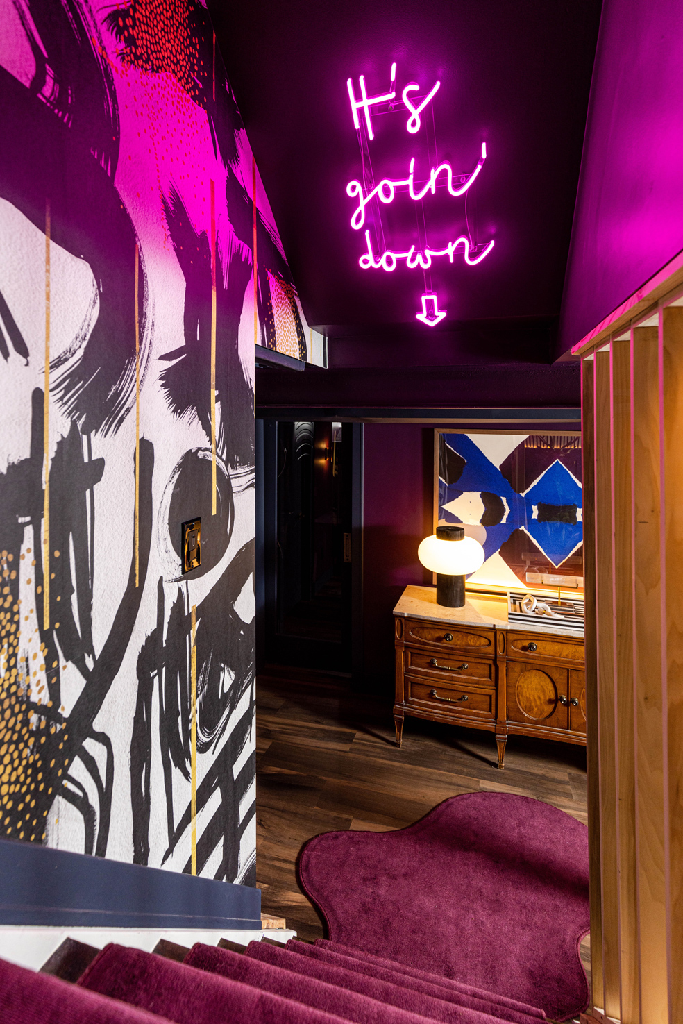
In a 1942-built bungalow in Grosse Pointe Woods, Michigan, the conceptual design and speakeasy vibes of its recently transformed lower-level sounds like music. There is a gradual swell in volume as one descends the stairwell beneath neon lights that speak like lyrics to an expressive landscape, gesturing to rhythm and tone of ambient composition. The bright glow of magenta and cobalt sink into deep hues of navy and aubergine, brass animal heads and evil eye motifs add whimsy and lore, and arched pendants resonate with the rock’n’roll elegance of Regina Andrew Design’s grit and glam décor and lighting brand. And, as a boldly designed solution years in the making for Detroit-based Concetti’s Chief Executive Officer and Principal Designer, Rachel Nelson, and her husband, it is a multi-functional space—a musical chord made manifest—that sets her soul on fire.
“We have always wanted to finish the basement. It has definitely been something that my husband, Joe, and I have been dreaming about for many years. We have a 1,000-square-foot bungalow and space is a commodity, so we were really excited to add a whole other living space, a whole other layer to this house,” Nelson said. “It really just started out of the desire of needing more space, but then it was about what is it going to feel like? We, at Concetti, being conceptual designers and design strategists, are always focused on the goal.”
Concetti is an interior design strategy studio that invites clients on a creative exploration as co-creators of their own spaces. Founded by Nelson, the studio embraces the idea that good design is for everyone and strives to bring functional goals and aesthetic style into boldly designed solutions that are genuine reflections of their clients. Since 2014, Concetti has built a portfolio of commercial and residential work throughout Oakland County and beyond, leveraging a phased design approach to guide clients through a process of discovery, co-creation, personalization, translation, advocation, and celebration. For the team of creative, strategic thinkers at the studio, it is about delivering spaces that look, act, and feel like their clients.
To activate the roughly 700 square feet of unused basement space into a multi-functional oasis designed with entertainment in mind, Nelson said it was important to move through the same process as her clients to ensure the space became an extension of self-expression, or in other words didn’t lose its heart. It was also important it functionally supported their lifestyle on a day-to-day basis.
“I walked through the very same process, our phased approach, that we use with our clients, because it works. Phase one is the most important step and if you skip that step, you lose sight of the heart of the project: authenticity to the person, and from a vibe and design standpoint, the feel. You will also lose sight of your functional goals. I think that is so important when investing so much time and so much money in a project,” Nelson said.
“We want to see forward motion, but forward motion without strategy isn’t good. You need to make sure you spend time aligning with your goals before executing and so if I want to change something in my house, it starts with inner awareness, going internally to understand what do I need out of this space, how do I want it to function, and how do I want it to feel? That should drive your solutions forward,” Nelson added.
That strategy also included understanding the current pain points of the existing floor plan, which had its own inherent set of challenges associated with a lower-level build of the early 20th century. Nelson noted it can often be hard to work on one’s own home because it is so personal and one of the big challenges of the project was that space was limited. Conceptually, the idea was to introduce a designated bar area and lounge space as well as an exercise room and bathroom, while navigating constraints like the existing mechanical systems, duct work, water meter locations, glass block windows, and ceiling heights.
“I mean, basements are tough. When working in lower levels, you have to understand where the existing mechanicals are and can you work within them to reach your goal? Where the support beams are, the HVAC dropping, window locations: it is really a huge puzzle to figure out how to work within the existing architecture and mechanicals to support functional goals,” Nelson said.
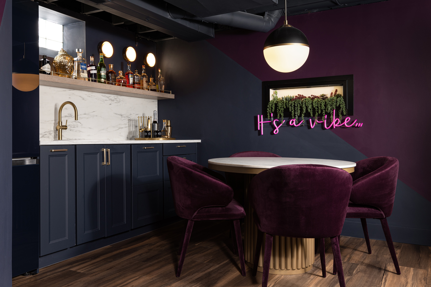
Nelson also noted floor and ceiling height changes have to be taken into consideration since they subconsciously signify a new space, which is why it can be uncomfortable if there is a change in the middle of one idea like a ceiling height fluctuation mid-island in a kitchen space. In this instance, rather than fight an existing run of HVAC, Nelson leveraged it in an intuitive move to designate the bar as separate from the rest of the larger seating area, while using an open concept ceiling to maintain its cohesion with the overall space.
“It actually worked to my advantage, so it feels open to the rest of the space, but still separate,” Nelson said. “So, the [first] goal was function, but then the other goal was vibe. My husband and I are fans of hip hop and there is a song called ‘It’s a Vibe’ [by 2 Chainz] and when we walk down the stairs, I want it to feel like it’s a vibe, so that song was always in the back of our minds, that feeling, that it just needed to feel like a treasure, a speakeasy, something you don’t expect and just takes you into a whole new world.”
With its program defined, the project quickly became a creative exploration in mood and fearless style. To bridge design concepts from both floors, Nelson turned to a black-and-white wallpaper featuring dripping gold paint to serve as a neutral, but powerful graphic of transition. Neon lights inspired by “it’s going down” lyrics sung by Ludacris, that is echoed by Nicki Minaj with the word “basement,” act to pull onlookers both visually and physically down a series of stairs carpeted in deep aubergine into a deeply saturated world, softened by moments of whimsy. The carpet not only acts as an intentional quirky and unique element as it spills out onto the floor in an organic shape, but also a functional one, serving as a landing pad for their 95-pound dog to catch his footing.
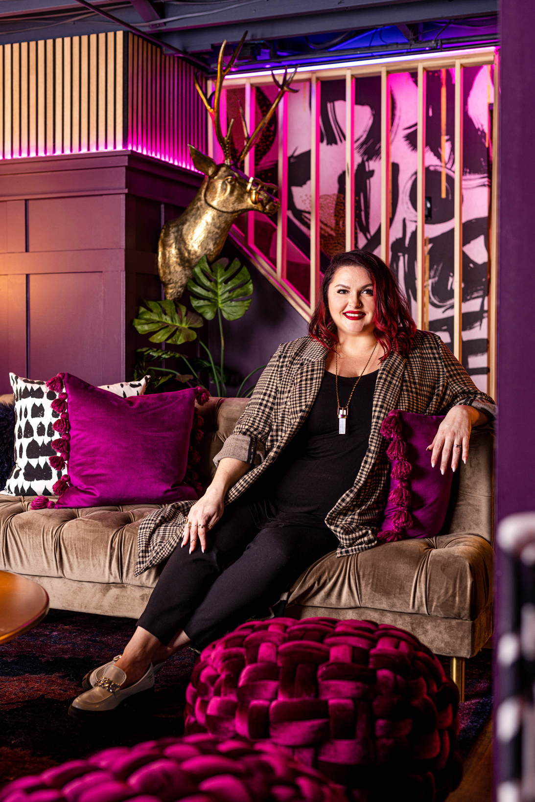
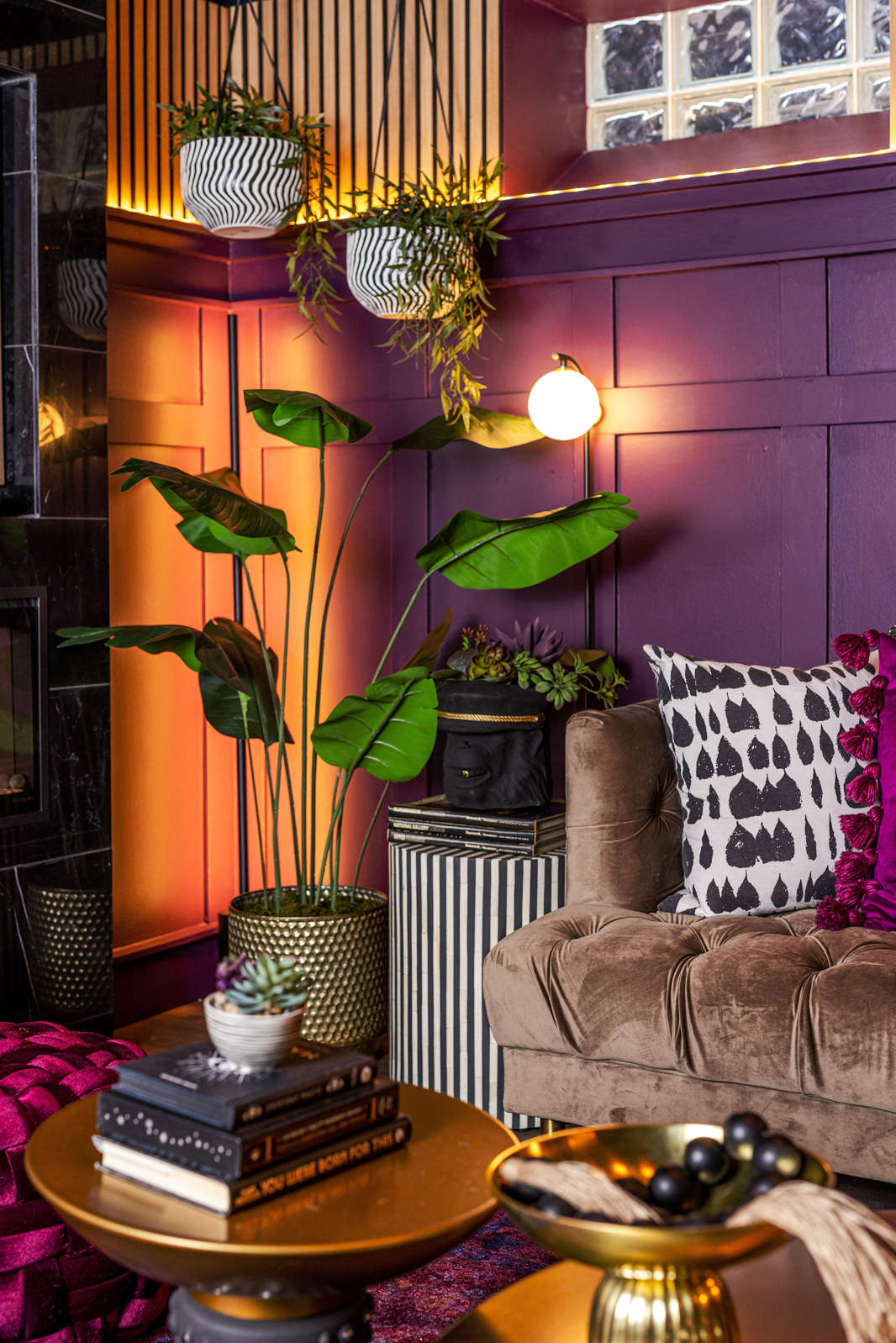
Heavily pigmented colors of gold, navy blue, and aubergine—a hue that evokes the eggplant-purple of nightshades—are tempered by custom millwork in lighter grain and layered with LED and neon lighting, which Nelson said really became an extension of the color scheme itself. The same hues of blue and purple became cobalt and hot pink in the neon spectrum, with the ability to turn them to white for functionality during the day. Light also played a large role in accentuating certain features throughout the lower level, like highlighting the custom slat wall using LED strip lighting on the stair rail ledge, the brass animal heads with their sunglasses and monocles, and in the bathroom, where rich, floral wallpaper and arched mirror are accented by the arced pendant designed by Regina Andrew Design.
“Lighting is just a great way to pull your attention to certain features, to draw the human experience in, or attract people to look in a certain direction,” Nelson said.
“That huge floral wallpaper was super fun and you are already soaked in so much color down in the basement, it was like, how do we do something that is unique, but not going to compete with anything else? I think that wallpaper was just hugely successful and I love how the bathroom turned out with the Regina Andrew pendant. I know it is such a small detail, but every time I see it my heart goes a-flutter. It just looks so good how it came together and that is how design should be, exciting for your senses,” Nelson added.
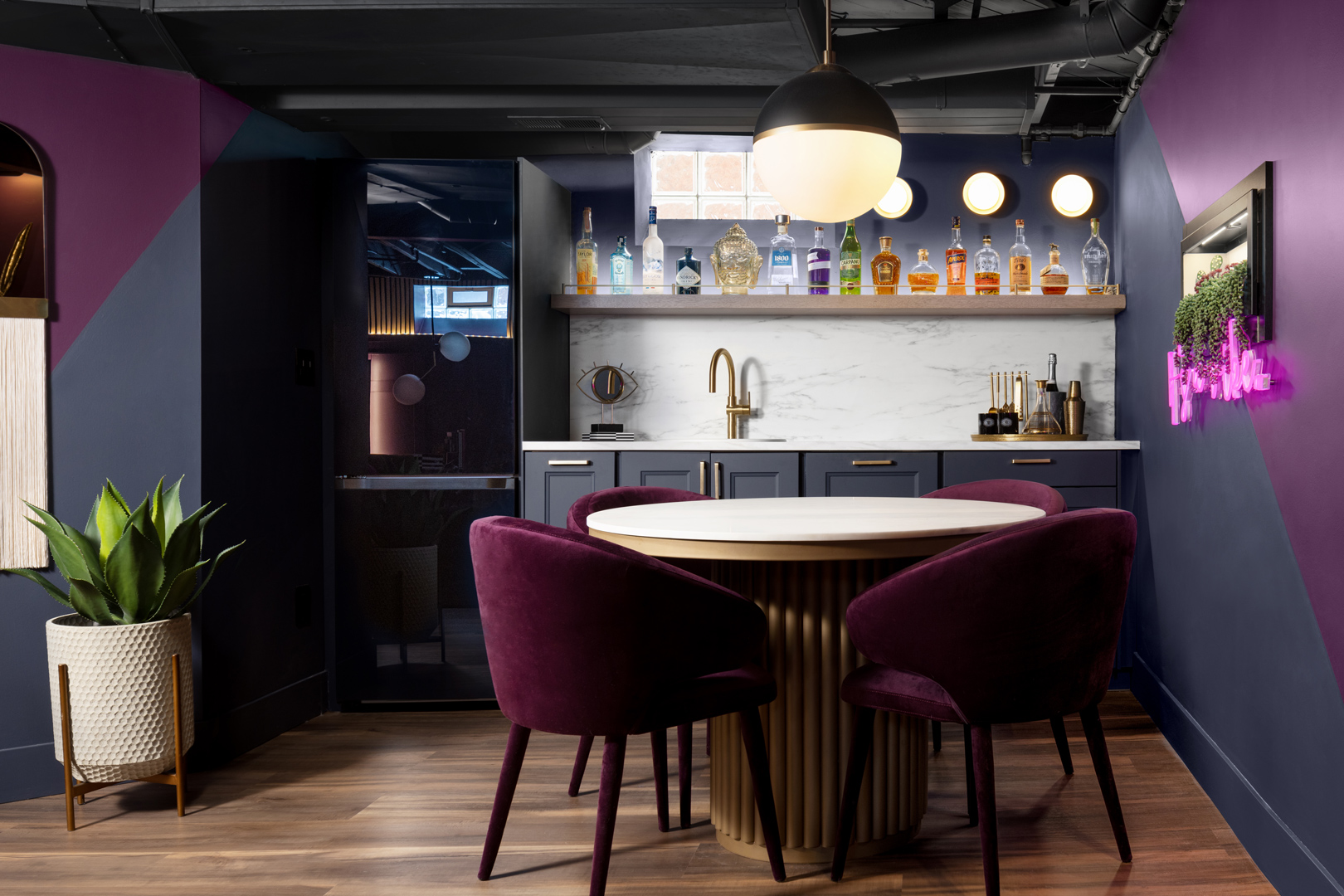
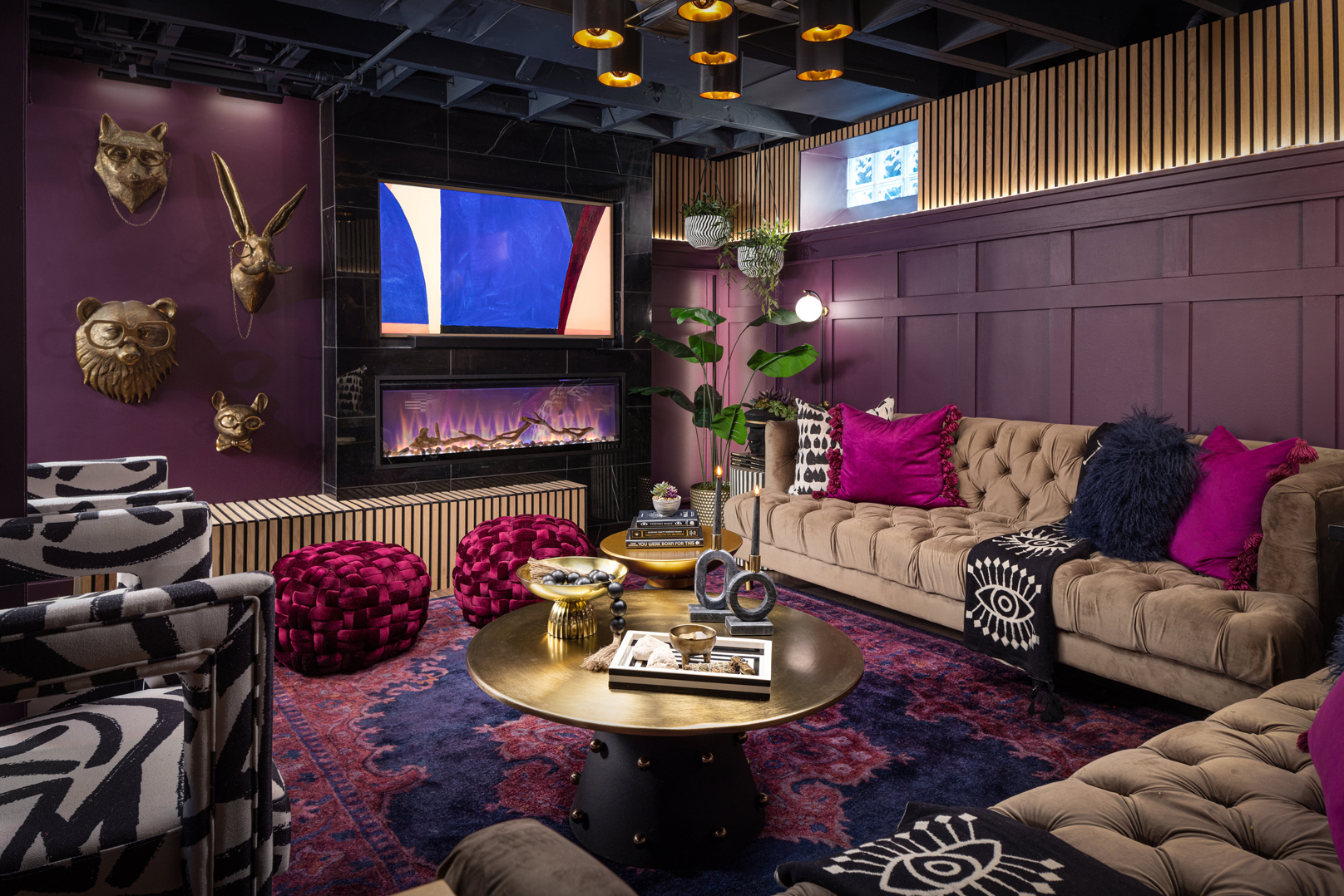
For Nelson, in the transformation of the nondescript 1942 basement into a rich oasis of delight, color, and moody vibes in true alchemical fashion, its success is not just in its fearless style and bold authenticity, but also in its ability to live within the existing architecture and meet their functional, lifestyle needs.
“My brain is all about the strategy, right- and left-brain thinking, so it is successful because it feels good. What does it mean that it feels good? To me, it boils down to: did we accomplish what we needed to from a function standpoint so that it is supporting Joe and I and our dog and the way we want to live day-to-day? Does it support us when we want to invite friends and family in? The answer is yes, so those are those programming notes, if you will, the function, the goal, like why did we set out to do this? It is supporting our human experience,” Nelson said.
“Then, the other big piece to this is it’s a vibe, it feels good, the energy feels good. It feels like being surrounded by some of my favorite things, things that make you feel good like graphic black-and-white patterns, evil eyes, sage, crystals, references to hip hop music that I love, and quirky animal details. They are all the things that set my soul on fire and that is what is important, not worrying about following a trend or is this too weird, who cares, it is your space. Do what feels good to you,” Nelson added.
First published in Great Lakes By Design: Bold Graphics, 2023
Text: R.J. Weick
Photography: Brett Mountain Photography LLC

