 Photography has been an important tool in documenting the human experience since early experiments in the heliograph and daguerreotype captivated both innovator and subject alike nearly two centuries ago. It is an art and practice in visual communication; both objective and subjective in recording the cultural, social, and natural world.
It is a craft that is arguably one of the most significant inventions since the printing press, with genres and artistic styles that run the gamut from objective photo-journalism and montage portraiture to abstract landscapes and naturalistic architecture.
Great Lakes By Design Magazine spoke with some of the photographers in the region to learn more about their work, inspiration, and design process.
Lacy Landre | Landre Photography
Milwaukee, Wisconsin
On the heels of the photography industry’s transition from film to digital in the early 2000s, Milwaukee-based photographer Lacy Landre was studying the craft at the University of Wisconsin-Milwaukee. After quickly adapting to resulting shifts in technology and methodologies, Landre has remained a versatile artist with a multi-faceted portfolio. Well-versed in genre—and often able to blend it to per clients’ needs—her work ranges in specialization, from product and corporate portraits, to reportage, editorial, and architectural photography.
An appreciation for clean visual lines and undiluted imagery unifies Landre’s approach to each. Specifically concerning the architectural image, she prefers to create a simple, balanced translation of design for viewers; allowing each structure to express itself in photography.
Great Lakes By Design: What are some of the things you initially consider when shooting architecture?
Landre: There is a lot—a lot more than people realize. One thing that is very important is definitely time of day—which will affect the direction of the sun. It can make a difference when shooting interiors and the sun is coming through a window and I’m getting super harsh shadows and hotspots from the glaring. Diffused light during earlier or later in the day is ideal, but that doesn’t always work out.
For exteriors, dusk and dawn is always best for lighting, but it doesn’t last very long. You need to plan very well around that, as well as weather. It can also make a different with the mood of a shot, too, for interiors. Staging is also super important. Designers are more conscious of that obviously, but different types of clients have different priorities; there is a lot to consider.
The proper equipment is important since you need different things for shooting portraits or products, like a really solid tripod is a must. It makes a difference when compositing shots and post-processing. An architectural photo isn’t one quick snapshot like people might think either; it’s maybe between five and ten images stitched together to make it look perfect. Tethering cables or tilt shift lenses are important too—and keeping vertical lines straight.
It sounds like you are a designer as well—designing a sort of experience for the eye. How do you see the concept of design in your work?
Landre: I think it’s inherent when trying to compose any photograph. When you’re in art school, you’re taught to adhere to the rule-of-thirds or try to make everything look really balanced. I try to do that for clients. It’s not possible to do that in every single shot, but I try. I’m a pretty technical person so I do think about those things when I’m planning a shot—I like to have a shot list in advance if I can—and I think that having good design in photographs takes some planning when possible.
I plan around what the intended use for a photograph is going to be, such as luxury apartment developers wanting a very different aesthetic than an interior design firm would. For interior designers, I’ll do a lot more close-ups, getting more creative shots; whereas designers might want a wider, expansive looking space. I try to be conscious of that if I can and shoot for what the intended use is going to be.
Zooming outward from that, what does the concept of design mean to you—even as an artist?
Landre: I prefer—though I can’t always achieve this in every shot since I’m shooting for clients—to have a really simple, balanced, calm aesthetic. Design to me means it’s easy and you don’t think too much if it’s done well. The less-is-more trope is very true. You want to be able to concentrate on the work rather than have your eye drawn to something that is out of place and garish. If it doesn’t go well together, it’s not designed well, and I think that less is more for sure.
How do you think your view of a subject is unique?
Landre: Being a more, well-rounded photographer applies to my work, because it allows me to use skills from each focus to enhance other ones. If I’m shooting a portrait, I’ll try to be more conscious about the environment and vertical lines and making everything feel a bit more balanced. I don’t want to photograph somebody up high and have those lines be converging or distorted. I think I’m a little more conscious of the background in portraits, because I’m paying attention to the architecture.
If I’m shooting for an architectural client, but it’s a public space, I’ll try to encourage them to let me incorporate people walking through the frame just to see how it’s used or get a scale of the place. I love putting blurry people in shots.
I have experience doing other things; sometimes a client will want more than one thing covered; and if they want photos of their buildings and employees at the same time, I can offer that in one shoot rather than them having to call on several different people.
What have been some of your favorite projects—and why?
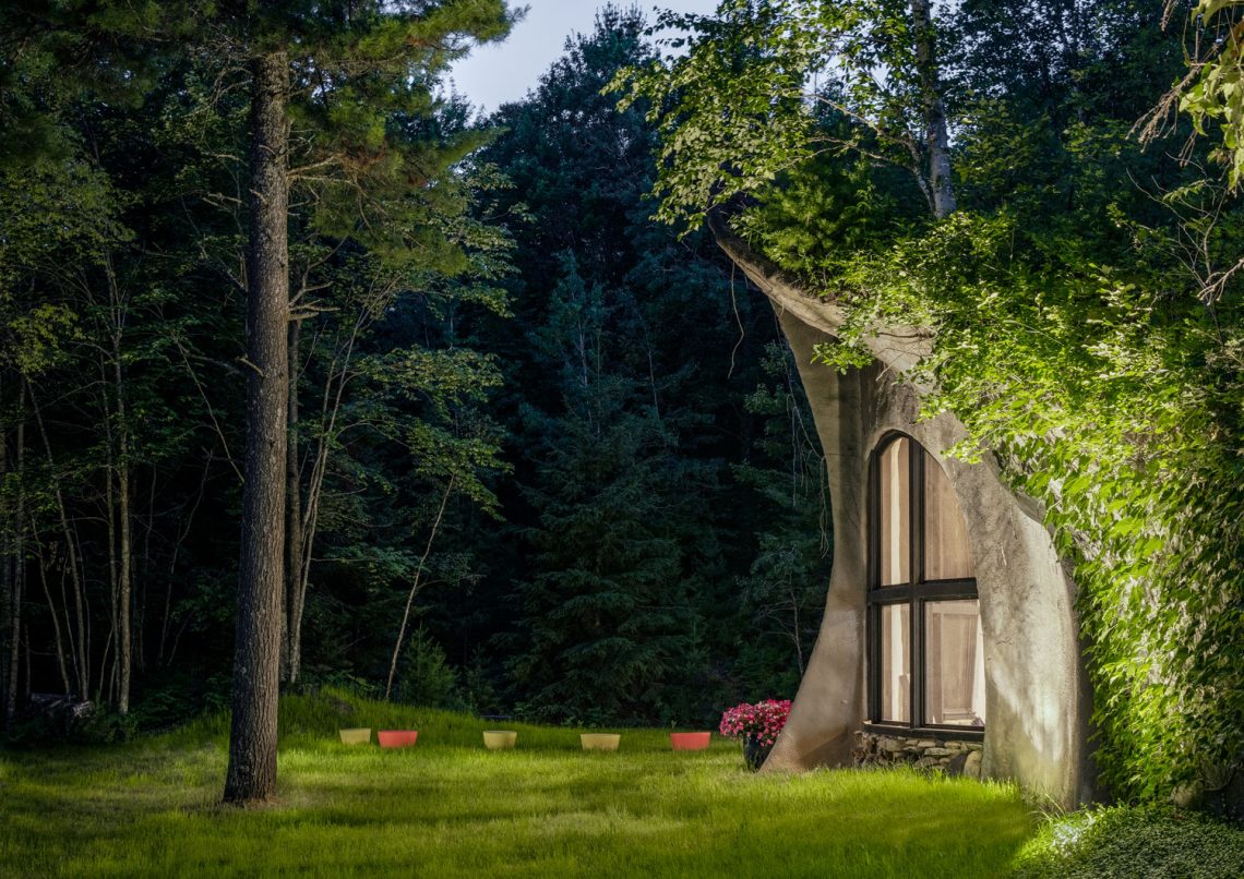
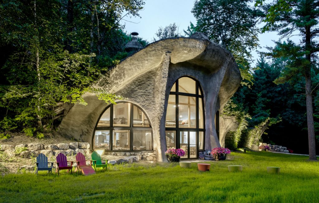
Landre: It was after a super long day of shooting for a major national client up in Door County. I was super sunburnt, tired, and mosquito-bitten. It was the end of the day and the homeowner mentioned she had another house down the street she owned and mentioned that all the kids called it ‘the mushroom house.’
I asked her if it was possible to run over there for a minute to shoot it. She let me wander around there for about an hour. It was getting dark and I wished I had more time, but she was a very design-conscious person as well, so thankfully everything was very much in place and designed well. The exterior landscaping and lighting were great, so I didn’t have to worry about moving anything around. It was pretty much perfect.
That was definitely one of the most unique places I’ve ever seen and been able to photograph. It was built into a sand dune, it had these crazy curves and windows, and there’s a great backstory about how her father designed the place back in the 1960s or 1970s and then it fell into disrepair before she bought it and renovated it recently. I got some shots I was really happy with; they turned out looking super dark and moody since it was during sunset, which actually fit the abstract design of the building very well.
Text: R. Collins, Tyler Fleser, R.J. Weick

