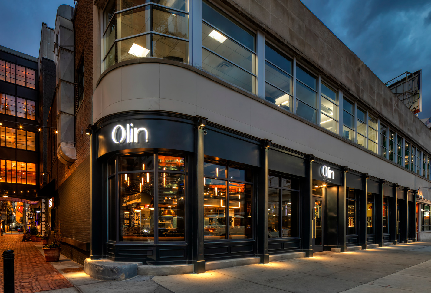
In Downtown Detroit, a city known for its community of designers, industrialists, creatives, and culinary artists, this adaptive reuse of a 1940s-designed Art Deco Streamline Moderne building near Woodward Avenue along Parker’s Alley is a thoughtful curation of the old and the new.
Realized by a collaborative design, build, and creative team led by the award-winning firm of McIntosh Poris Associates Inc. in Birmingham, Michigan for clients Holly McClain and Shawn McClain, renowned restauranteurs and hospitality leaders, Olin Bar & Kitchen breathes rich, eclectic life and depth throughout its roughly 3,900-square-foot main level. It is a concept where buried architectural origin, and the seasonal, flavorful ingredients inherent to both Michigan and the sun-drenched regions of the Mediterranean and Spain reimagine the American brasserie in subtle exploration, a welcoming atmosphere, and inspired experiential narrative.
Michael Poris, AIA, principal and founding partner of McIntosh Poris Associates, noted the vision behind Olin Bar & Kitchen was somewhat of a departure from the husband-and-wife’s existing portfolio of restaurants. Dynamic in their own culinary and hospitality rights, Shawn McClain and Holly McClain have been involved in restaurant projects like Las Vegas’ Libertine Social, Five50 Pizza Bar, and Sage; and Detroit’s Highlands Steakhouse and Hearth71 at the Renaissance Center, as part of the McClain Camarota Hospitality Group. Olin Bar & Kitchen, however, presented an opportunity for them to create their own restaurant as a fun, warm environment in their hometown—largely driven and inspired by Holly McClain’s passion to develop her own restaurant in Detroit.
“Shawn and Holly are a husband-and-wife team. Shawn’s the known chef, but Holly is a chef as well and they’ve done everything together. They’ve had restaurants in Chicago originally and then it has been Las Vegas and they live here and are from here and this was Holly’s; this was hers. It is special to them. It is in their hometown,” Poris said.
“They didn’t want it high-end or polished, because they already have that. This one they really wanted it to be a little more informal, a little fun,” Poris added.
McIntosh Poris Associates is a full-service architecture, interiors, and urban design firm that believes in the power of design as a catalyst for change. The firm strives to engage clients, project stakeholders, and communities in an open-platform approach to deliver transformative projects across residential, mixed-use, institutional, hospitality, commercial, and arts sectors. Established in 1994, the firm has built a portfolio of award-winning and recognized work throughout Michigan, New York, and Ontario, such as Prime + Proper, Detroit Foundation Hotel, The Assembly, The Factory at Corktown, and Detroit East Riverfront.
Referred to the firm, Holly McClain and Shawn McClain reached out to the team at McIntosh Poris Associates for the design of the street presence and the interiors for their new restaurant concept. Upon identifying the site, which is located adjacent The Shinola Hotel in Detroit and featured a vacant Art Deco building initially designed by Charles N. Agree, the team was tasked with transforming the combined roughly 5,000 square-feet of the two-level floor space.
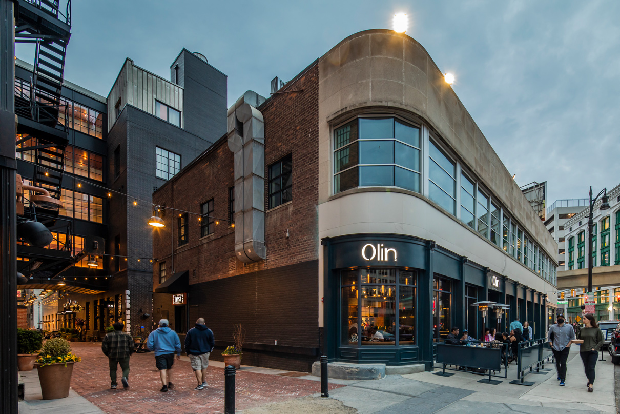
Initially known as the Nadell Furs building, its design was influenced by the international style of Streamline Moderne that emerged in the 1930s inspired by aerodynamic and curvilinear forms. At the time, elements of the international style could often also be found in industrial and automotive design that left an impression of sleek lines and modernity. Since its completion in the 1940s, the building would house the Biegas Gallery and PuppetART Theatre, until the latter of which announced its departure in 2017, leaving behind a built canvas of high ceilings, open space, brick-bearing walls covered by black adhesive, exterior limestone paneling, and decorative pilasters.
For Olin Bar & Kitchen, it would prove an ideal setting for capturing both the history and the modernism of the city drawing upon industrial finishes and eclectic design elements for a program featuring a bar, kitchen, entryway, exterior storefront, canopies, public restrooms, and a take-out window service area on the main floor, with kitchen-prep, storage, office, and employee restrooms located on the lower level.
Karin Abel, interior designer at McIntosh Poris Associates, said they were a great client to work with, because they had a very strong vision and gave the team a lot of inspiration images and key phrases to work with at the onset.
“They had a vision. They had reasons why they liked something or why they didn’t like something and they were an absolute pleasure to work with,” Abel said. “Key words expressed to us were fun, funky, eclectic, not polished, not perfect, and neighborhood. These were the drivers behind the design concept.”
Its exterior form presents a sleek, horizontal stance amid the more vertically dense neighborhood with its distinctive streamlined, curvilinear edge inherent to the architectural style and its series of windows that almost reinforce that impression in parallel plane above the street. Original limestone paneling was preserved on the exterior and traditional, decorative pilasters are complemented by newly added blue-gray metal panels between large glass-paneled windows. Due to existing conditions on its streetscape, its entry was placed along Grand River Avenue rather than at the curved edge of the building—an element considered at one point in the design process—and leveraged on the inside to intentionally delineate interior spaces and experiences.
“The sidewalk slopes, so there were only a certain number of places it could actually go,” Poris said. “We liked the idea of placing it where it is a nice demarcation from the lounge, bar, and more of the restaurant beyond.”
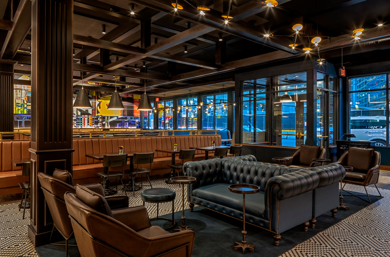
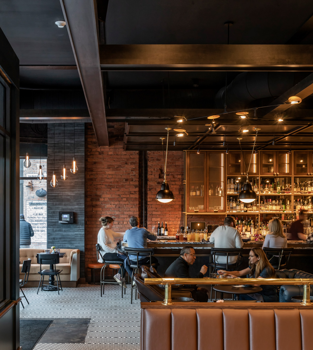
The interior, while structurally sound, was updated to meet current fire-safety codes, such as applying a fire-resistive material to the ceilings and columns, and incorporated acoustical ceiling panels to reduce noise. The black adhesive found on the brick wall was also removed to expose the original organic material. Its spatial layout is intuitive, leveraging the rectilinear space to locate functional spaces like the kitchen near the back wall where the former theater stage had been, and creating a mix of seating and bar experiences toward the windows that provide transparency to and with the streetscape. Poris noted the layout was driven by both common tenets in hospitality and dining project as well as the space itself.
“The front, where the windows are, we wanted to make that more public, so the dining and bar are facing out and people can see in and see the activity to draw them in. Bathrooms and storage are toward the back where there are no windows,” Poris said. “We really ended up doing a longer, thinner space with the kitchen behind it and then the open kitchen in front of that. Then, the bar on one side is a focal point and then the mural on the other side, so it laid out pretty quickly. Having the bar on the one end was a nice focus: the entry way kind of came in right between the bar and the dining.”
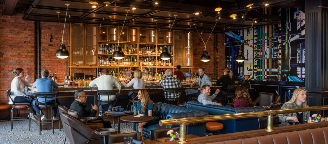
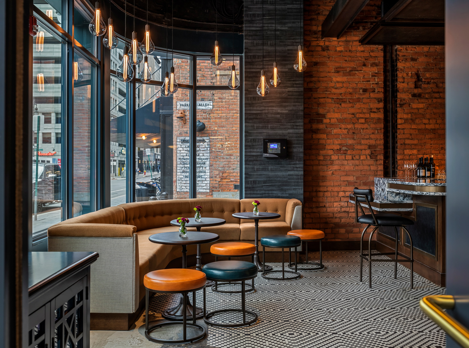
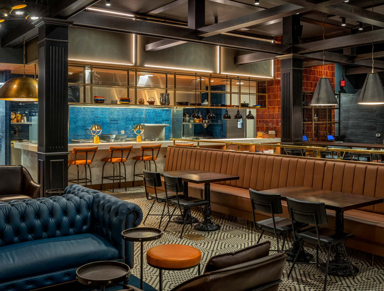
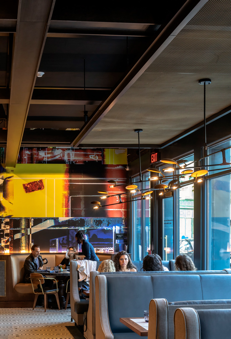
With the bar and commissioned mural serving to anchor the space, the team crafted a number of dining settings through the intentional use of furniture, the layering of light and oversized pendant fixtures, and the introduction of beams and coffered ceilings to create a more intimate atmosphere and to delineate space. Each dining area was meant to provide a distinct experience and perspective of the space that would draw visitors back time and again. Upon entry, the bar is set before an exposed brick wall on the left that leads into the large, half-round booth at the curvilinear edge, a form reflected in both the seating and bar countertop. From there, a relaxed, casual lounge area featuring custom Chesterfield-style sofas and deep leather chairs leads into an array of banquettes, open kitchen seating, and booths.
“We like to create a lot of different experiences. It’s a big, open space with high ceilings. For me, the worst thing at a restaurant is when you walk in and it is just a sea of tables. There is no intimacy. So, we always try to avoid that. We are always trying to create multiple, different seating opportunities and spaces so that there is something for everyone,” Poris said.
“We introduced beams that we put into bring the scale of it down. Beams create a datum and then the lighting creates another datum below that, so you are looking through these layers. Then we also lowered the ceiling planes, metal planes, to bring the scale down over the booths on the street and over the bar. There is a lot of different layering and depth and groupings that we’re conscious of that we wanted to put in to create this variation and intimacy,” Poris added.
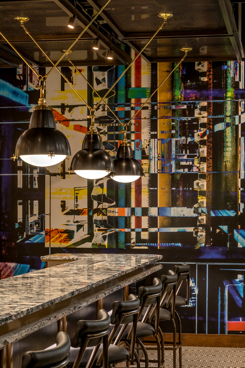
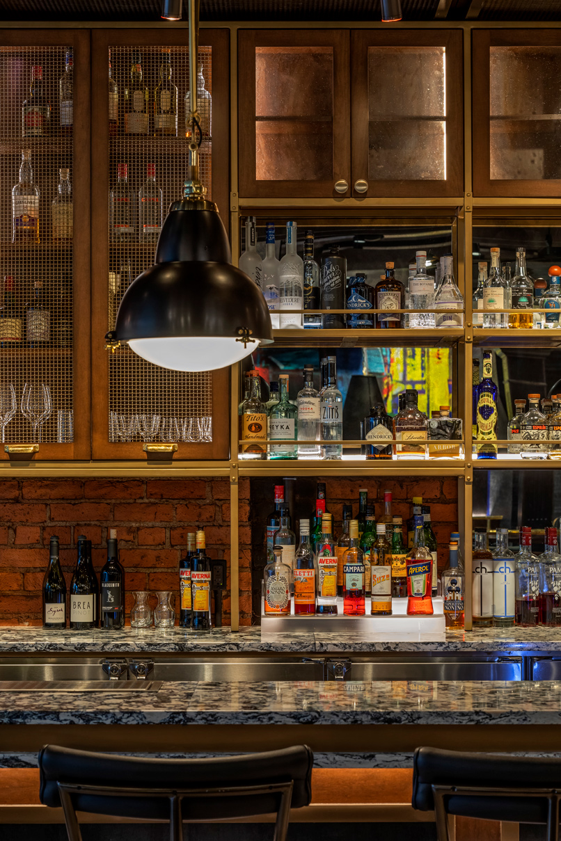
Visually, the interior palette reflects an industrial, organic materiality where the reddish brick on the wall and the vintage, mosaic-patterned tile floor was complemented by accents of metal, glass, stone, and vibrant color. In the bar area, blue-and-gray quartz is contrasted with a backbar of metal mesh, seeded glass, oversized light fixtures, and an abstract mural commissioned from Lisa Spindler of Lisa Spindler Studio, a local fine art photographer and artist based in Detroit. The blue is also carried throughout the space in seating and the porcelain tile at the open kitchen, where a backlit mesh soffit echoes industrial metals in the space.
“Shawn definitely wanted that deeper blue color seen on the façade as well as on the interior walls. That is what we started off with, plus their images were leaning industrial, so that is where we came up with a lot of the wire mesh, which is brass, and fabrics in neutrals like browns, blacks, and rust,” Abel said.
“I really like the eclectic mix of styles. The exterior has classical fluted pilasters, which we carried into the black columns on the interior. They were actually structural columns. We went to a squared-off column on the interior, but it totally coordinates with our exterior. So, you have that little bit of classic industrial, the floor is funky, the murals are funky, and it just all comes together. It’s a great mix,” Abel added.
The murals, located by the bar and anchoring the opposite end of the restaurant, are the result of a collaboration with Spindler and the husband-and-wife team of Holly McClain and Shawn McClain. Upon visiting the Lisa Spindler Studio gallery, the team at McIntosh Poris Associates developed renderings to show potential murals of Spindler’s work in the restaurant space. The process involved a selected series of images of industrial steel objects from Spindler’s analog and digital photography archive that dated back to 1976. The potential images, which were from a number of locations in Detroit around 2012, were then artfully merged to create a tapestry of objects and textures, resulting in Spindler’s “Industrial Series” collection.
The process, which took a number of months, led to the selection of “Industrial Tapestry #1” for the eastern wall and “Industrial Tapestry (Blue Fragment)” for the bar and lounge area, which were then printed in large format to the artist’s specifications—30-by-10-foot and 16-by-14-foot in dimension, respectively—by The Detroit Wallpaper Company on Type II commercial-grade paper.
“We actually had some schemes where it was more subdued and even the artwork—working with Lisa Spindler—we had some of her photos that we wanted to use that were a little more elegant and refined and it was really interesting, because Shawn and Holly, while they liked them, they thought it took them more in a direction of fine dining. The image we ended up with was really an industrial image,” Poris said.
“[Lisa Spindler] has been photographing stuff all over Detroit for 30 years. She has this huge archive and she collages them together and creates these amazing collages. There is so much depth in these. I’ve always loved her work, so I was really excited we were able to work with her on this and as colorful as these are, it’s definitely industrial. It’s like the buried origin of that collage. It’s absolutely industrial, it’s all Detroit, authentic, but it’s also this really colorful piece that you wouldn’t necessarily think is an industrial mural. I love how it contrasts with the seating and the more subdued interior,” Poris added.
It is a subtle thread that ties into the legacy of industry of the city itself and as Poris noted while the most sustainable thing is reusing a building, it also is about the story of the building and the space that gives the new iteration authenticity.
“That’s a real important piece to it that is nice to then contrast that by bringing in the new, so you have the old and the new. It just gives it lots of depth in multiple different ways,” Poris said. “I love taking existing buildings and working with them to create something new without losing the old. It’s a classic collage where you are putting it together and creating something new with the origin buried. The buried origin of the original is still there, but it’s different than just a straight preservation and that is the difference to me in adaptive reuse and reusing it, it’s there, but it’s not a straight restoration that is period.”
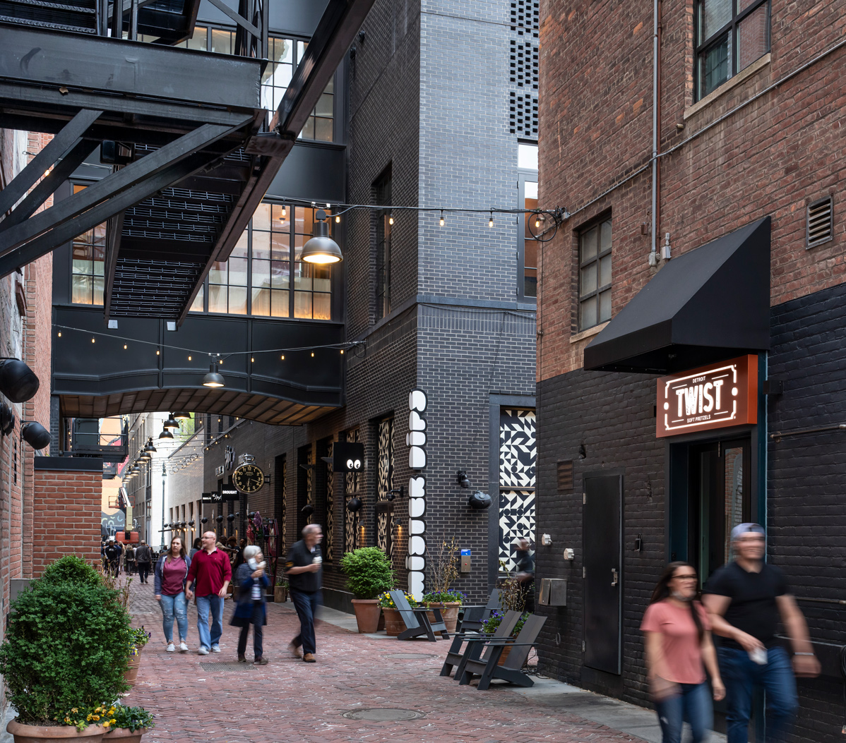
Olin Bar & Kitchen, which also features a take-out window along Parker’s Alley known as Twist—serving soft pretzels, cocktails-to-go, and more—was completed and officially opened in September 2020. The collaborative team that realized the restauranteur Holly McClain’s vision also comprised: City Contracting Services, general contractor; Greenpath Design, mechanical engineer; ETS Engineering Inc., electrical engineer; Millis & Associates, kitchen consultant; Illuminart, a division of Peter Basso Associates Inc., as lighting designer; Metro Signs & Lighting, environmental graphics; and Lisa Spindler Studio and The Detroit Wallpaper Company, murals.
“You have this Art Deco building, you have the brick industrial walls, you have this sort of fluted pilaster and columns inside that are a little more classic, and you have the metals and the murals that are industrial, so it is very eclectic, but it works together,” Poris said. “To me, it is like bringing all of those things together, which is really a lot about Detroit.”
First published in Great Lakes By Design: Ergonomics, 2022
Text: R.J. Weick
Photography: Justin Maconochie

