Set amid a row of iconic Greystone buildings along California Ave. in Chicago, Illinois, the grid-like façade of concrete and glass on the En Masse Architecture and Design Ltd. studio presents a bold juxtaposition with its environment at first glance. Its poured-in place, brise-soleil creates a patterned effect where vertical fins of concrete lend an added layer of complexity to the grey-hued limestone of the historic residential building style inherent to Chicago, and bring an energy and dynamic tension to the creative conversation within its architectural landscape.
Minimalist in design, the studio is more than a composition of its brise-soleil—an architectural solution popularized and initially designed for climatic challenges by Le Corbusier in the 1930s—large expanses of glass, roof deck, and interior conference and lounge spaces, but rather a home to a team of creative collaborators with a passion for delivering inspired surroundings of refined function and undeniable style to their clients across residential and commercial sectors. That foundational idea of being more than the sum of the parts is an integral philosophy at the heart of the studio as the architecture and design collective invests in their clients throughout the entire process and brings everyone to the table from the onset.
“We focus a lot on the schematic design phase of the project. The bulk of what most architects do is construction drawings, but the construction drawings are a tool to get the thing built. The real meat of an architectural dialogue happens in the schematic design phase,” said Mike Shively, AIA, LEED AP, founding partner of En Masse Architecture and Design in Chicago.
“Really taking the time to get to know people and understand their needs, taking the time to understand the site: not only does that ultimately result in better architecture, but it comes back to that notion of architecture is home or architecture is peace. You have to let things simmer a bit, you have to let people really understand the reasons you are doing things and get that buy-in from the client so they are going to ultimately feel very satisfied with the process once we start building and ultimately when they start living there,” Shively added.
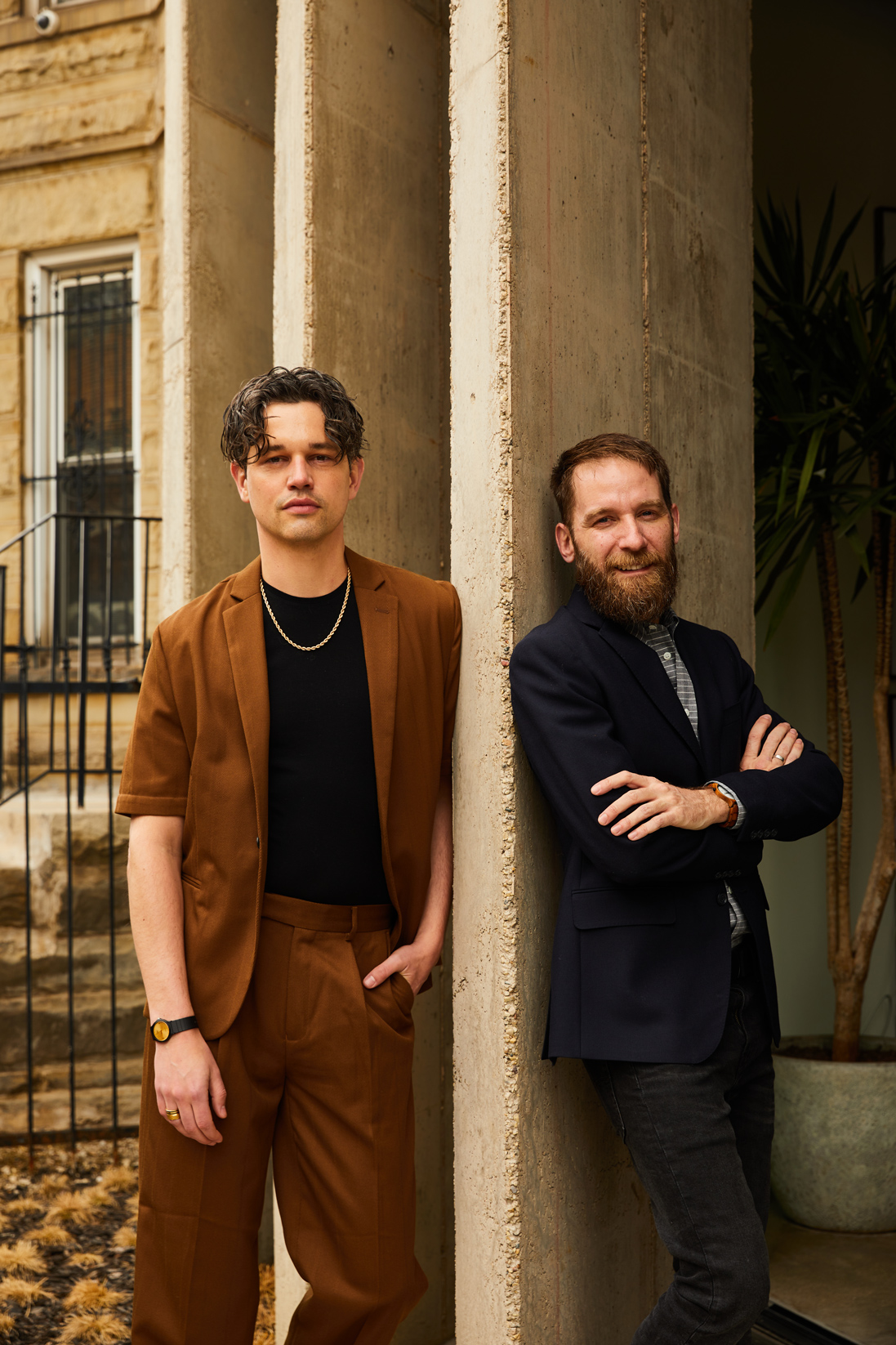
Initially founded in 2015, En Masse Architecture and Design is a full-service architectural firm providing comprehensive services and client-specific solutions for their clients. Throughout its seven-year tenure, the firm has developed a portfolio of work ranging from a Colonial style renovation, a midcentury modern condominium imbued with ’60s inspiration, and a Shingle Style residential build, to a timber loft conversion of industrial space as an upscale office environment, among others.
Formerly known as Mike Shively Architecture, the team underwent a creative design journey of their own when Lucas Goldbach, AIA, NCARB, design director, became a partner in the firm in 2020, sparking a process of rebranding the practice in name and logo that would celebrate and better represent who they are and strive to be each day. The resulting “en masse” or “all together”—derived from Old French with older etymological roots in Latin and Greek that evoke the careful process of kneading and bread as a whole—combined with the patterned grid of the brise-soleil from the façade of the studio, would become a distillation of their diverse and creative collaboration, and continued goals, services, and human-centric approach. The latter of which emphasizes meeting people where they are, understanding how they live, and understanding the contextual setting or place where the architecture will ultimately be set into the built landscape.
“I think an important part of any architecture is engaging with the site,” Shively said. “A lot of what is built today could really be plopped down anywhere. I appreciate architecture that takes advantage of the views that are available, the light that is available, and the context of the site.”
Shively also noted that context goes beyond physical, natural characteristics to cultural aspects as well such as how there is an authenticity and permanence to the Chicago common brick found tucked into building across the city due to its composition of local clay, and how zoning requirements have informed the very shape of those buildings.
“Over time the zoning code has established a building type where you are going to get the most natural light at the front and back, which influences how people live in the space,” Shively said.
For the clients of this particular renovation, their existing residence spoke of its former inhabitants, where the rigidly symmetrical design and layout had been intended for a different lifestyle. Shively noted the project is a perfect example of taking a unique building in a unique neighborhood and transforming the existing house to support the clients’ affinity for entertaining and cooking by opening up the interior layout, highlighting the kitchen, and creating additional views and outdoor spaces.
“For the last 10 years, they lived in a home designed by an architect for his own family. I’ve never seen a house so rigidly symmetrical. The stairs and the hallways were right in the center and every room—if it spanned the full width of the house—had two doors into the room,” Shively said. “It was, from the get-go, an interesting sort of concept with the house to be much more free-flowing and easier to circulate around.”
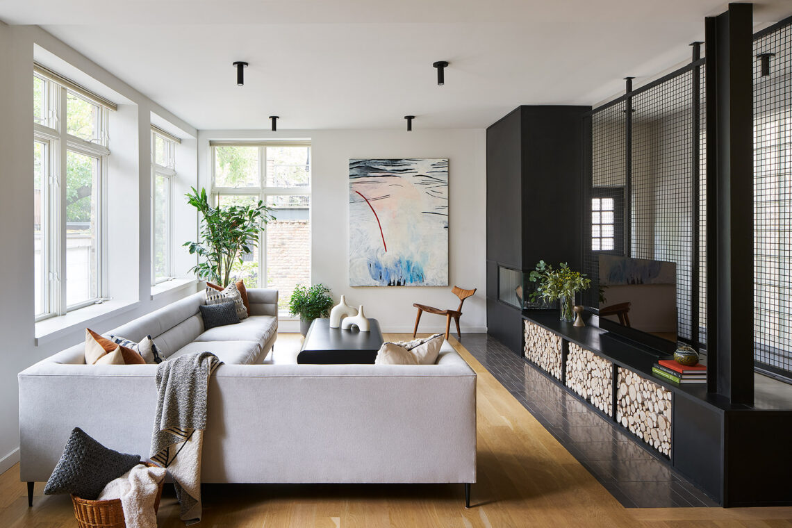
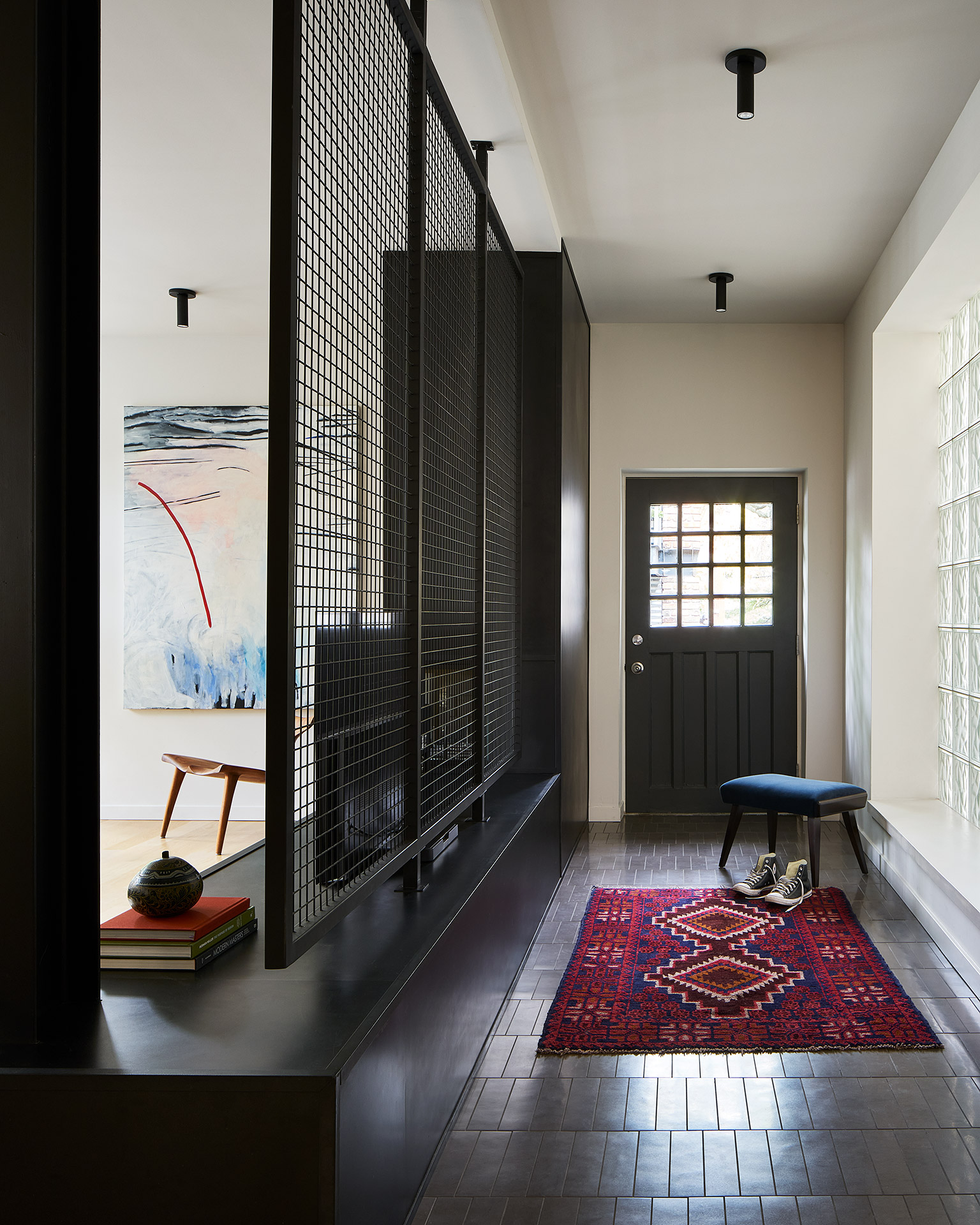
From the entrance, a custom steel-fabricated screen wall informs movement and the flow of space from the onset as it guides toward and past a mudroom cube of white oak to unfold into an open layout where living and dining spaces have sightlines into the kitchen. The layout, simple albeit intuitive, then leads into more private spaces beyond the kitchen on the one side, while the opposite provides storage space with an intentionally placed pantry.
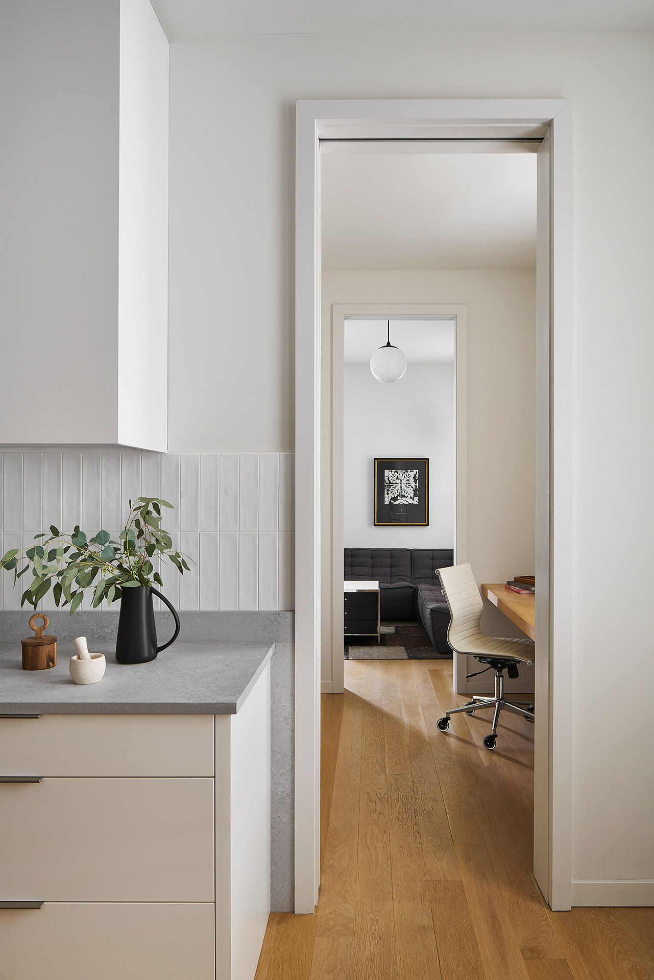
“We are doing a lot of these really open kitchens, which are great. Everybody socializes in the kitchen so it is nice to have that adjacency to dining or living, but at the end of the day, no one wants to be looking at dirty dishes or a toaster. Thinking through that ease-of-use in a kitchen often translates into us having pantry spaces that flow directly off of the kitchen, so it is easy to put clutter away or leave things out on the counter,” Shively said. “Whenever you try too hard with architecture to create rigid systems, it is never satisfying.”
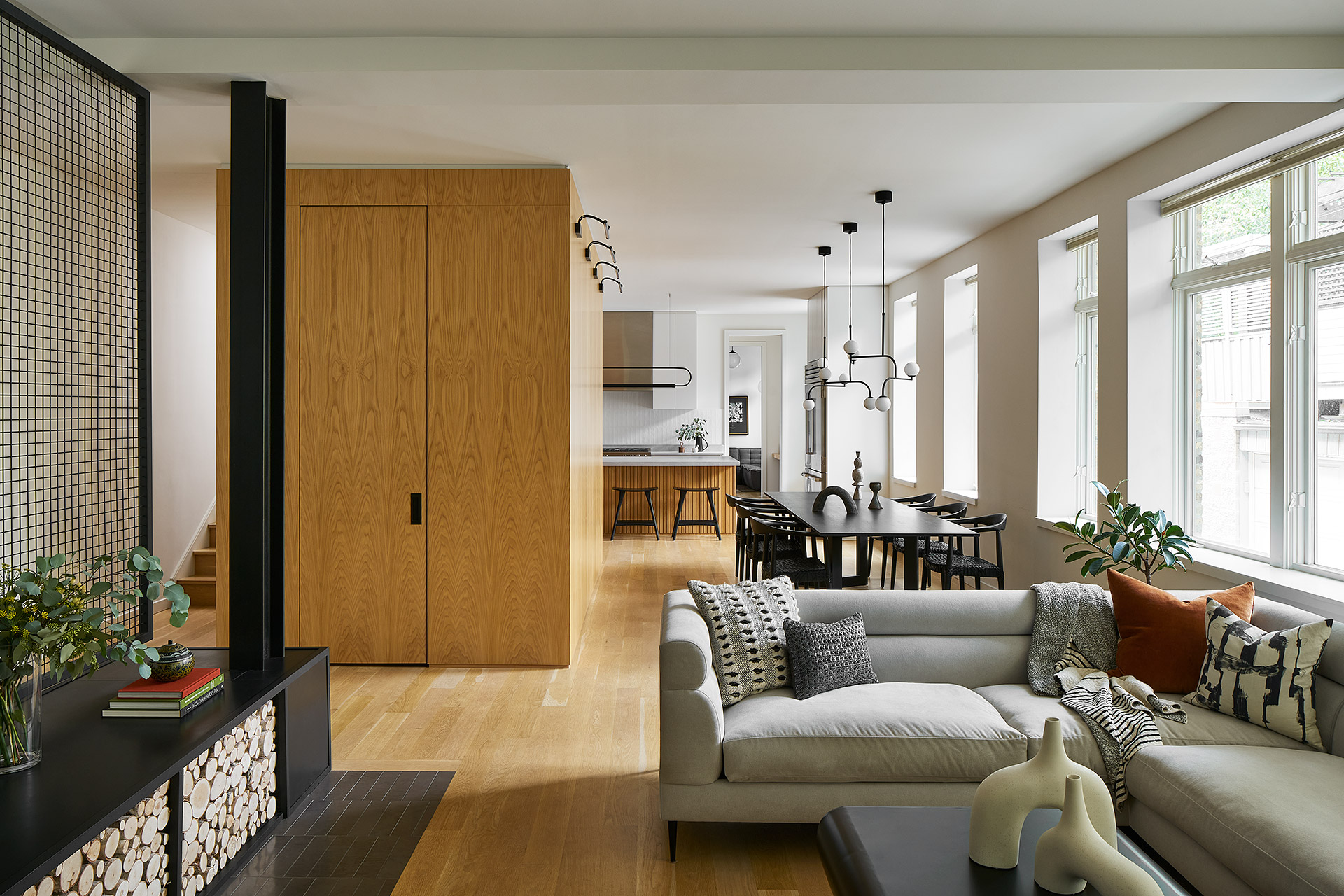
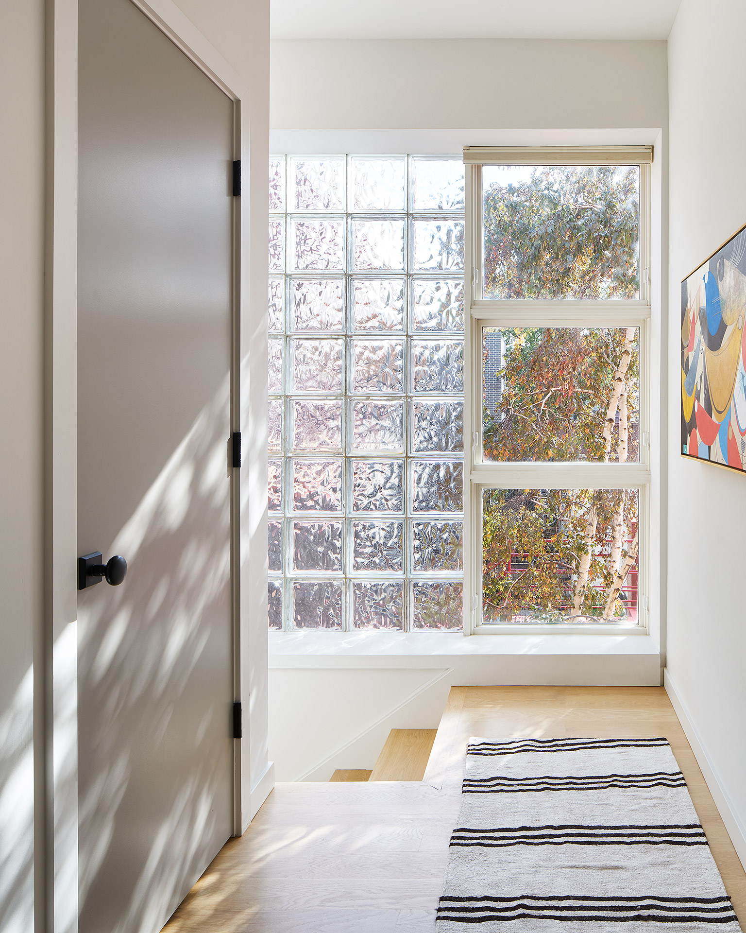
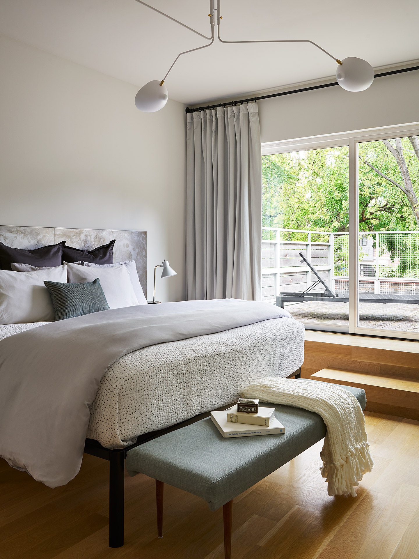
Shively also noted though opening up a lot of views to the outside was important, due to the site’s location on a corner lot in a busy neighborhood, one of the design solutions comprised running a row of transoms at the top of the windows to allow treatments to be drawn up to a certain height to maintain privacy while still allowing natural light in and sightlines out to the environment beyond. That connection to the outdoors—of which the team has an affinity for blurring those lines between the interior and exterior, often requiring some creativity on their part to address specific challenges associated with the Great Lakes regional climate—is also showcased on the second floor where the main bedroom leads directly out onto a roof deck amid trees.
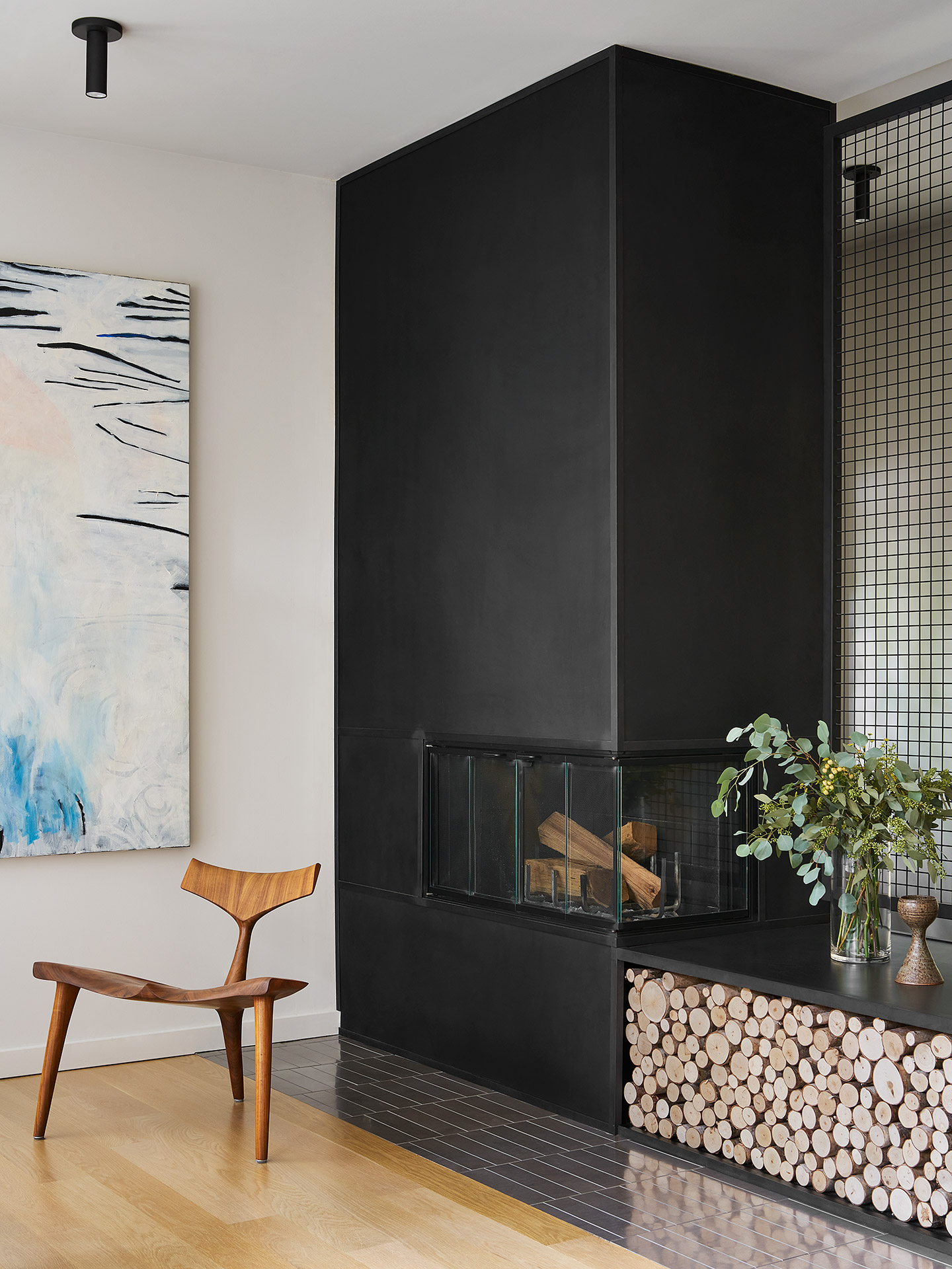
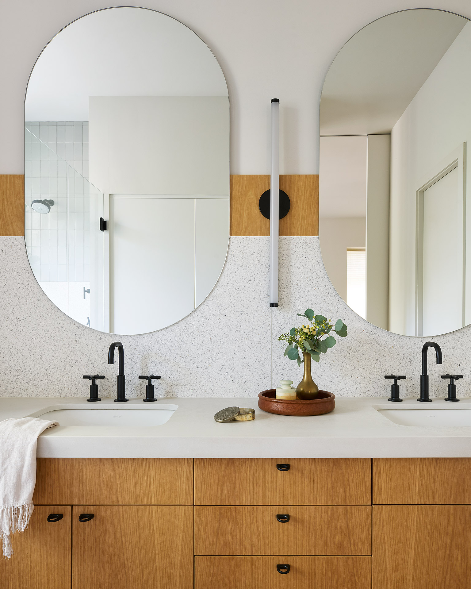
In balance with its open layout, its interior palette is one of simple, natural materials, where Fousanna porcelain tile inspired by the natural appearance of rippled water in the foyer and living room complement the steel cladding found on the fireplace and white oak floors, cabinetry, and custom mudroom cube. In the main bathroom, artisanal and textural terrazzo tile on the shower walls and floor—from Waterworks’ Concourse and Portlandia collections—is layered with the concrete countertops of veiled cream and soft swells of white, custom cabinetry, and a clean-lined lighting fixture that provides uninterrupted illumination as it appears to float on the wall. The neutral palette is carried throughout the shared bath as well, where terrazzo and concrete come together in grays and notes of black basalt in its countertops.
The kitchen, as one of the focal elements of the project, also features Sub-Zero and Wolf stainless steel appliances, Airy Concrete Caesarstone countertops that evoke ephemeral movement in a textured surface, and a custom island handcrafted and hand-finished by a finish carpenter who also built the mudroom cube onsite. Lighting inspired by natural hardware in solid wood and metal are also paired with sconces from Cedar & Moss that introduce a feminine, modern silhouette to the space.
“On any scale project, you are going to end up honing in on some really feature elements and knowing that the kitchen was so precious to them was an opportunity to bring in some real craft to the space. I think that is another element that En Masse brings to our projects—the relationship and collaboration with different craftspeople,” Shively said.
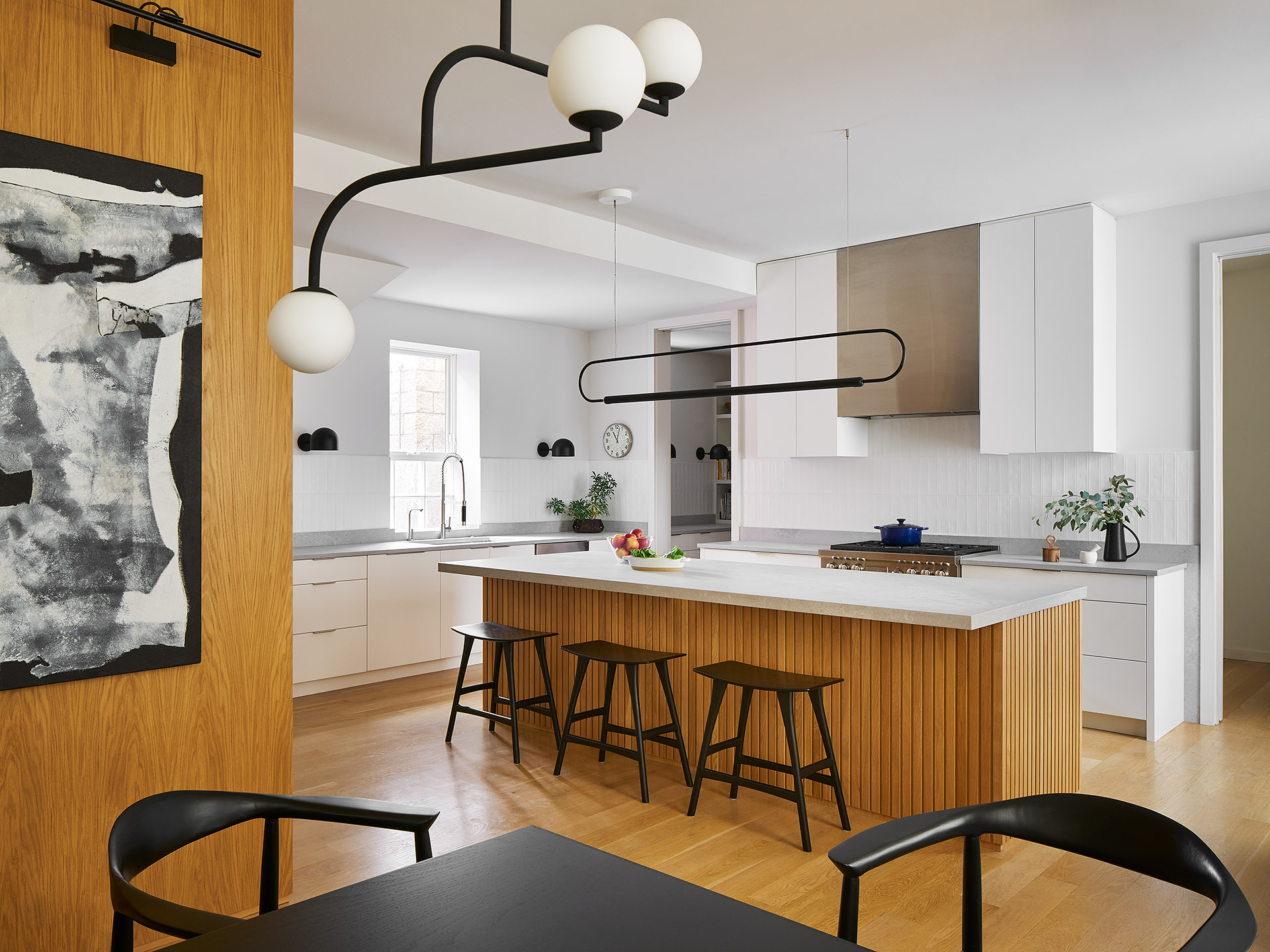
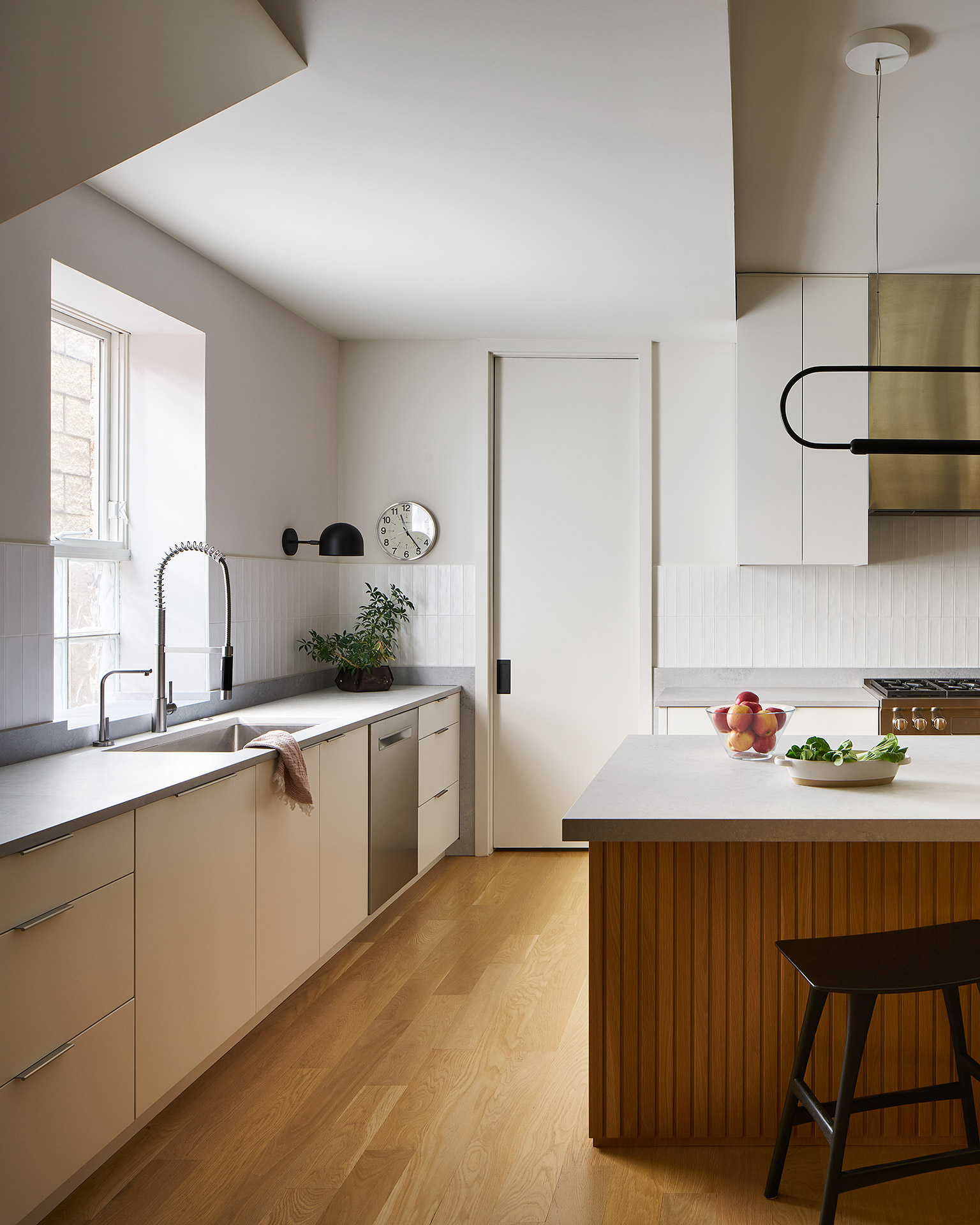
Shively also noted with open floor plans, there can often be a lot of visual clutter in a space and to address that challenge, they find the right move with the architecture is to keep a really tight palette.
“In this project, the kitchen cabinets, the cube in the center of the house, and the floors were all done in white oak with a very similar matte sheen to them. The cabinets were done in a painted finish that matched the painted finish of the walls. Then we did a lot with steel as both steel panels on the fireplace and as a steel mesh in this screen system,” Shively said.
“We really kept it to those three materials: steel, white oak, and paint. That allows the lighting, furniture, textiles, plants, and the life being lived in the space to all have a way to shine,” Shively added.
With its subtle contrasts of sculptural lighting—globed pendants, geometric constellations, and minimalist mobiles—and bold fixtures, natural materiality and views outside, there is an openness and comfort that welcomes throughout the space, culminating in a kitchen that serves as heart and hearth of the home.
For Shively, whose leadership is informed by empowered, whole-team creativity, En Masse Architecture and Design is the culmination of a goal fostered at an early age.
“I suppose I am unique in that I always knew what I wanted to do. Even as a kid, I wanted to be an architect. I grew up in a family of wanderers. We moved all over the Midwest—Indianapolis, St. Louis, Louisville—all very similar midwestern cities with very similar big box architecture and I think that had the most impact on me as a kid. I longed for places that had more identity,” Shively said.
“For me, design means home. Design means peace. I think having a design that you feel truly invested in, and that you know is made for the place you are, can really create a wonderful sense of peace in life. I love living every day in a home I designed, and I love giving that to our clients,” Shively added.
Originally published in Great Lakes By Design: Crafted Lodging, 2022
Text: R.J. Weick
Photography: Tim Finch, Ryan McDonald

