Overlooking Long Lake in Traverse City, Michigan, a home originally built in the mid-1990s was recently transformed into a rustic-modern, home-away-from-home for a couple and their growing family, a remodel designed by New Leaf Interiors of Traverse City.
An interior design studio founded in 2010 by Gretchen Knoblock, owner and design director, New Leaf Interiors works toward helping clients realize their dream spaces, utilizing in-house capabilities such as kitchen and bath cabinetry selections, an array of finish options, and many furniture and home accessories lines. The firm’s services also include space planning assistance and visual representation of a client’s vision through sketches, the creation of concept boards, CAD drawings, and 3D renderings.
“A lot of times when clients reach out to us, they like to ask us: ‘What is your design style?’ I am always baffled by that question, because it isn’t about me. We are true students of design, and despite what our personal homes might look like, we appreciate all styles of design,” Knoblock said.
“Our design philosophy is to have a good, thorough understanding of what [the client’s] vision is so we can create the roadmap of how to get there. We love to tell clients that our base job is to help them make really good decisions and sleep at night after they make them,” Knoblock added.
Originally from Grand Rapids, Michigan, the clients of the home on Long Lake had only visited Traverse City once during the summer before deciding the city was a perfect place to plant long-term roots. They purchased the lakeside residence with the intention of having it renovated into their dream vacation home. Having never worked with an interior designer before, the couple did an internet search and found New Leaf Interiors, then called up the company to meet with them about creating their forever home.
“One of the things we had laughed about is that they bought a house that in no way reflected their tastes,” Knoblock said.
“It had arched windows and weird angles, fake rock on parts of it—it was very much a ’90s builder’s home, and everything inside was oak cabinets and closed-off rooms. When you have a lake house, you want the lake to be inside that house, from every view as much as possible,” Knoblock added.
Originally built by a professional home builder for him and his wife to live, the house did check a number of the new homeowners’ boxes in terms of its location on the waterfront and its number of bedrooms. Though the design didn’t quite align with the clients’ personal style, it offered a foundation that would support their lifestyle and needs for hosting and entertaining a growing family.
When Knoblock initially met with the couple to start planning their ideal lake house in the fall of 2018, the clients did not have a builder chosen at the time and quickly connected them with Jeffrey Simonis of Simonis Custom Home Building & Remodeling. New Leaf Interiors and Simonis Custom Home Building & Remodeling had worked on past projects together, resulting in a positive working relationship and Knoblock knew the company would be the right fit for the client and the project. Mike Watkoski, owner and operator of Ground Level Landscaping & Irrigation, was also brought on board to provide landscaping services. Due to scheduling, the remodel first broke ground approximately a year after Knoblock’s initial meeting with the clients.
“[Clients] need to be comfortable with you and the builder. They need to trust you and feel like they can come to you with anything, even if it is something they don’t particularly like,” Knoblock said. “We want that. We can’t solve the problem if you don’t feel comfortable being open to us. That is why our clients become friends in the end; it is the wonderful byproduct of being in this business. You develop these wonderful relationships with clients, and they become your friend or family member in a sense; part of your design family. It is very rewarding.”
While the renovation was initially planned to be completed in stages, it was quickly realized that the whole project would have to be done all at once due to structural damage, such as major leaks and mold that would lead to more issues down the road if they didn’t act quickly.
“It is one of the biggest projects we have ever done all at once, outside of a new construction,” Knoblock said. “As a renovation, it is the biggest we have ever done.”
The clients’ main functional goals for the home were to have spaces for their children and their growing families to stay overnight, ample entertainment areas, and a brightened interior with views of the lake.
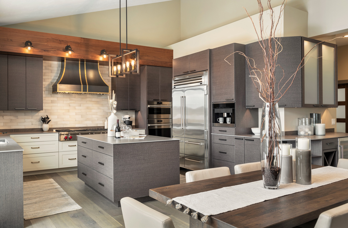
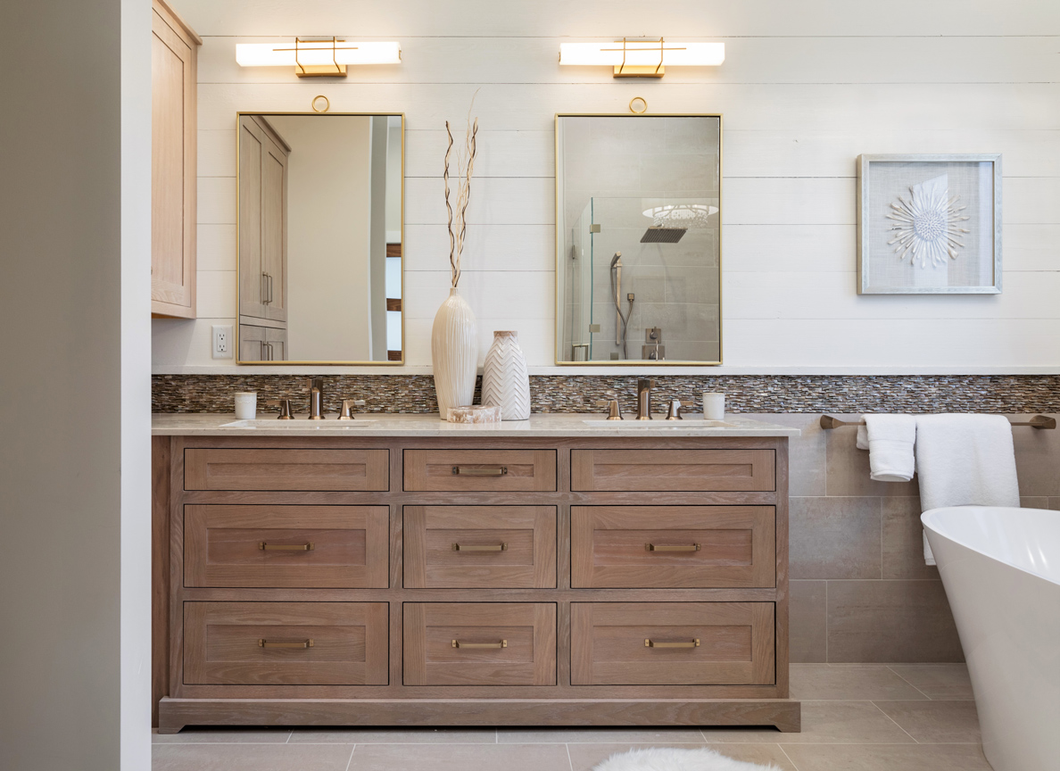
The design-and-build-team worked to achieve a more spacious interior and an additional bedroom without expanding the existing envelope of the home. Originally, many of the rooms inside the house were cramped by 45-degree angles, making the layout a bit dark and counterintuitive as one moved throughout each space. Some of the project’s changes comprised straightening many of the sharply angled walls, creating more space inside certain rooms on the main level of the home—such as the kitchen, and the master bathroom. The master bathroom originally only had room for one vanity, but by shifting the wall over and opening up the corner, taking space from the large mudroom on the other side, a second vanity was able to be implemented for the homeowners to enjoy a two-vanity master bathroom. One of the bedrooms on the main level was also split into two rooms to create an additional bedroom, giving the home five bedrooms overall, rather than its existing four bedrooms.
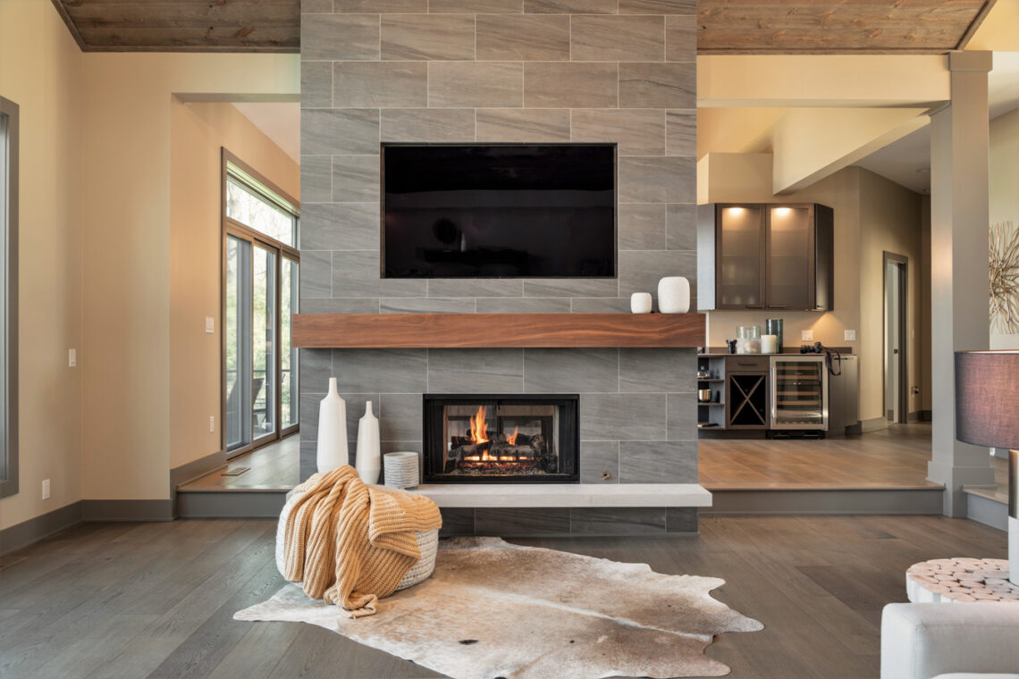
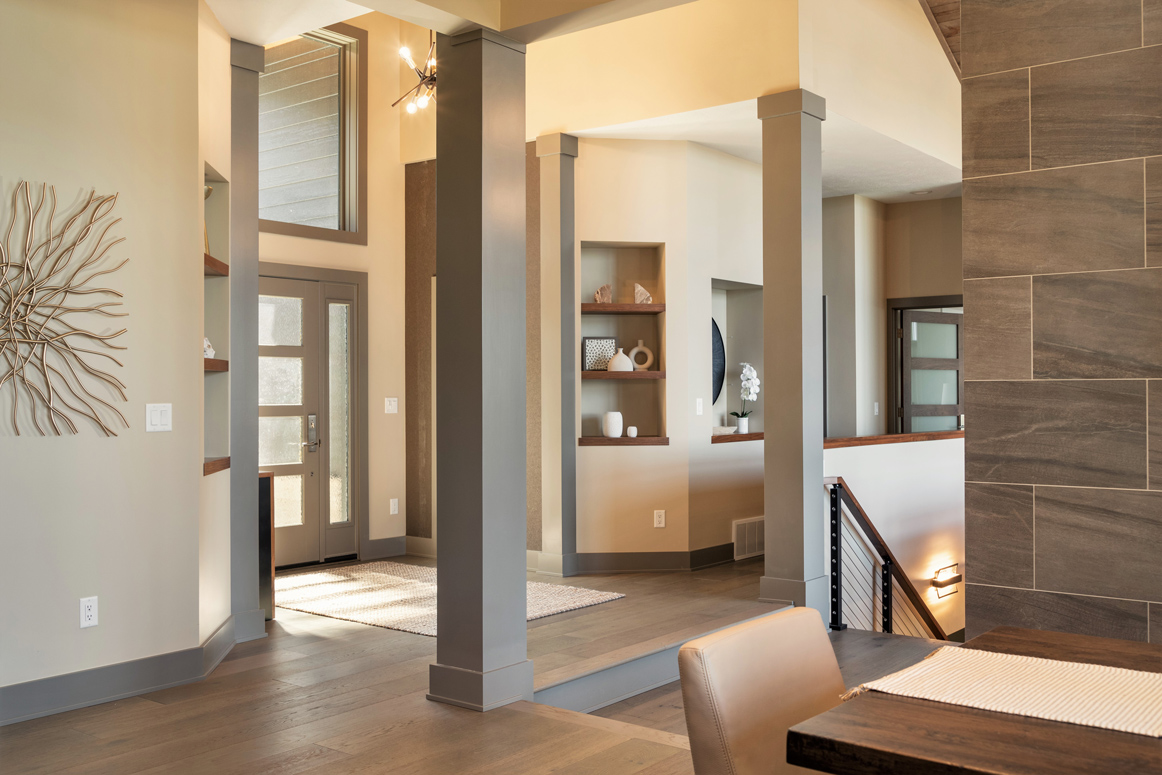
Light was drawn throughout the main entertainment spaces of the home—such as the entryway, the living room, and the kitchen and dining area—by removing some of the existing walls. On either side of the fireplace, a wall was removed, providing an easy connection between the dining area and living space. People can now walk completely around the fireplace, which appears as a monolith statement piece, grand and singular, and what was before a full wall on one side of the stairs headed down to the basement is now a half wall. Both alterations opened the rooms on the upper level to feel as if they are part of the same enormous space flowing into one another.
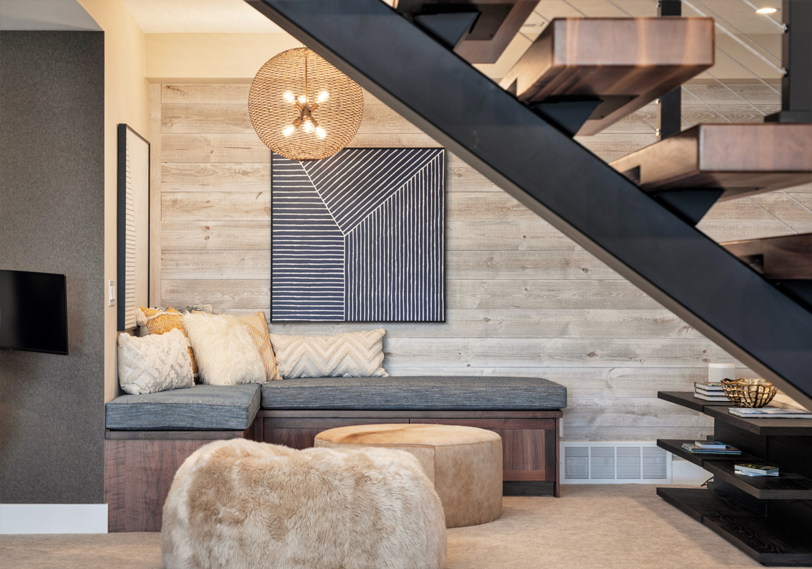
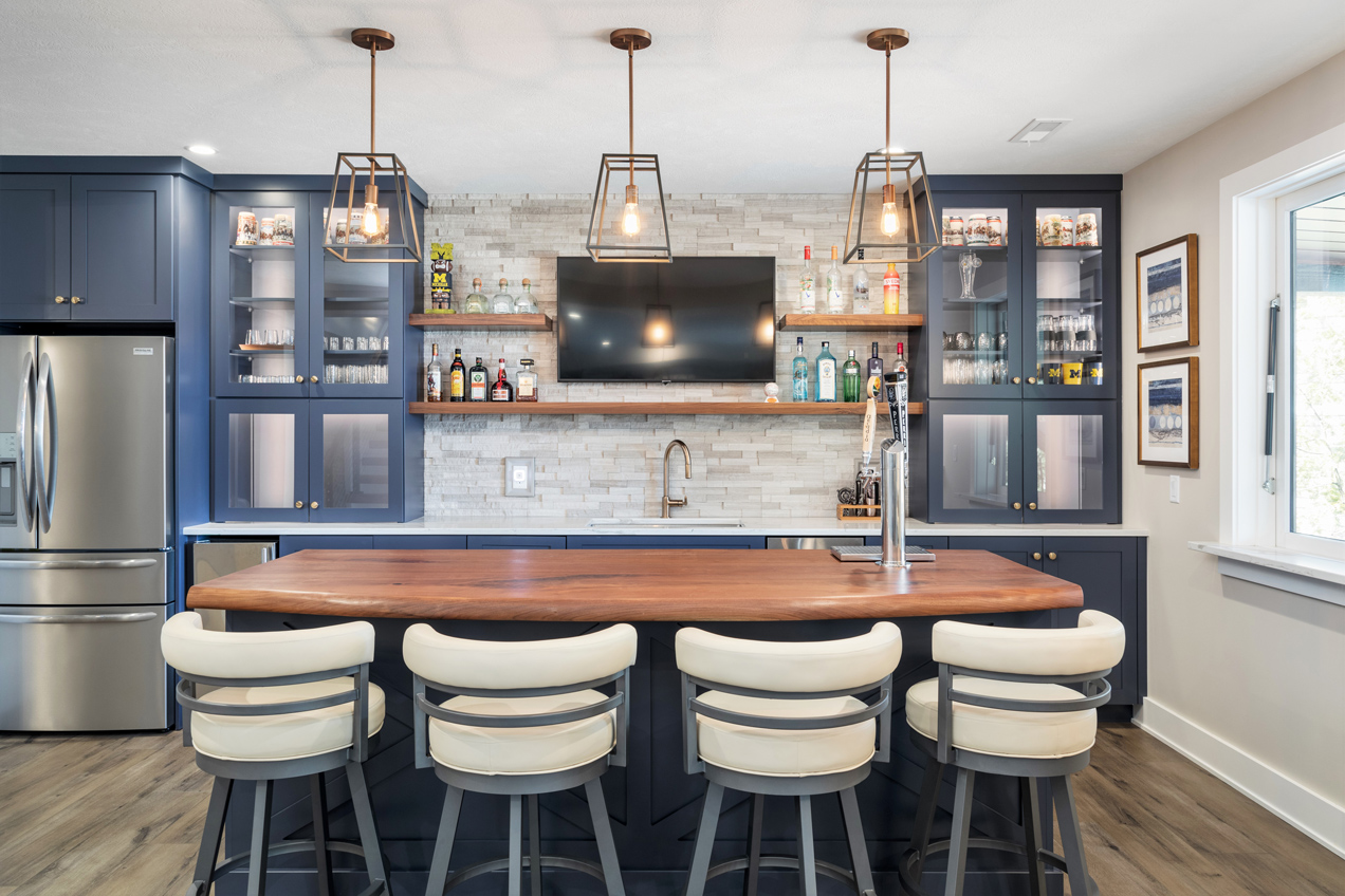
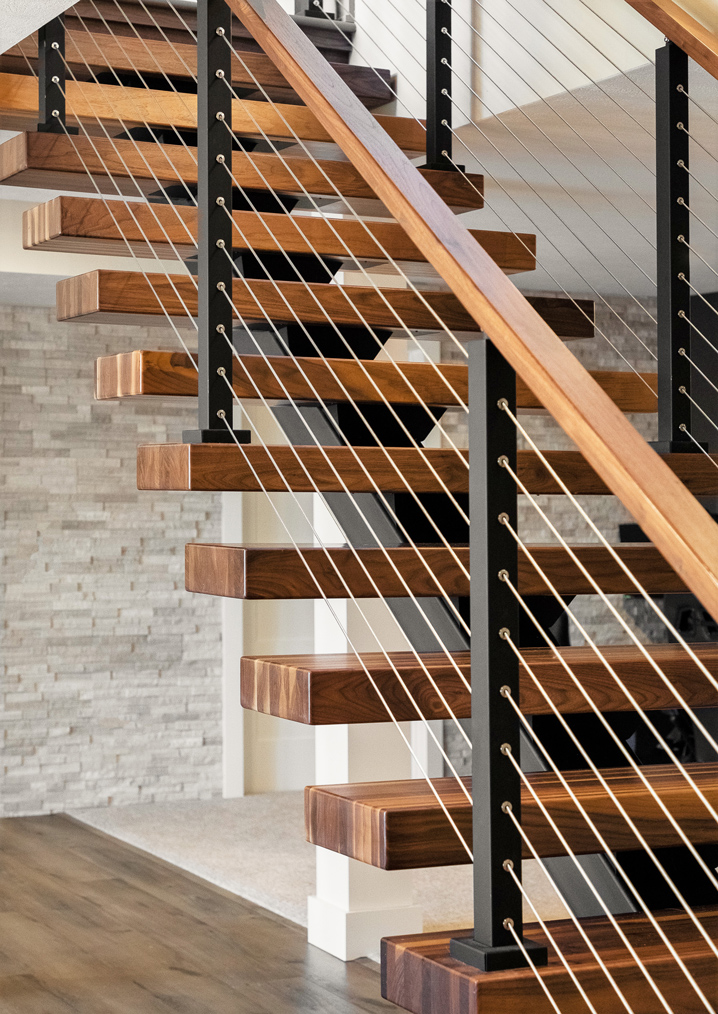
Prior to the remodel, the lower level of the house was only half-finished, and as a result, was only partially utilized as living space. Before, the staircase leading into the basement created separation between the lower-level family room and the unfinished areas. To reimagine the lower level, the staircase and walls that designated the unfinished rooms, were removed and replaced with a new, floating staircase. As a result, the space is now one large room designed for entertaining and complete with an integrated kitchenette, bar area, family room, and gaming and lounge spaces.
Lakeside, the two separate exterior decks just outside the upper-level kitchen and living room were extended to become a single platform, allowing people to walk a longer, connected outdoor space. A screened porch was also added below the deck, providing additional seating and an outdoor bar for entertaining on the lake.
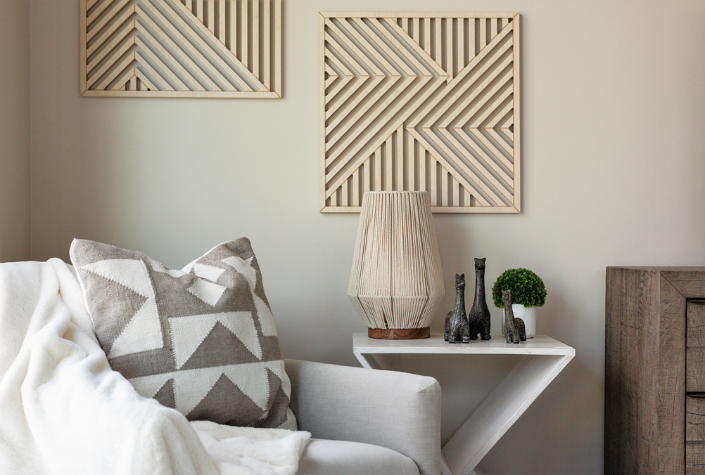
To realize the clients’ aesthetic vision, Knoblock also modified the material and finishes palette, as well as other design touches and décor throughout the home. Knoblock noted while initial planning leaned more rustic, as they worked through the process, the design integrated more modern inspiration, resulting in a balance of the two styles.
“I always tell clients that on day one we are going to have all these great ideas and visions, but at the very end of this process, on the last day, it is going to have morphed, because as you move through the design process you get influenced by other things. It is never a straight path,” Knoblock said. “It is an organic process, and your house is going to tell you what it wants to be if you just listen to it.”
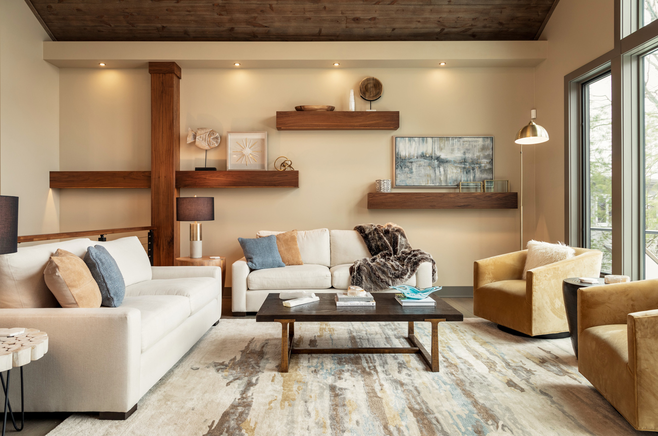
Finding that balance of the two styles, the design utilized more natural, rustic woods on the ceiling in the main upper-level spaces, balanced with a rich walnut, which is the only other wood species in the home. The doors to each room, the bulkhead in the kitchen, the mantle, the railings, custom wall features, and the floating shelves are all a walnut material.
The public spaces of the house are also highlighted by a dark trim, and the ceiling beams in the living room reflect the color as well, weaving another modern detail into the palette. The arched windows were switched out for squared windows, and a sleek, linear tile on the fireplace contrasts with the rustic wooden ceiling as they meet at the top of the room.
“The color palette is strongly tied to the gentleman of the house, because he is a massive University of Michigan fan. At the beginning he was jokingly saying, ‘I want the house to be blue and maize,’” Knoblock said. “The whole time he was trying to interject U-M everywhere and his wife and I would laugh and then behind the scenes go, ‘what can we give him?’”
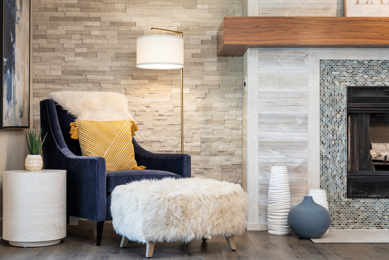
Incorporating the clients’ color wishes subtly into the interiors, the downstairs cabinetry in both the bathroom and kitchenette are dark blue in color, with hints of yellow and gold seen throughout the lower entertainment areas on cabinet handles, throw pillows, and other décor.
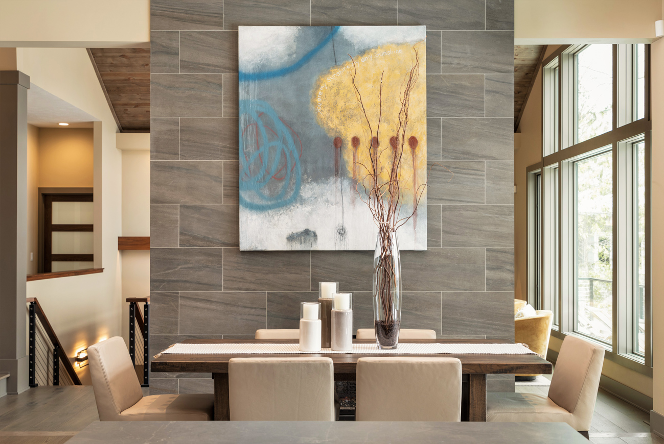
Upstairs, the color theme is a more muted version of what is seen downstairs, drawing warmth in the space with creams, browns, and little peeks of the university’s colors, though not noticeable to someone who isn’t looking for it. On the backside of the fireplace, a commissioned custom painting hangs above the dining area, punctuating the room with an abstract array of shapes in blues and golds. The painting was created by a fellow student Knoblock had gone to college with, and his wife, as they had just shifted from their previous careers to becoming full-time artists. According to Knoblock, she had seen a similar painting of theirs on Facebook and knew something of that style would be perfect to set the tone for the interior of this home.
Continuing the balance of rustic and modern, the kitchen cabinetry showcases two different styles: dark and smooth cabinets on the upper row and the island, and ivory-colored shaker cabinets on the bottom, softening the room with a more traditional element.
“Amy [Schichtel] is our cabinetry [engineer] and our [design] coordinator, so whenever there is cabinetry involved in a project she works hand in hand with me, and we do it as a team,” Knoblock said. “Amy is instrumental in the technical drawing so that the builder understands how to install the kitchen and the cabinets, the whole thing.”
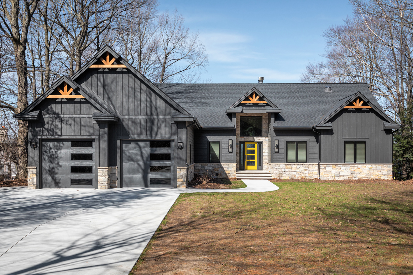
From the drive, the rustic-modern style is expressed in rich invitation on the exterior. The dark color palette wraps the home outwardly, contrasted by natural stone. The original home’s design included partial stone on the exterior as well, but according to Knoblock, it was round and not necessarily real stone. Board-and-batten siding adds linear texture and gable brackets give a nod to the rustic style. The front door also lends a pop of color with its yellow hue, drawing viewers’ eye to the entrance, and honoring the clients’ wishes of a University of Michigan color scheme.
“It was an amazing project to work on. Projects of this scale—especially as a remodel—don’t come along that often. To have a project where we get to do every single thing is rare. This client trusted us the entire way, right down to the candles sitting on the coffee table,” Knoblock said.
“It really is a great example of A-to-Z how to make it work with a designer and have your clients in tears when they come in at the end and see how their house is all done. Tears of joy and disbelief; [the client] kept walking through saying: ‘I can’t believe this is my house,’” Knoblock added.
Originally published in Great Lakes By Design: Bold Graphics, 2022
Text: Brenna Buckwald
Photography: Kristen Turick

