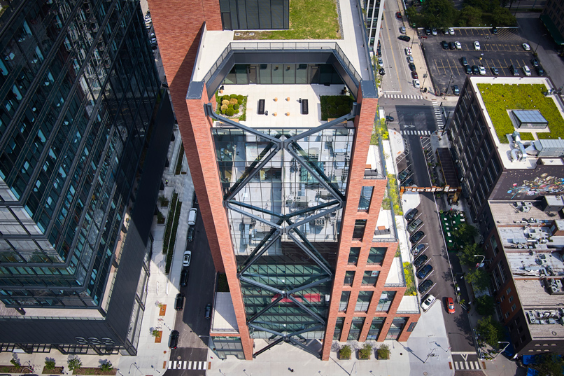
Built at the intersection of W. Fulton Street and N. Halsted Street, 800 Fulton Market is an intentional composition of materiality, form, and function, where architectural expression is informed by the grit, the resilience, and the innovation of an industrial past and vibrant future. Its three-story podium, from which the 19-story, mixed-use office building rises, is inspired by the rhythm and scale of its neighborhood, blurring temporal and physical lines of the historic and existing low-rise streetscape to higher-density commercial districts nearby. The offset core and series of landscaped terraces, triangular in form, are set back from its ground-level footprint, softening its presence at the Fulton Market District Gateway and evoking an impression of embedded, woven glass at the entrance of the historic landmark district.
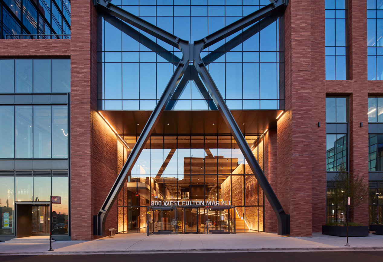
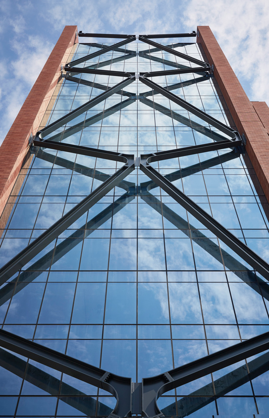
Its exterior façade is defined by a rich palette of glass, brick, and dark metal paneling—characteristic of the neighborhood—and while structurally expressive, the building’s external steel braces are engineered for its regional climate and speak to the smart building systems that envision a new way of working. Interior spaces are meant to foster wellbeing and community—both within the building and to the larger surrounding neighborhood—leveraging an intentional activation of space that begins with a 40-foot-tall, hospitality-focused lobby and continues throughout roughly 470,000 square-feet of office, retail, and public amenity space.
Julie Michiels, AIA, NCARB, LEED AP, associate principal and interior design leader at Skidmore, Owings & Merrill LLP, or SOM, in Chicago, Illinois, said their client, Thor Equities Group, really wanted to develop an innovative and signature building that would fit into the emerging skyline of Fulton Market in a way that felt sensitive to the neighborhood and like it belonged to the district, and, to a larger extent, Chicago.
“The project really is a gateway in a lot of ways. It is located right next to the iconic Fulton Market sign, so it is a gateway into the Fulton Market neighborhood; it is a gateway between old and new in terms of architectural materiality and the expression of the building; and it is a gateway between scales, really working between the smaller, existing scale of the industrial meatpacking industry that had been there historically in the neighborhood and the emerging high-rises that zoning is now allowing,” Michiels said.
“The team worked really hard with the community and with the alderman presenting various options on the massing of the building and the materiality of the building, and how it would connect to the neighborhood, and how it would thoughtfully address the existing occupants of the neighborhood all around,” Michiels added.
Located along the eastern boundary of the Fulton Market Innovation District, 800 Fulton Market’s project narrative is part of the roughly 217-acre community’s larger story as it continues to evolve as a place where traditional and innovative businesses coexist. Originally adopted by the Chicago Plan Commission in 2014 and subsequently updated in 2021, the Fulton Market Innovation District, or FMID, plan outlined design guidelines and an overall vision that sought to preserve the cultural significance and historical character of the built landscape through renovation and restoration of existing building stock, while also investing in new transportation and pedestrian infrastructure, and new construction.
In 2016 and 2017, the City of Chicago expanded its downtown zoning district to the Fulton Market area, allowing for high-density office, commercial, and hotel development west of the Loop. By 2021, it reassessed that its original 2014 land use recommendations were no longer applicable, according to the FMID Plan Update. The new goals and strategies highlighted the promotion of mixed-use and mixed-income developments, improved access for all transportation modes, and the protection and enhancement of historical and cultural assets.
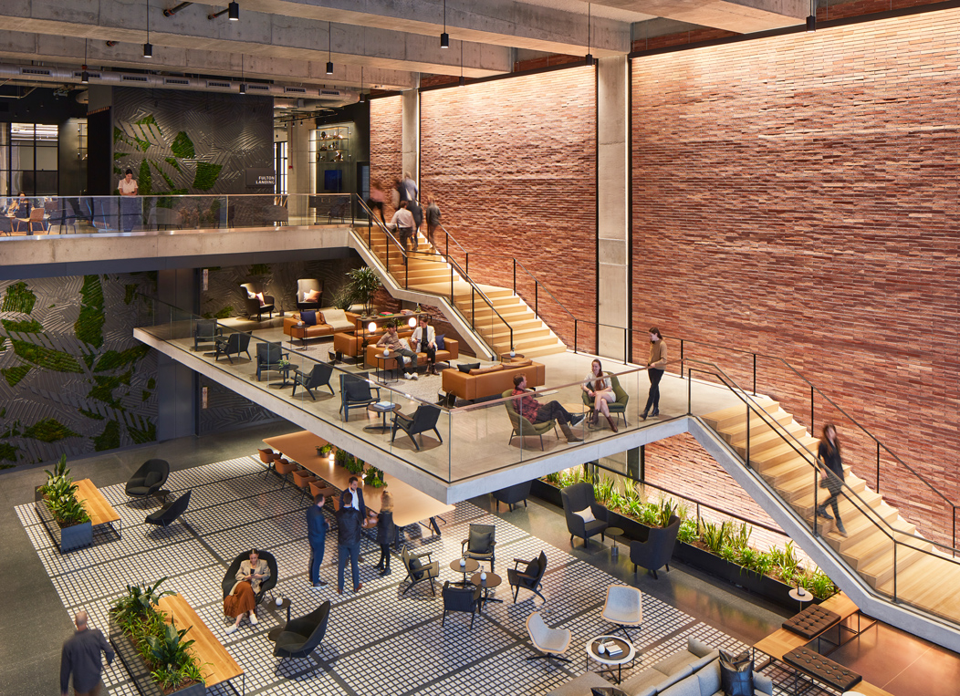
Occupying a full city block and envisioned by Thor Equities of New York and QuadReal Property Group of Vancouver as a fusion of the past and present, 800 Fulton Market is intended to integrate seamlessly into the neighborhood while activating it as a dynamic destination for both tenants and the larger community alike, emphasizing sustainability, wellness, amenities, greenspace, and technologies. In realizing that vision, Michiels noted Thor Equities looked to SOM to take on the project based on a long working relationship and recognition of the firm’s iconic additions to the local skyline throughout its history.
“There is a lot of complexity in this building and it is not all very visible, but it is all working together to make it a really seamless experience. The client had a really solid vision and I think that is important to continuing to push through when you have these complexities,” Michiels said. “It is easier to say maybe we don’t need all these pieces, but they all add up I think to a total picture of sustainability and health and wellness.”
SOM is an interdisciplinary design firm with a history and legacy of developing bold, award-winning projects that set out to transform the skyline and built environments across industries and national boundaries. Since 1936, the firm has evolved from a joint venture launched in an attic office into a collective of architects, engineers, designers, and planners leveraging design solutions to build a better future. Throughout its 86-year history, SOM has delivered projects like One World Trade Center in New York, JTI Headquarters in Switzerland, Burj Khalifa in Dubai, Lever House in New York, and Willis Tower in Chicago, among others.
From the onset of this project, Michiels indicated the team considered the juxtaposition that has come to define the burgeoning Fulton Market district, noting the dichotomy of old and new, big and small, indoors and outdoors, informed a lot on the site. In positioning the mixed-use building, the team looked to the existing context of the built landscape, leveraging both the taller building located just to the north and the grade change from east to west to orient the offset core and main lobby entrance.
With its offset core to the north—in relationship to a higher-density commercial district—the 326-foot-tall tower’s slender profile then cascades down into an architecturally expressive façade through its stepped terraces to the three-story podium that relates more to the scale of Fulton Market. Michiels noted while Halsted Street is a busier and more visible thoroughfare, the significant elevation change along Fulton Street allowed for more height and connection back to the neighborhood if the entrance was located along the east-to-west side.
“Programmatically, they wanted to focus on connecting with the community as well as creating community within the building. There was a lot of focus early on about health and wellness as being a major consideration in programming the building and thinking about how we were massing it,” Michiels said.
“Since it is a developing neighborhood—there are a lot of restaurants, there are a lot of shops—but there weren’t a lot of people living in the neighborhood, and that is rapidly changing as well, so there is a real opportunity there to provide some health services to the neighborhood. So, that idea around health and wellness really extends down and out through the building and out to the community,” Michiels added.
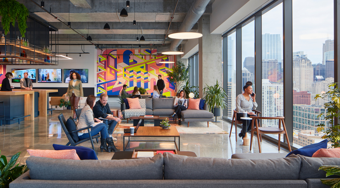
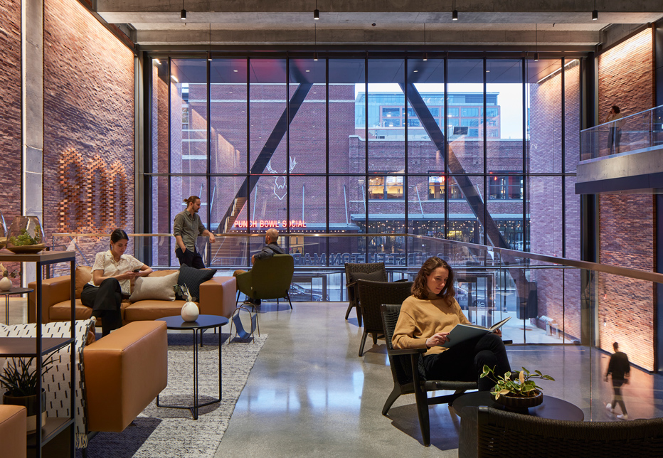
Recognizing the building would serve as a destination for the Fulton Market community as well as its business tenants, SOM was intentional in planning the interior program, which features an ecosystem of office, retail, conference, fitness, and lounge spaces—35,000 square-feet of which are dedicated retail and restaurant area. Michiels noted the interior is a gradient experience, transitioning from more public spaces upon arrival where a double-height lobby welcomes the public to more private, dedicated tenant amenities as one moves up through the building.
“The community, especially the local business community, is welcome to use some of the amenities within the building, so creating this sense of openness and welcoming feel and experience for them was important, while also providing for the community within the building. Anytime you have multiple companies within the building and an anchor tenant, [it is about] really providing a way for them to connect and cross paths and feel like it is their home-away-from-home. The work-life balance has become much more in the forefront since COVID—it is something that we have always been thinking about, but now it is really at the front of everyone’s mind: ‘Why am I coming to an office building if I can do my job at home?’” Michiels said.
“I think providing this almost, hospitality-feel of the lobby and of the amenity spaces, even though we have sort of landed on these ideas in advance of COVID, it really worked out in the end to draw people back to the office and activate these spaces and create that community within the building. We wanted to have that gradient of very public-facing, this intermediate-blended tenant and local business offering, and then something that was just for the tenants of the building,” Michiels added.
From the entrance, which features a cantilevered staircase and mezzanine that conceptually ties back to the external X-braced steel on the façade, a materiality of exposed concrete, wood, and red brick welcome people into public amenity areas where open circulation and wide corridors offer flexibility and multifunctionality. Visual connection to the mezzanine and open staircase invites exploration, and as one moves deeper and higher into the building, amenities transition into office space and private, outdoor landscaped terraces on every other floor.
“In order to invite people in, it really needed to feel like this urban living room that had been created by just sort of pulling the materiality of the exterior of the building, and really of the neighborhood, into the building. It was about using elements like interior plantings and the interior landscape that we worked on with the same team who did the exterior landscaping, bringing in the greenery and softening some of those materials through lighting, through furnishings, and really giving some purpose to that space through programming the furniture into various landscapes within that large volume of space,” Michiels said.
“It takes the great scale of the building and pulls that inside, but starts to bring it down to a human scale on the interior. I think it is important in our ethos of the design work that we do that the interior feels like it’s very much a part of the building that you approach, versus walking into the front door and being transported to somewhere else. It is really about honesty and acknowledging the authenticity of the building,” Michiels added.
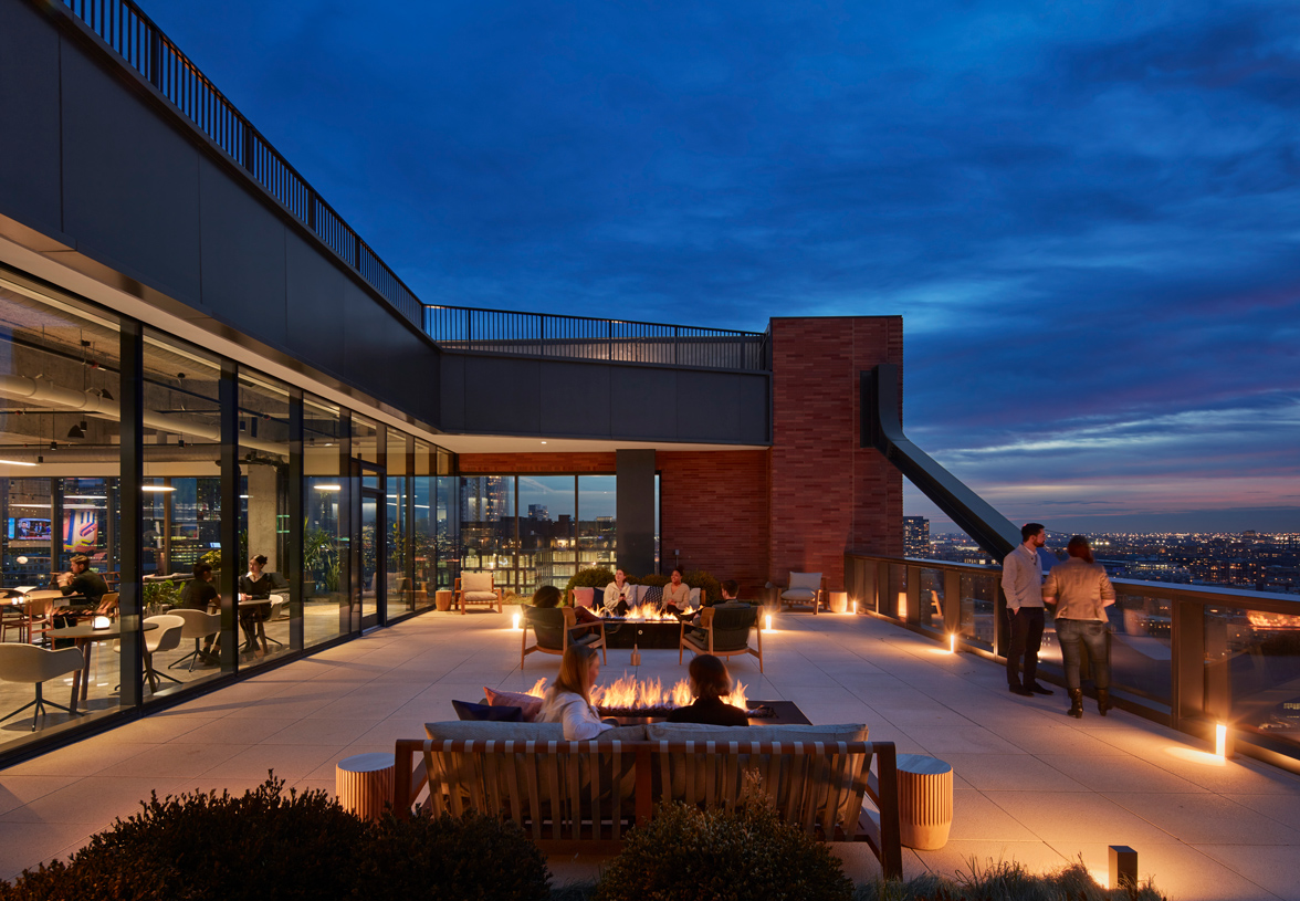
On the tenant floors, the offset core allows for open floor plates, delivering flexibility and natural daylight throughout the office environment and into spaces like the restrooms, stairwells, and the glass-enclosed elevator cabs. While its external steel bracing that frames the offset core is architecturally distinctive, Michiels noted it also serves an additional structural purpose as lateral reinforcement in order to provide the long, open and flexible floor plates. The economical solution is also an engineering one as well, constructed to resist wind loads and withstand Chicago’s winters. Designed with an expected range of nine inches of thermal movements, the central node of each brace has the ability to move closer to the façade as the steel cools and contracts, or move farther from the building as the material heats and expands.
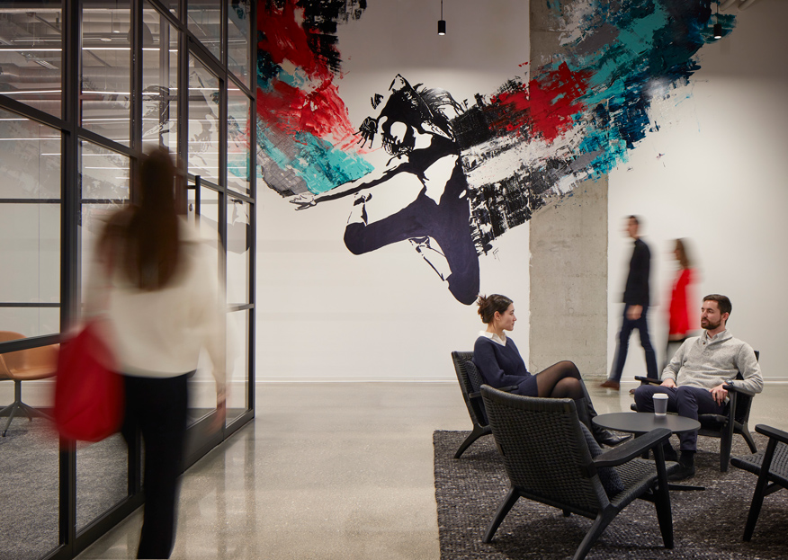
Other innovative features of the building comprise a range of smart building systems and cloud-based machine learning insights—delivered in a collaboration between Thor Equities and Buildings IOT—such as the Xandar Kardian occupancy sensors that monitor the use of different spaces, a centralized tenant communication platform known as Rise App that allows tenants to book space and management to control security access and track preferred spaces, and Atlasen™ indoor environmental quality sensors that account for 15 different metrics such as temperature, humidity, sound level, and particulate matter. The building also offers amenities such as: electronic charging stations, scooters for tenant use, penthouse lounge and roof deck, state-of-the-art fitness center, bike racks, showers, below-grade parking spaces, and six, site-specific murals by Chicago-based artists. Michiels said design is about problem solving in a way that has vision and it is the combination of passive architectural strategies and complex technology that really makes a smart building.
“I think it is really about creating an outcome that is more than just an assemblage of the answers, but it is something new that emerges from the intersection of the problems that you are trying to solve for and really in doing all of this, you have to be a good listener and you have to be a good collaborator to be responsible for the environment, for the community, for the economics of the project,” Michiels said.
“And in the end, you’ll have created a great experience that has longevity and that sets the bar higher for yourself and for future projects. I think anyone can answer questions and bundle them together, but that is not what we are doing. We are finding the blending of and the intersection of those things to create something new. We are always looking for what is next and how can we solve this uniquely and authentically,” Michiels added.
Completed in 2021, 800 Fulton Market has since been recognized by a number of organizations such as the American Society of Civil Engineers in 2022 with an AEI Professional Project Award, and been certified LEED Platinum, WiredScore Platinum, SmartScore Platinum, and WELL Gold. It is also considered to meet the AIA’s 2030 target for embodied carbon reduction at 65 percent when compared to an average commercial office.
Since then, 800 Fulton Market has welcomed The Aspen Group, Prevolv Inc., Inscape, Teknion, DineAmic Hospitality, and John Deere as office tenants, with Aspen Dental occupying more than 207,900 square-feet of combined office and retail space as its anchor tenant. John Deere has leased roughly 35,000 square-feet in the building for its Chicago office, and looked to SOM’s interiors practice to help envision their new workplace. Michiels said it has been exciting for the firm to continue working on a project it loves so much in a different capacity and has worked with five different clients to date on tenant build-outs, including John Deere.
“We want to carry through those ideas around authenticity and thinking about how we would solve the problem and the complexity around it, but it is just shifting the scale of thinking a bit. There are new things that show up on a smaller scale and new ways of engaging with the client—new ways of listening and really knowing that this is your end user who is going to be in that space every day—and so really hearing them and thinking about how you can make that a great space for them,” Michiels said.
“[John Deere] is looking to become part of that neighborhood and they are very excited about it and looking to grow their tech talent by being there. It was really great to hear their reasons for choosing the building and it really had a lot to do with an alignment of values, of the architecture—the principles behind the architecture—and of their goals and values as well,” Michiels added.

Originally published in Great Lakes By Design: The Acoustics, 2022
Text: R.J. Weick
Photography: Dave Burk © SOM

